The resurgence of Pictorialism isn’t about nostalgia; it’s a calculated artistic and market-driven choice where intentional craft commands higher value than technical perfection.
- Authentic pictorial effects, rooted in optical physics and meticulous technique, are prized over the sterility of generic digital filters and algorithmic blur.
- The fine art market is rewarding the emotional resonance and ‘soul’ of a print, with collectors paying premium prices for works that prioritize atmosphere and materiality over clinical sharpness.
Recommendation: Focus on mastering localized adjustments, character-rich optics, and tactile paper choices to create authentic pictorial work, rather than relying on global, one-click effects.
In an age dominated by high-resolution sensors and optically perfect lenses, where digital sharpness is the default measure of quality, a counter-movement is gaining significant traction in the fine art world. Artists and collectors are increasingly turning their gaze backward, rediscovering the atmospheric, painterly, and often soft-focused aesthetic of Pictorialism. This revival poses a fascinating question: why, in our quest for ever-more-perfect images, is there a growing desire for the intentionally imperfect? While many assume this is simple nostalgia or a reaction against digital sterility, the reality is far more nuanced.
The common understanding is that artists are merely applying soft-focus filters or vintage textures to mimic a bygone era. However, this surface-level interpretation misses the core of the movement. The contemporary pictorialist revival is not a stylistic trend but a deep, philosophical commitment to craft. It involves a deliberate rejection of automated perfection in favor of manual intentionality, from the choice of a vintage lens with unique ‘flaws’ to the painstaking digital replication of historical printing processes like gum bichromate. It is a return to the idea of the photograph as a hand-made object, imbued with the artist’s touch and soul.
This shift is not just happening in artist studios; it is being validated by the art market itself. The enduring appeal of traditional photographic techniques is evident as a recent survey shows that 66.5% of photographers identify as pure photographers, prioritizing classic methods over broader multimedia approaches. This article explores the historical foundations, technical discipline, and market dynamics driving Pictorialism’s comeback. We will deconstruct why algorithmic blur fails to replicate true optical softness, how to master techniques that add drama and soul, and ultimately, why a collector might pay more for an image that is soft and evocative than one that is clinically sharp.
To fully understand this contemporary movement, this article deconstructs its key facets, from its historical origins to its modern-day validation in the auction house. Explore the philosophy, techniques, and materials that define authentic pictorialist art today.
Summary: The Enduring Allure of Painterly Photography
- Why Did Early Photographers Fight to Make Photos Look Like Paintings?
- Why Does Post-Processing Blur Fail to Mimic Optical Softness?
- Helios 44-2 or Canon L Series: Which Best Serves Artistic Portraiture?
- Why Is Local Contrast Superior to Global Contrast for Drama?
- How to Replicate the Gum Bichromate Look Digitally?
- The Editing Mistake That Makes Pictorialism Look Like a Cheap App Filter
- How to Choose Papers That Enhance the Pictorialist Effect?
- Sharpness or Soul: Which Matters More to the Pictorialist Collector?
Why Did Early Photographers Fight to Make Photos Look Like Paintings?
The origins of Pictorialism are rooted in a fundamental battle for legitimacy. In the late 19th and early 20th centuries, as cameras like the Kodak Brownie democratized photography, the medium was widely dismissed as a mechanical recording process, devoid of artistic intent. For serious practitioners, this was an unacceptable status. They fought to elevate photography to the level of fine art, and their primary strategy was to align its aesthetics with the established arts of painting and drawing. By creating images that were evocative, atmospheric, and clearly manipulated by the artist’s hand, they argued that photography could transcend mere documentation to express emotion and beauty.
This was not about a lack of technical ability to produce sharp images; it was a conscious philosophical choice. They embraced techniques like soft focus, complex printing processes (gum bichromate, platinum prints), and manual retouching to suppress literal detail and emphasize tone, composition, and mood. This philosophy was powerfully articulated by its proponents. As the historical records of the Alfred Stieglitz Collection at the Art Institute of Chicago note, “Pictorialists proudly defined themselves as true amateurs—those who pursued photography out of a love for the art.” This “love” was expressed through profound, hands-on craftsmanship.
Case Study: The Photo-Secession Movement’s Impact
The fight for recognition was formalized by groups like the Photo-Secession, founded by Alfred Stieglitz in New York in 1902. This was a direct challenge to the “you press the button, we do the rest” ethos of mass-market photography. The Photo-Secession was a strategic and powerful force; they established the influential “Little Galleries of the Photo-Secession” on Fifth Avenue, published the beautifully crafted journal Camera Work to showcase their art, and mounted international exhibitions. Their concerted efforts were ultimately successful, directly leading to the acceptance of photography as a legitimate art form by major museums and galleries, thereby securing its place in art history.
Understanding this history is crucial because the contemporary revival mirrors this foundational struggle. In an age of AI-generated images and sterile digital perfection, modern pictorialists are again fighting to assert the value of human intentionality and handcrafted soul over mechanical output. They are not simply copying a style; they are embracing its core philosophy.
Why Does Post-Processing Blur Fail to Mimic Optical Softness?
At the heart of the pictorialist aesthetic is a quality of softness that is profoundly different from the blur created by a digital filter. The distinction lies in the origin of the effect: one is a product of physics, the other of mathematics. Applying a Gaussian blur in post-processing is an algorithmic process that uniformly averages pixel values, resulting in a smooth but often lifeless and flat “out-of-focus” look. It lacks the complex, organic quality that defines true optical softness, which is created in-camera as light itself is rendered imperfectly.
As one technical analysis compellingly puts it, “Optical softness is an artifact of physics, while digital blur is an artifact of mathematics.” This is a crucial distinction. Optical softness arises from lens aberrations—minuscule imperfections in the lens design that cause light points to “bloom,” bend, and bleed into one another before they are ever recorded by the sensor or film. This effect is not uniform; it interacts with the light in the scene, often causing highlights to glow and transitions to have a gentle, luminous quality. This is what creates depth and a sense of atmosphere, a quality that a uniform mathematical blur simply cannot replicate. It is an “intentional artifact” that adds character.
This is why photographers pursuing an authentic pictorialist look often turn to vintage or specially designed “art” lenses. These tools are engineered not for perfect sharpness, but for the quality of their rendering, including the specific character of their softness and bokeh. While digital tools can be used to enhance this effect, the foundational quality must originate from the light’s interaction with the glass. A simple blur filter announces itself as a digital imitation, whereas true optical softness feels integral to the image’s very fabric, contributing to a more believable and soulful result.
Helios 44-2 or Canon L Series: Which Best Serves Artistic Portraiture?
The choice of lens is a defining statement for a pictorialist photographer, and the debate between a technically perfect lens like a Canon L Series and a vintage “character” lens like the Helios 44-2 perfectly encapsulates the movement’s philosophy. A Canon L lens is an engineering marvel designed to eliminate flaws: it delivers edge-to-edge sharpness, minimal vignetting, and perfectly controlled flare. It is built for clinical precision and reliable, repeatable results. For commercial or documentary work, it is unparalleled. However, for artistic portraiture in the pictorialist tradition, these strengths can become weaknesses.
The Helios 44-2, a Soviet-era lens, is famous for its “flaws.” It is often soft at the edges, prone to dramatic flare, and creates a distinctive “swirly” bokeh. From a purely technical standpoint, it is an inferior lens. But from an artistic perspective, these are not flaws; they are features. As one contemporary analysis notes, “The lens ‘flaws’ of the Helios are actually artistic features. The vignetting naturally frames the subject, the softness is flattering for portraits, and the unique bokeh creates a painterly, dreamlike background.” The lens imposes a distinct personality on the image, an “intentional artifact” that cannot be easily replicated by a perfect modern lens followed by a software filter.
Choosing the Helios over the Canon L is a declaration that the artist values expressive character over technical perfection. It is about collaborating with the tool’s unique way of seeing the world rather than simply using it to record reality with maximum fidelity. While a skilled artist can create beautiful portraits with either lens, the starting point is fundamentally different. The Canon L provides a perfect, clean slate, requiring the artist to add character in post-production. The Helios provides a canvas already rich with character, challenging the artist to harness and shape it. For many modern pictorialists, the latter approach is more authentic to the movement’s soul.
Why Is Local Contrast Superior to Global Contrast for Drama?
One of the most common mistakes in emulating the pictorialist style is the crude application of global adjustments. Simply lowering the overall contrast of an image often results in a flat, muddy, and uninspired photograph. True pictorialist drama and depth come not from global changes, but from the masterful application of local contrast. Global contrast affects the entire tonal range of the image uniformly, brightening all highlights and darkening all shadows. Local contrast, by contrast, targets the mid-tones and enhances the texture and definition within specific areas without altering the overall luminosity of the brightest highlights or deepest shadows.
This technique, often controlled with tools like the “Clarity” or “Texture” sliders in modern software, allows an artist to build what can be called a tonal architecture. Instead of a blanket effect, the photographer can selectively guide the viewer’s eye. For example, one can enhance the texture in a subject’s clothing or the crags of a rock face while allowing the background sky to remain soft and atmospheric. This selective enhancement creates a powerful sense of depth and three-dimensionality that global adjustments destroy. It is the digital equivalent of the historical bromoil process, where the artist would manually ink up a print to control density and texture area by area.
The success of this approach is validated by the art market. The work of artists like Francesca Woodman, known for her masterful use of atmosphere and selective focus, commands high prices. For example, her pictorialist-influenced photograph ‘From Space 2’ sold for $63,500 against a high estimate of $9,000, demonstrating how collectors value the dramatic and moody effects created by nuanced tonal control over sharp, globally adjusted images. Mastering local contrast is therefore not just a technical exercise; it is fundamental to creating work with genuine emotional resonance and market value.
Action Plan: Applying Local Contrast for Pictorialist Drama
- Focus adjustments: Use the Clarity or Texture slider selectively on specific textures within the image, such as fabric, foliage, or architectural details, using a brush or mask.
- Create depth: Apply graduated or radial filters to gently increase local contrast on a foreground subject while leaving the background soft and ethereal.
- Preserve the mood: When making adjustments, always mask them to protect atmospheric elements like fog, haze, or soft background light from being sharpened.
- Build in layers: Rather than one heavy-handed global adjustment, build up contrast through multiple, subtle layers with varying opacity and blend modes to maintain a natural look.
- Guide the eye: Concentrate local contrast enhancements on the primary subject or the emotional focal point of the image, allowing the surroundings to remain soft and dreamy.
How to Replicate the Gum Bichromate Look Digitally?
The gum bichromate process is one of the most iconic historical techniques of Pictorialism, celebrated for its painterly quality, rich texture, and the unique, one-of-a-kind nature of each print. It involved coating paper with a mix of gum arabic, a photosensitive chemical (dichromate), and pigment, then exposing it. The process was often repeated in layers with different colors. Replicating this complex, tactile aesthetic digitally requires far more than a simple filter; it demands a parallel process of building an image in deliberate, transparent layers.
An authentic digital workflow mimics the logic of the physical craft. It begins in a program like Adobe Photoshop, not with a single filter, but with multiple adjustment layers. Each layer represents a “pass” of color or density, just as a traditional artist would re-coat and re-expose their paper. By using different blend modes like Multiply, Overlay, or Soft Light, the artist can progressively build tonal density. The key to avoiding a sterile digital look is to introduce organic imperfections. This is achieved by creating and using custom brushes sampled from real-world textures, such as scanned paper fibers, chemical stains, or uneven brush strokes. These textures, when subtly applied via masks, break the uniformity of the digital canvas.
Furthermore, color is critical. Instead of relying on a simple sepia overlay, a sophisticated approach uses gradient maps to remap the image’s tones to a palette of historically accurate pigments—subtle carbon blacks, ochres, and siennas. The final, and perhaps most crucial, step is localized masking. Just as a gum print artist would physically wash away parts of the emulsion, the digital artist uses masks to control precisely where these effects appear, mimicking the beautiful, slight variations of a hand-coated print. This layered, intentional process is what separates a rich, convincing digital homage from a cheap, one-click effect.
The Editing Mistake That Makes Pictorialism Look Like a Cheap App Filter
There is a fine line between a masterful pictorialist image and an amateurish attempt that screams “cheap app filter.” The critical difference almost always comes down to one principle: uniformity versus selectivity. Inexpensive filters and basic editing techniques apply a single, uniform effect—be it blur, grain, or a color overlay—across the entire image. This global application is the cardinal sin of digital Pictorialism because it ignores the logic of light and the nuance of a handcrafted object.
An authentic pictorialist work is defined by its subtle variations. For instance, softness should not be uniform; it should emanate logically from the light source, blooming in the highlights and feathering naturally into the shadows. Similarly, texture or “grain” should not be a flat, mechanical overlay. A skilled artist will integrate textures organically using blend modes like Soft Light and mask them to enhance specific areas, avoiding a mismatched “grunge” look. Color is another major pitfall. Pictorialism favors a muted, earthy palette. Over-saturating an image with vibrant digital colors instantly breaks the nostalgic, painterly illusion.
Case Study: The Craft Behind Professional Pictorialist Actions
The development of professional-grade tools like Gavin Seim’s Pictorialist Actions for Photoshop highlights the complexity involved. Seim spent years studying historical techniques from Stieglitz to David Hamilton before creating a digital workflow. His breakthrough was not a one-click filter, but a balanced system of layers and masks that allows for quick, powerful adjustments while preserving the hand-crafted quality. This approach is designed specifically to avoid the sterile, uniform look of automated filters by building in the ability to apply effects selectively and with nuance, which is the essence of authentic pictorialism.
Ultimately, the goal is to create an image that feels as if it were made by hand, not by an algorithm. This means abandoning uniform filters in favor of custom brushwork, selective masking, and layered adjustments. Each decision should be intentional, guided by the light and composition of the specific photograph. It is this thoughtful, selective approach that elevates a digital image from a mere pastiche to a work of art with genuine soul.
How to Choose Papers That Enhance the Pictorialist Effect?
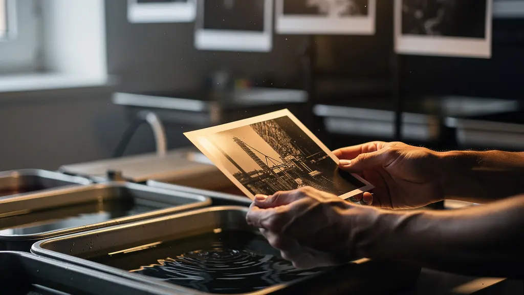
In the pictorialist philosophy, the photograph is not just an image; it is a physical object. The choice of paper is therefore not an afterthought but a critical component of the final artwork. The paper’s texture, tone, and weight—its very materiality—must work in harmony with the image to enhance its painterly qualities. A glossy, plastic-coated paper would betray the entire aesthetic. Instead, pictorialists gravitate towards fine art papers that have a tangible presence and interact with the ink and light in a beautiful way.

The selection is often guided by the historical process the artist wishes to emulate. For an image with rich, deep tonality meant to evoke a gum bichromate print, a heavy cotton rag paper is an ideal choice. Its warm tone and high absorption rate allow inks to sink in, creating a velvety depth. For more ethereal portraits reminiscent of platinum-palladium prints, a delicate Japanese washi paper with visible fibers can add a unique, translucent quality. The goal is to create a symbiotic relationship where the paper’s surface texture complements the image’s softness and tonal range, rather than fighting against it. This is why matte and textured surfaces are overwhelmingly preferred over anything with a high gloss or sheen.
The following table, based on an analysis of pictorialist printing methods, breaks down how different paper types can be matched to specific historical aesthetics to achieve a more authentic and impactful result.
| Paper Type | Historical Process Emulated | Characteristics | Best For |
|---|---|---|---|
| Heavy Cotton Rag | Gum Bichromate | Warm tone, high absorption, visible texture | Multi-layered prints with rich tonality |
| Japanese Washi | Platinum-Palladium | Visible fibers, delicate surface, neutral tone | Ethereal portraits, minimalist landscapes |
| Warm-Toned Matte | Carbon Print | Creamy base, low reflectance, smooth surface | Nostalgic scenes, vintage aesthetic |
| Textured Fine Art | Bromoil | Pronounced texture, high ink retention | Dramatic landscapes, architectural studies |
Choosing the right paper is the final step in asserting the photograph as a handcrafted art object. It completes the sensory experience, inviting the viewer not just to look at the image, but to appreciate its physical form.
Key takeaways
- Pictorialism originated from a deliberate fight to establish photography as a fine art, valued for its expressive potential rather than as a mere mechanical record.
- Authentic contemporary pictorial effects stem from a deep understanding of optical physics and intentional, selective craft—not the application of generic, global digital filters.
- The fine art market increasingly values emotional resonance (‘soul’) and materiality over pure technical sharpness, a trend proven by record-breaking auction results for pictorialist-style works.
Sharpness or Soul: Which Matters More to the Pictorialist Collector?
In the broader photography market, technical metrics like sharpness, resolution, and lack of noise are often paramount. But within the fine art sphere, and especially for work in the pictorialist tradition, the criteria for value shift dramatically. Here, the driving force is not technical perfection but emotional resonance, narrative power, and the palpable presence of the artist’s hand. For the discerning collector, soul unequivocally matters more than sharpness. This preference is not just a matter of taste; it is a quantifiable trend in the art market, where works embodying these qualities are achieving remarkable results.
As one contemporary pictorialist artist explains, “The soul of a pictorialist print lies in its subtle tonal transitions… the soft, low-contrast image on screen translates faithfully into a physical print with rich, deep, and nuanced tones.” It is this successful translation of on-screen intent into a beautiful physical object that collectors seek. They are buying an artifact, not just a data file. A technically perfect, ultra-sharp image can sometimes feel cold, clinical, and anonymous. In contrast, a pictorialist work, with its soft focus, atmospheric tones, and textured paper, feels unique, personal, and imbued with a human touch that cannot be perfectly replicated.
This valuation of artistic expression over technical perfection is demonstrated with stunning clarity at high-end auctions. A powerful example from 2024 confirms this trend, where the collector market demonstrated that it values expression over perfection when a Peter Hujar portrait sold for $252,000, a staggering five times its high estimate. Hujar’s work, known for its emotional depth and often-subtle softness, appeals directly to a collector’s desire for authenticity and soul. This and similar sales send a clear message: the market for fine art photography is mature enough to recognize that the most valuable quality in a photograph is not how well it records reality, but how profoundly it expresses a unique vision.
The contemporary pictorialist revival is a direct response to this sophisticated collector’s gaze. It is a movement built on the understanding that in a world saturated with technically perfect images, true value and distinction lie in the intentional, soulful, and beautifully crafted imperfection.
To cultivate a body of work that resonates with this discerning market, an artist must therefore shift their focus from achieving technical perfection to mastering the craft of emotional expression, a journey that is both challenging and profoundly rewarding.