The most impactful interior design no longer treats art as a final accessory, but as a foundational architectural element.
- Success lies in mastering the interplay of scale, mounting, and conceptual depth, not just matching colors.
- High-end mounting like Diasec and a focus on an artwork’s narrative are now more valuable than pure technical perfection or fleeting trends.
Recommendation: Shift your mindset from “decorating a wall” to “curating visual weight” by selecting one oversized, conceptually rich piece to anchor your space’s entire aesthetic.
You’ve done everything right. The furniture is exquisite, the lighting is perfect, the textures are layered with care. Yet, something feels unresolved. The space, while beautiful, lacks a soul. This is a common frustration in high-end interiors, and the culprit is often how we approach art. For years, the standard advice has been to create gallery walls of small personal photos or to find a piece that simply “matches the sofa.” This approach treats art as an afterthought, a decorative filler that completes a room but rarely defines it.
This methodology is becoming obsolete. In the world of luxury design, a fundamental shift is underway. But what if the true key to an unforgettable space wasn’t about filling the walls, but about commanding them? What if, instead of a collage of small moments, a single, monumental work could provide the room’s entire narrative? The new paradigm moves beyond simple aesthetics to embrace art as a strategic, architectural component. It’s about understanding the power of scale, the science of perception in mounting techniques, and the lasting value of a compelling concept.
This guide abandons the platitudes of color-matching and embraces the sophisticated strategies used by top-tier stylists. We will deconstruct why oversized prints are eclipsing gallery walls, explore the technical nuances that separate a good print from an investment-grade masterpiece, and reveal how to ensure your chosen art possesses a timeless quality. It’s time to stop decorating and start curating.
To guide you through this new approach, this article is structured to build your expertise from the ground up, moving from major trends to the critical details that make all the difference. Explore the sections below to master the art of the contemporary print.
Summary: A Strategist’s Guide to High-End Photographic Prints
- Why Are Oversized Prints Replacing Traditional Gallery Walls in Modern Homes?
- How to Choose Between Acrylic Face Mounting and Traditional Framing?
- Geometric vs. Organic: Which Style Will Remain Timeless in 10 Years?
- The Color Grading Error That Makes Art Clash with Your Furniture
- When to Rotate Your Art Display to Refresh Your Living Space?
- Why is Concept Now More Valuable Than Technical Perfection?
- Why Does a 40-Megapixel Image Look Soft at 2 Meters Wide?
- Geometric vs. Organic: Which Style Will Remain Timeless in 10 Years?
Why Are Oversized Prints Replacing Traditional Gallery Walls in Modern Homes?
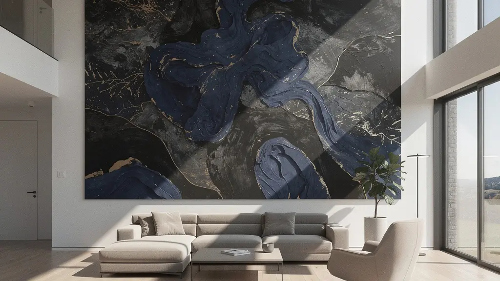
The era of the cluttered gallery wall is fading, making way for a bolder, more confident approach to interior design: the singular, oversized statement piece. This isn’t just a trend; it’s a fundamental shift in how we perceive and use art within a space. A large-scale print doesn’t just decorate a wall—it claims it, transforming a passive surface into an active architectural feature. This move towards monumental art reflects a growing desire for simplicity and impact, where one powerful voice speaks louder than a chorus of whispers. In fact, a recent survey shows that 42% of interior designers project greater use of both paintings and sculpture, signaling a clear move towards pieces with significant presence.
The power of the oversized print is its ability to create a focal point that anchors the entire room. Unlike a gallery wall, which can scatter attention and create visual noise, a single large piece provides a clear center of visual weight. It commands attention, directs flow, and establishes the room’s mood and narrative in one decisive gesture. This approach requires confidence, but the reward is a space that feels curated, intentional, and profoundly more impactful. It’s the difference between a room with art in it and a room that *is* a work of art.
Case Study: The Gursky Effect
Photographer Andreas Gursky perfectly demonstrated the value of scale and presentation when his work ’99 Cent II Diptychon’ became one of the most expensive photographs ever sold. By mounting the massive print on acrylic glass using the Diasec process, he transformed a seemingly mundane commercial scene into a museum-quality masterpiece. This case shows how monumental scale and pristine mounting can elevate a subject, creating an immersive experience that commands a premium and defines the collector’s space as a serious art destination.
Ultimately, choosing an oversized print is a commitment to a singular vision. It declares the homeowner’s or designer’s aesthetic with conviction, creating a space that is both minimalist in its approach and maximalist in its impact. This singular focus simplifies the design process while amplifying its emotional resonance.
How to Choose Between Acrylic Face Mounting and Traditional Framing?
Once you’ve chosen your statement piece, the next decision is arguably just as critical: how to present it. The choice between modern acrylic face mounting and traditional framing goes far beyond aesthetics; it fundamentally alters the artwork’s visual properties, longevity, and relationship with the viewer. Traditional framing, with its matting and glass, creates a “window” into the art, putting a respectful distance between the piece and its audience. It’s a classic choice, but one that can feel formal and dated in a sleek, contemporary interior.
Acrylic face mounting, especially the patented Diasec process, does the opposite. It bonds the print directly to a sheet of high-grade acrylic, eliminating the air gap and creating a seamless, object-like presence. This technique enhances color, contrast, and gives the image a stunning sense of optical depth. The artwork becomes a luminous, vibrant object that seems to float off the wall, demanding a more direct and intimate engagement. At Reed Art & Imaging, a leading professional print lab, their experience confirms this: “We’ve found that the Diasec process with Fuji Flex photographic paper delivers exceptional sharpness even at massive scales,” they note. “The proprietary gel adhesive and lens-grade acrylic actually enhance micro-contrast, making a properly prepared file appear sharper.”
The following table breaks down the key differences, showing why archival face mounting is often the superior choice for high-end contemporary prints where visual impact and longevity are paramount.
| Feature | Diasec Process | Standard Acrylic | Museum Glass |
|---|---|---|---|
| UV Protection | 99% with TruLife | Limited UV protection | 99% UV blocking |
| Longevity | 50+ years proven | Subject to delamination | Archival quality |
| Visual Impact | Super-saturated colors | Good color enhancement | True color accuracy |
| Reflectivity | 25% reduction with TruLife | Standard glare | Less than 1% reflection |
| Cost | Premium ($500-2000/m²) | Moderate ($200-500/m²) | High ($300-800/m²) |
While museum glass offers excellent clarity and UV protection, it cannot replicate the immersive, three-dimensional quality of a face-mounted print. For designers aiming to make a contemporary print the undeniable hero of a room, the vibrancy and modern finish of Diasec or a similar high-end acrylic process is the definitive choice for achieving maximum archival intent and visual punch.
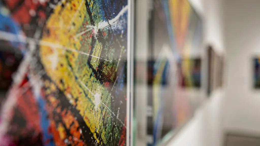
As the visual comparison shows, the face-mounted print on the left exhibits a deeper saturation and a glossier, more dimensional finish, while the traditionally framed piece on the right offers a more muted, classic presentation behind glass. The choice directly influences the artwork’s final character in the space.
Geometric vs. Organic: Which Style Will Remain Timeless in 10 Years?
The debate between geometric abstraction and organic forms is a tale as old as modern art. Geometric art, with its clean lines, structured patterns, and minimalist appeal, speaks to our desire for order, logic, and man-made precision. It integrates seamlessly into modern and industrial architectures, reinforcing lines and creating a sense of calm control. Organic art, by contrast, draws from the fluid, imperfect, and flowing forms of nature. It brings a sense of softness, movement, and biophilic connection to a space, breaking up rigid interiors with natural chaos.
Currently, the pendulum is swinging towards nature. As a recent interior design survey notes, “Organic and bold or large-scale patterns will hold sway among print lovers in 2024,” indicating a collective yearning for warmth and authenticity in our homes. This trend is a reaction to years of stark minimalism, a desire to create spaces that feel more human and connected to the natural world. However, chasing this trend is not the secret to timelessness. True longevity isn’t found in choosing one style over the other, but in selecting a piece whose conceptual dialogue transcends its form. A mediocre organic print will feel dated far faster than a brilliant geometric one.
Timelessness is a quality of intent, not of style. A truly timeless piece, whether geometric or organic, has a depth that invites repeated viewing. It asks questions, tells a story, or evokes a powerful emotion that remains relevant long after the initial aesthetic trend has passed. The key is to look beyond the surface style and evaluate the work’s conceptual foundation.
Action Plan: Auditing a Print’s Timeless Potential
- Contextual Channels: Where will this print be seen? (Online, a private residence, a public space). This defines its primary dialogue with the environment.
- Style Inventory: Does the artwork lean geometric (structured, minimalist) or organic (fluid, nature-inspired)? List its core visual elements.
- Cohesion Test: How does it align with your space’s foundational aesthetics (architectural lines, material palette)? Does it complement or deliberately contrast?
- Emotional Resonance: Does the piece evoke a lasting feeling or just follow a fleeting trend? Differentiate its core emotion from its decorative style.
- Integration Strategy: Plan how to build the room’s narrative around it, rather than just matching its colors. Define its role (anchor, accent, dialogue piece).
Rather than asking “Is geometric or organic in style?”, the better question is, “Does this piece have something to say?” A strong work of art, regardless of its genre, will always remain compelling.
The Color Grading Error That Makes Art Clash with Your Furniture
One of the most common yet misunderstood mistakes in pairing art with interiors is a myopic focus on matching primary colors. A designer sees a blue sofa and searches for a painting with a splash of the same blue. This “paint-by-numbers” approach almost always fails because it ignores the two most critical components of color theory in design: saturation and luminosity. An artwork can contain the exact same hue as your furniture but clash horribly if its colors are highly saturated and vibrant while your room’s palette is muted and desaturated (or vice versa).
The secret to sophisticated integration is achieving chromatic harmony. This means aligning the overall intensity and brightness of the artwork’s palette with the room’s atmosphere. For instance, a space decorated in soft, earthy tones requires an artwork with a similarly muted and complex color grade, not a primary-colored pop art piece. The trend toward subtle, nuanced palettes makes this skill even more crucial. The 1stDibs design community survey reveals that 26% of designers named light green/sage as a favorite for 2024. A room built around this calming, low-saturation color would be completely visually disrupted by an artwork with piercing, high-saturation colors, even if they are technically “matching.”
Instead of matching a specific color, analyze the overall color temperature (warm vs. cool) and saturation level of your space. Is the room’s feel bright and airy, or is it dark and moody? Is the color palette rich and deep, or is it light and pastel? Select an artwork whose own color grading resonates with this ambient feeling. This creates a cohesive, high-end look where the art feels like it belongs, rather than looking like it was forced to fit in.
This nuanced understanding of color is what separates an amateur from a professional stylist. The goal is a dialogue between the art and the space, not a perfect, uninspired match. It’s about creating a unified emotional and visual experience.
When to Rotate Your Art Display to Refresh Your Living Space?
In a high-end interior, art is not a static fixture like wallpaper. It is a dynamic, living element that can and should evolve with the space and its inhabitants. The practice of rotating artwork is a powerful but often overlooked strategy for keeping a home feeling fresh, engaging, and responsive to the seasons and personal moods. Leaving the same piece in the same spot for years can lead to “visual fatigue,” where the eye becomes so accustomed to the art that it no longer truly sees it. The work loses its impact and fades into the background.
A strategic rotation schedule breathes new life into a room without the need for a complete redecoration. It allows you to re-experience your collection and create different atmospheres throughout the year. The key is to approach this not as a chore, but as a form of active curation. You can align rotations with the changing seasons, bringing in lighter, more vibrant pieces in the spring and summer, and transitioning to warmer, moodier works in the autumn and winter. This creates a home that feels deeply connected to the natural world and the passage of time.
Case Study: The Power of Seasonal Art Rotation
Luxury interiors in Australia have successfully adopted seasonal art rotation as a core design strategy. Throughout 2024, spaces were transformed on a quarterly basis: summer featured light-filled oceanic prints in soft blues and sandy neutrals; autumn brought in rich terracotta and olive-toned botanicals; winter saw a dramatic shift to deep blues and moody landscapes; and spring was celebrated with vibrant pastel florals. This simple, cyclical change ensured the homes felt constantly refreshed and emotionally aligned with the seasonal mood, demonstrating that dynamic curation can be as impactful as a full renovation.
Beyond seasonal changes, art rotation can also serve psychological needs. Feeling stressed? Rotate in a calming, minimalist piece. In need of creative energy? Bring out a bold, abstract work. By treating your art collection as a versatile toolkit, you transform your home from a static showroom into a responsive, nurturing environment that actively supports your well-being.
Why is Concept Now More Valuable Than Technical Perfection?
In the age of 40-megapixel cameras in our pockets and AI image generators that can produce flawless visuals in seconds, the value of pure technical perfection in photography has been fundamentally devalued. Achieving a sharp, well-exposed, and perfectly composed image is no longer the hallmark of a great artist; it’s the baseline. This technological shift has forced a crucial evolution in the art market: the new currency of value is concept.
As one market analysis astutely observes, “With modern cameras and AI, achieving a technically ‘perfect’ image is easier than ever. This has devalued pure technical skill as a differentiator. The new currency of value is the unique idea, the story, or the question that only the artist can provide.” A technically flawless but soulless photo of a sunset is just a pretty picture. But a slightly soft, grainy, or unconventionally framed photo that tells a compelling story or challenges our perception holds infinitely more value. It is the artist’s unique vision and intellectual rigor that a machine cannot replicate.
This is why, for interior designers and collectors, investigating the “why” behind a piece is more important than ever. What is the artist trying to say? Is this print part of a larger series that explores a specific theme? Does it engage in a dialogue with art history or contemporary social issues? This focus on narrative is also reflected in market trends, as BIG Wall Decor’s 2024 trend analysis shows that customization is becoming a major trend, with increasing demand for art that tells personal stories. Art with a strong conceptual core gives a space intellectual depth. It provides a story to tell and an idea to contemplate, transforming the room from a display of taste into a place of conversation and introspection.
Therefore, when selecting a contemporary print, look past the surface gloss. A piece that makes you think, question, or feel something profound will always be a better long-term investment than one that is merely technically perfect. The latter is decoration; the former is art.
Why Does a 40-Megapixel Image Look Soft at 2 Meters Wide?
It’s a frustrating scenario for any designer or homeowner: you invest in a print from a high-resolution, 40-megapixel camera, yet when it’s enlarged to a statement size of two meters, it looks disappointingly soft. The culprit is rarely a single issue, but a cascade of technical factors that separate amateur photography from professional, large-format-ready files. Megapixels are just one part of a much larger equation for perceived sharpness.
First and foremost is lens quality. A high-megapixel sensor can only resolve the detail that the lens in front of it can deliver. A cheap or mediocre lens on a high-end camera will produce a large but fundamentally soft file. Professional artists use high-quality prime lenses that are tested for sharpness at specific apertures. Secondly, the final print resolution, measured in Dots Per Inch (DPI), is critical. For close viewing (under one meter), a resolution of 300 DPI is the gold standard. For a large print viewed from 2-3 meters away, 150 DPI may be sufficient, but anything less will likely appear soft. A 40MP file might not have enough native pixels to achieve 150-300 DPI at a massive size without skillful upscaling.
Finally, the viewing distance itself and the mounting choice play a significant role in perceived sharpness. A print that looks soft up close may look perfectly sharp from the intended viewing distance across a room. Furthermore, as mentioned previously, certain mounting processes like Diasec can actually enhance micro-contrast, making the image appear sharper. To avoid costly mistakes, a technical checklist is non-negotiable before going to production.
- Verify Lens Quality: Ensure the image was captured with a prime lens or a high-end zoom known for its edge-to-edge sharpness.
- Calculate Viewing Distance: Use the formula: Optimal Distance = Print Diagonal × 1.5. This determines the required DPI.
- Check Native Resolution: Confirm the file can achieve at least 150 DPI at the final print size without excessive upscaling.
- Apply Professional Upscaling: If the native resolution is insufficient, use advanced software like Topaz Gigapixel AI, not basic Photoshop resizing.
- Run Test Prints: Always produce small (e.g., 12×12 inch) test strips of critical areas at 100% final size to check for sharpness before committing to the full print.
Ultimately, a high megapixel count is just a starting point. It’s the combination of superior optics, correct resolution calculations, and professional post-production that ensures a monumental print retains its stunning, tack-sharp quality.
Key Takeaways
- Shift from gallery walls to single, oversized prints to create a powerful architectural anchor and reduce visual clutter.
- Choose modern mounting like Diasec over traditional framing to enhance color, create optical depth, and give the artwork a contemporary, object-like presence.
- Prioritize conceptual depth over fleeting style trends; a piece with a strong narrative or emotional resonance will remain timeless, whether it’s geometric or organic.
Geometric vs. Organic: Which Style Will Remain Timeless in 10 Years?
We return to the central question of style, but with a more holistic perspective. Having explored the critical importance of scale, mounting, color harmony, concept, and technical quality, it becomes clear that the debate of geometric versus organic is the wrong question to ask. Timelessness is not an inherent quality of a style, but the result of a series of deliberate, strategic choices. A print does not become timeless; it is *curated* to be timeless.
Imagine two prints. One is a trendy, organic fern pattern that perfectly matches the sage green trend of the year. The other is a stark, geometric abstract. In ten years, the fern print, chosen only for its trendiness, will likely feel dated and specific to a bygone era. The geometric piece, if it possesses a strong concept, is impeccably printed and mounted, and creates a compelling dialogue with the room’s architecture, will feel as relevant as the day it was hung. The style itself was secondary to the quality of its execution and the depth of its idea.
The ultimate path to timelessness, therefore, is synthesis. It’s about selecting a piece—whether a structured grid or a flowing abstract—that has a powerful conceptual core. It’s about committing to that piece with an oversized scale that gives it architectural weight. It’s about investing in an archival mounting method like Diasec that presents it as a precious object. And it’s about integrating it through sophisticated chromatic harmony, not simplistic color matching. When all these elements align, the question of style becomes moot. The artwork simply *works*, today and in a decade.
By shifting your focus from fleeting trends to these foundational principles of curation, you can confidently select contemporary prints that will not only define your space today but will continue to resonate with power and relevance for years to come. Your next step is to start looking at art not as decoration, but as a strategic investment in the soul of your space.
Frequently Asked Questions on Contemporary Art Prints
How often should I rotate artwork to prevent visual fatigue?
Experts recommend rotating major pieces every 3-6 months, with a full ‘art sabbatical’ of 6-12 months for signature pieces to renew appreciation.
Should rotation follow calendar seasons or personal needs?
Consider both: align with seasonal aesthetics for coherence, but prioritize psychological needs—calming pieces during stress, energetic works for creativity periods.
How do I store prints safely during rotation periods?
Store in acid-free folders or tubes, maintain 65-70°F temperature and 45-55% humidity, keep away from direct light, and document rotation dates.