
The art market doesn’t reward technical perfection; it rewards communicative power. Your portfolio fails not because the images are weak, but because it lacks a coherent visual argument.
- Most portfolios are rejected for being a “random collection of work,” lacking a single, unifying thesis.
- Success hinges on moving from photographer to director—orchestrating every element, from negative space to color choice, to serve a singular emotional intent.
Recommendation: Stop curating your “best work” and start directing a focused body of work that proves a specific artistic thesis, compelling collectors to not just see, but feel and understand your vision.
You have the portfolio. The images are technically flawless. The lighting is immaculate, the compositions are balanced, and the post-production is seamless. Yet, they sit. They accumulate digital dust in online galleries and fail to move beyond the first review with gallerists. This is the silent crisis facing countless photographers: your work is perfect, but it says nothing. You’ve mastered the craft of taking a picture, but not the art of making a statement. The advice you’ve received is always the same—be consistent, tell a story, develop a style. These platitudes are not wrong, but they are critically incomplete.
They treat a portfolio as a scrapbook of greatest hits, a retrospective of your technical abilities. This is a fundamental, and costly, misunderstanding of what a discerning collector is searching for. They are not buying a photograph; they are investing in a vision. They are looking for an artist who has something to say, a point of view so clear and compelling that it radiates from every image in a series. This is where the distinction between a photographer and an artistic director becomes paramount. A photographer captures what is there; a director engineers an entire visual world to communicate a single, powerful idea.
The real challenge isn’t about finding your style. It’s about defining your visual thesis—the core argument your work is built to prove. This is a paradigm shift. It requires you to move beyond aesthetics for their own sake and to start wielding composition, color, and subject matter as rhetorical tools. This guide is not another checklist of portfolio tips. It is a directorial mandate designed to force you to deconstruct your process and rebuild it with singular intent. We will dissect why most portfolios fail, how to master narrative space, and ultimately, how to develop an artistic vision that doesn’t just get seen, but gets collected.
This article provides a strategic framework for transforming your collection of images into a powerful, cohesive visual statement. Explore the key elements that will define your artistic voice and capture the attention of serious collectors.
Summary: A Director’s Guide to Visual Statements
- Why Do 80% of Portfolios Fail to Communicate a Clear Message?
- How to Use Negative Space to Amplify Your Narrative Voice?
- Black and White or Color: Which Best Serves Your Emotional Intent?
- The Styling Error That Dilutes Your Visual Statement Instantly
- When to Release Provocative Art: Navigating Public Reception Safely
- Subject Matter or Visual Style: Which Binds a Series Better?
- Why Do Viewers Ignore 80% of Images with Cluttered Compositions?
- How to Develop an Artistic Vision That Stands Out in a Saturated Market?
Why Do 80% of Portfolios Fail to Communicate a Clear Message?
The vast majority of portfolios are not rejected because the photography is poor. They are rejected because they are incoherent. They present a collection of disparate images—a beautiful landscape here, a striking portrait there, an abstract experiment in the middle—held together by nothing more than the artist’s name. This approach is a fatal error. It demonstrates technical skill but a complete lack of directorial vision. According to research from Milan Art Institute, the primary reason for portfolio rejection by galleries is a lack of cohesion and consistency. The work fails to present a unified artistic identity.
This failure stems from a misunderstanding of a portfolio’s purpose. It is not a catalogue of your capabilities; it is a declaration of your artistic thesis. Each image should be a piece of evidence supporting a central argument. A gallerist or collector must be able to discern this argument without reading a single word of your artist statement. If your visuals cannot communicate your intent on their own, the work has failed before it has even been properly seen. As the Milan Art Institute pointedly notes:
A portfolio that appears to be a random collection of work will likely get overlooked.
– Milan Art Institute, 6 Art Portfolio Mistakes You Must Avoid
The solution is not to simply group images by color or subject. That is superficial organization. The solution is to define a communicative objective first, and then create or select work that exclusively serves that objective. Are you exploring themes of urban isolation? Then every shot, whether a portrait or an architectural detail, must contribute to that specific narrative. Anything that deviates, no matter how technically brilliant, must be cut. Your portfolio must function as a single, indivisible statement.
How to Use Negative Space to Amplify Your Narrative Voice?
Negative space is not empty space; it is the most potent, yet most misunderstood, tool in a director’s arsenal. Amateurs fill the frame, believing more content equals more interest. This is wrong. A true visual statement is defined as much by what is absent as by what is present. Negative space is the silence between notes that creates music. It is the pause in a speech that gives a word its power. In photography, it is the psychological stage upon which your subject performs, and its deliberate use is a hallmark of a confident narrative voice.
When you flood a composition with detail, you create visual noise. The viewer’s eye has nowhere to rest and no clear path to follow. You are shouting a dozen things at once, and consequently, nothing is heard. By contrast, employing vast areas of negative space isolates your subject, amplifying its emotional and symbolic weight. It forces the viewer to confront the subject without distraction, creating an atmosphere of intimacy, isolation, grandeur, or peace, depending entirely on your directorial intent. This space gives the viewer’s mind room to wander, to ask questions, and to connect with the work on a deeper, more personal level.
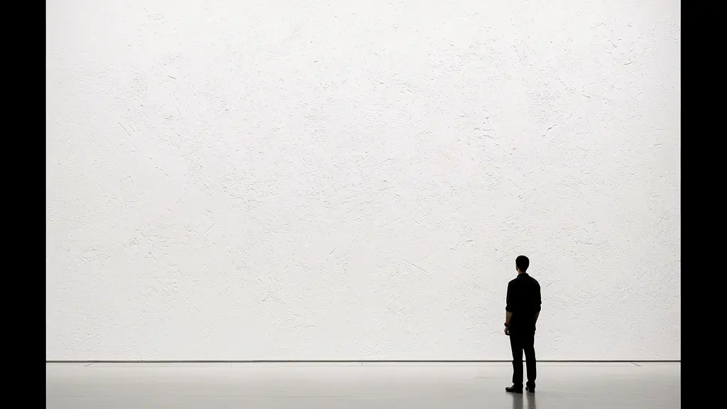
Look at the image above. The figure is not just a person against a wall; they are a statement about solitude, contemplation, or perhaps being dwarfed by an institution. The meaning is generated by the immense space that surrounds them. This is not passive emptiness; it is an active compositional element that directs the narrative. Mastering this means you are no longer just documenting a scene; you are sculpting an emotional landscape for the viewer to inhabit. It is a declaration of control, showing you have the confidence to say more with less.
Black and White or Color: Which Best Serves Your Emotional Intent?
The choice between black and white and color is not an aesthetic preference; it is a strategic decision about emotional impact. It is one of the most critical choices a director makes, as it fundamentally alters the viewer’s psychological response. Color is visceral and immediate, tying an image to the real world and evoking direct emotional associations—red for passion or danger, blue for serenity or melancholy. Black and white, conversely, is an abstraction. It strips away the familiarity of reality, forcing the viewer to focus on form, texture, light, and shadow. It is inherently interpretive and often feels more timeless and serious.
The question is not “which looks better?” The question is “which serves my emotional intent?” If your visual thesis is about raw, документальный realism or the vibrant energy of a moment, color may be your tool. If your argument is about timeless human conditions, abstract forms, or a somber, introspective mood, black and white will likely be more potent. A collector’s decision is driven by this resonance. In fact, according to Artsy’s comprehensive collector survey, a staggering 78% of collectors cite aesthetics as the most important factor in a purchase—far above investment potential. “Aesthetics,” in this context, is simply the successful execution of emotional intent.
To make this decision with directorial precision, you must abandon personal taste and adopt a clinical framework. The choice must be defensible as the optimal vehicle for your core message. Anything less is a failure of vision.
Your Action Plan: The Color Philosophy Mandate
- Define Core Emotion: Write a single sentence declaring the primary emotion your series must evoke (e.g., “This series will evoke a sense of quiet, urban melancholy.”).
- Analyze Psychological Triggers: Assess whether color (e.g., the cold blues of twilight) or the absence of color (the stark drama of monochrome) better serves this declared emotion. Red can trigger passion, but also nostalgia; blue can create serenity, but also a feeling of corporate trust.
- Commit to Consistency: Once the decision is made, it is absolute for the entire series. Mixing color and black and white within a single, cohesive body of work is a sign of indecision that will instantly shatter your visual argument.
- Articulate the Rationale: Be prepared to explain *why* you made the choice. Your artist statement should include a sentence on your color philosophy, linking it directly to your conceptual goals.
- Test for Resonance: Before a public release, share two or three key images with a trusted inner circle of peers or mentors. Ask them what they *feel*, not what they think. If their emotional response aligns with your intent, your choice is validated.
The Styling Error That Dilutes Your Visual Statement Instantly
There is one mistake that immediately exposes an amateur, no matter how skilled: a lack of ruthless curation. Many photographers, proud of their versatility, include work that demonstrates different styles or their experimentation with new mediums. This is poison to a strong visual statement. It communicates not versatility, but a lack of focus and mastery. As industry experts at Artwork Archive warn, showcasing work you are “dabbling in—but haven’t mastered quite yet—doesn’t set a good tone.” It undermines your credibility and dilutes the power of your core message.
A portfolio is a chain, and it is only as strong as its weakest link. A single image that deviates from the central visual thesis—in style, quality, or subject—can shatter the entire narrative. The collector or gallerist will not see it as an interesting outlier; they will see it as a lack of directorial control. The inclusion of a weaker or stylistically inconsistent piece suggests you either cannot recognize your best work or, worse, that you don’t have a clear vision to begin with. This principle is so critical that industry experts consistently warn that “you will be judged on the weakest piece” in your portfolio.
The solution is brutal but necessary: if it doesn’t serve the argument, it must be cut. This applies even to a technically brilliant photograph. If you have a stunning portrait in a series of minimalist landscapes, it does not belong. It is a different argument, for a different portfolio. Building a powerful statement requires the discipline to sacrifice good images for the sake of a great, cohesive whole. Your goal is not to show everything you can do. Your goal is to prove you are the undisputed master of one specific, compelling vision.
When to Release Provocative Art: Navigating Public Reception Safely
Provocative work can define a career, but if mishandled, it can also end one. Releasing art that challenges social, political, or aesthetic norms is not a matter of simply uploading it and hoping for the best. It is a calculated strategic maneuver that requires groundwork, timing, and a deep understanding of your audience. The primary mistake artists make is believing the work should “speak for itself.” Provocative work rarely can; it exists in a cultural context and requires you to direct that context, not be a victim of it.
The key is to build a foundation of trust before you introduce a challenge. You must have an established base of collectors, critics, and gallerists who already understand and respect your vision. They become your first line of defense and your primary interpreters when the work is released to a wider, potentially hostile, public. Introducing challenging work to a cold audience is reckless. As Artsy’s editors advise on the collector-gallerist relationship, it’s essential to build a rapport where you can test the waters: “It’s well advised to just ask the dealer about any questions you may have.” This same principle applies to your relationship with your audience.
Timing is also critical. Launching a politically charged series during a moment of extreme cultural sensitivity, for example, is not brave; it’s foolish. It ensures your work’s nuance will be lost in the noise. A true director does not simply create the work; they prepare the stage for its reception. This involves:
- Preparing extensive documentation: Your artist statement must be impeccable, articulating the intent and context of the work with precision.
- Priming your inner circle: Have critics and collectors ready to champion and explain the work upon release.
- Choosing your platform wisely: A controlled gallery setting is safer than an unpredictable social media platform.
As Artsy Editorial wisely notes when discussing collector mistakes, the same logic applies to artists:
Underlying all of these mistakes is the temptation to make a hasty decision. Education and patience are fundamentals in making informed choices… as they learn to trust their guts.
– Artsy Editorial, 5 Common Mistakes New Art Collectors Make
Subject Matter or Visual Style: Which Binds a Series Better?
An emerging artist’s most common crutch is relying on a consistent subject matter to unify a series. A portfolio of “trees,” “abandoned buildings,” or “portraits of strangers” feels cohesive on the surface, but it’s a shallow form of unity. It’s an organizational category, not an artistic statement. A true body of work is bound by a consistent visual style and conceptual inquiry, a language that can be applied to any subject to make it your own. This is the difference between being a photographer of things and an artist with a vision.
Consider the work of Bernd and Hilla Becher, who photographed industrial structures. Their subject was water towers, but their thesis was about typology, form, and the objective gaze. The power came from their unwavering stylistic consistency—the flat lighting, the centralized composition, the grayscale palette. This visual methodology was the true subject. A study from the Women in Arts Network found that “collectors respond more strongly to conceptual unity than surface-level consistency.” Your visual style—your unique way of seeing and rendering the world—is that conceptual unifier. It is your signature, and it should be so strong that you could photograph a flower and a skyscraper, and both would be unmistakably yours.

This is what is meant by communicative cohesion. It’s a unity of approach, not of object. Your series is bound by the questions you ask and the visual language you use to ask them. Subtle cues like a recurring color palette, a specific compositional rule you impose on yourself, or a unique printing technique become the threads that tie the work together. This is far more sophisticated and defensible than simply pointing your camera at the same type of thing over and over. It proves you have a translatable, ownable perspective on the world.
Why Do Viewers Ignore 80% of Images with Cluttered Compositions?
A cluttered composition is an act of creative abdication. It is the visual equivalent of mumbling. When every element in the frame screams for attention, the viewer, overwhelmed and given no clear focal point, simply disengages. The human eye craves order and guidance. It seeks a path to follow, a hierarchy of importance. A cluttered image provides neither. It is a sign of a photographer who is a passive observer of a scene, not an active director of the viewer’s experience. You have failed to make a choice about what matters, and so, for the viewer, nothing matters.
This is where the disciplined use of negative space becomes a non-negotiable tool for command. As photographer Nicholas Goodden states, “Too little negative space results in cluttered and busy photographs with every element in the photo screaming for the viewer’s attention… The latter acts as breathing room for your eyes.” This “breathing room” is not optional; it’s essential for cognitive processing. Without it, the viewer experiences visual fatigue and moves on, likely within seconds. The 80% of images that are ignored are not necessarily bad images; they are poorly directed images.
The solution is an exercise in subtraction. Your job as a director is to eliminate every element that does not serve the visual thesis. This often means finding a simpler composition, moving closer, or using a wider aperture to blur a distracting background. To achieve a powerful effect, photography composition experts at Adobe recommend that the negative space should take up at least 50% of the photograph. This is not a loose guideline; it is a call for bold, decisive composition. You must have the courage to let your subject command the frame, supported by space, rather than drowned by noise.
Key Takeaways
- A portfolio’s power comes from a unified ‘visual thesis,’ not a collection of your best but unrelated images.
- Strategic use of negative space and a deliberate color philosophy are non-negotiable directorial choices that dictate emotional impact.
- Your statement is only as strong as your weakest, most inconsistent piece. Ruthless curation is mandatory.
How to Develop an Artistic Vision That Stands Out in a Saturated Market?
In a market flooded with technically proficient images, your artistic vision is the only true differentiator. It is your intellectual and emotional fingerprint, the unique perspective that cannot be replicated. Developing this vision is not a mystical process; it is an intellectual one. It begins by defining what you, as an artist, want to argue. What truth about the world do you want to reveal? What feeling do you want to make tangible? Your vision is the answer to these questions, and your body of work is the evidence.
The market for art remains robust. Indeed, Artsy’s 2024 collector insights reveal that 79% of collectors purchased the same amount of art or more in 2023 compared to the previous year. The money and interest are there, but they are flowing toward artists who offer more than just a pretty picture. Collectors are seeking a connection. As one analysis on collector psychology eloquently puts it, people buy art to feel understood, seeking a piece that “mirrors something inside them.” Your vision is that mirror. It resonates when it is specific, deeply considered, and communicated with unwavering consistency across a body of work of at least 15-20 pieces.
To build this vision, you must define your unique intersection. Combine two or three domains—for example, your interest in computational science, 17th-century Dutch painting, and your experience with long-distance running. The fusion of these seemingly unrelated fields is where a unique and defensible artistic niche is born. From there, you must develop a visual language—a consistent set of compositional rules, a color palette, and a methodological approach—that becomes your trademark. This is your intellectual property. It’s the “how” that makes your “what” compelling and unique.
Stop waiting for inspiration to strike. Your vision is not found; it is built. It is the result of rigorous self-interrogation, strategic decision-making, and the disciplined execution of a singular, powerful idea. Begin today by defining your visual thesis and start building the body of work that will prove it. This is how you transform your craft into an art that resonates, endures, and sells.