The key to abstract architectural photography is not to follow compositional rules, but to deconstruct them, using geometry as a vocabulary for creating visual tension and meaning.
- Abandon the need for leading lines to point to a subject; instead, treat the line itself as the primary element.
- Break perfect symmetry with deliberate imperfections to create a “broken rhythm” that directs the viewer’s eye.
- Utilize lens compression and advanced cropping not as corrective tools, but as methods of deconstructing a scene into abstract patterns.
Recommendation: Start by identifying one compositional “rule” in a scene and finding a way to intentionally subvert it to see the structure as a collection of shapes, not a building.
For many urban photographers, the creative journey hits a plateau. You’ve mastered the basics: the rule of thirds is second nature, you hunt for leading lines, and you frame every shot with postcard-perfect precision. Yet, your images feel predictable, like polished documentation rather than art. They capture the building, but not a feeling. You see other photographers creating stark, compelling, abstract pieces from the same cityscapes, and the method feels elusive, locked behind a door you haven’t found the key to.
The common advice—find better light, use a different lens, look for symmetry—only reinforces this documentary approach. It perfects the postcard but doesn’t transcend it. But what if the true path to elevating your work isn’t about better adherence to these rules, but about their intentional deconstruction? What if the secret lies in seeing architecture not as a subject to be framed, but as a raw vocabulary of lines, shapes, and volumes to be rearranged into something new? This is the essence of geometric abstraction.
This guide provides a structured framework for that shift in perspective. We will move beyond the foundational rules to explore how to manipulate and subvert them. We will analyze the psychological impact of different shapes, the artistic potential of “failed” compositions, and the techniques used to transform a three-dimensional structure into a two-dimensional statement of abstract art.
To see how these advanced composition techniques can transform your photography in practice, the following video offers a visual summary of core principles that complement the detailed analysis in this guide.
This article is structured to build your understanding of geometric abstraction systematically. Each section tackles a specific compositional element, breaking down conventional wisdom to reveal a more potent, artistic application. Follow this path to start seeing the city not as a collection of buildings, but as a canvas of infinite geometric possibility.
Summary: A Photographer’s Guide to Geometric Abstraction
- Why Do Leading Lines Fail If They Point to Nowhere?
- How to Use Tilt-Shift Lenses to Maintain Perfect Vertical Geometry?
- Triangles or Squares: Which Shape Creates More Tension in a Frame?
- The Symmetry Trap That Makes Your Photos Look Like Stock Images
- How to Crop Your Geometric Images for Maximum Impact on Instagram?
- How to Align Your Landscape Curves with the Golden Spiral?
- How to Use the Thirds Grid to Check Horizon Lines Quickly?
- Why Does Compression Make a City Look More Crowded Than It Is?
Why Do Leading Lines Fail If They Point to Nowhere?
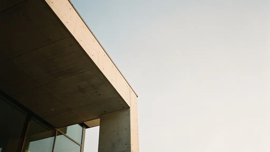
Conventional photographic wisdom dictates that a leading line must guide the viewer’s eye to a point of interest. A line that leads to empty space—or out of the frame entirely—is considered a compositional failure. For the abstract artist, however, this “failure” is the objective. When a line points to nothing, the line itself becomes the subject. The focus shifts from “what the line shows” to “what the line is”: its texture, its quality of light, its relationship to the negative space around it.
This technique, creating an “intentional void,” transforms a simple architectural element into a minimalist statement. The emptiness at the end of the line is not a flaw; it’s a deliberate choice that invites contemplation and emphasizes form over narrative. Similarly, the work of architect Moshe Safdie at Habitat 67 shows how heavy concrete volumes create irregular frames around green space. The straight lines and clear angles of the structure highlight the contrast between the built environment and the “void” of the natural world, making that empty space a critical part of the composition.
Instead of searching for lines that resolve, search for lines that create questions. A staircase that ascends into a sliver of overexposed sky or a beam that cuts directly out of the frame subverts viewer expectations, creating a subtle tension that is fundamental to abstract art. The goal is to make the viewer conscious of the act of looking, forcing them to engage with the frame’s geometric structure rather than a passive subject within it.
Action Plan: Turn “Failed” Lines into Abstract Subjects
- Identify Intentional Voids: Find lines that lead to empty negative space and reframe to emphasize that void for minimalist impact.
- Focus on the Line Itself: Capture its texture, the patterns of light and shadow falling across it, and its form, rather than its destination.
- Create Broken Rhythms: Deliberately interrupt a leading line mid-frame to generate visual tension and an unresolved feeling.
- Use Virtual Lines: Create guiding paths with non-physical, aligned objects (like a series of windows or pillars) instead of continuous physical lines.
- Lead Out of Frame: Position yourself so a strong line leads the eye directly out of the composition, subverting the viewer’s expectation of a focal point.
How to Use Tilt-Shift Lenses to Maintain Perfect Vertical Geometry?
A tilt-shift lens is the quintessential tool for the architectural photographer, primarily used for its ‘shift’ function to correct perspective distortion and ensure vertical lines remain perfectly parallel. This produces a clean, accurate representation of a structure. While essential for commercial work, this corrective use only scratches the surface of the lens’s creative potential. The ’tilt’ function, which alters the plane of focus, is a powerful instrument for selective abstraction and focal plane manipulation.
By tilting the lens, you can create a thin, unconventional slice of focus that runs diagonally, vertically, or horizontally across a scene. This allows you to isolate a single geometric detail—a window frame, a mullion, a textural panel—in razor-sharp focus while dissolving the surrounding architecture into a painterly blur. The building is no longer a recognizable structure but a canvas of color and form. This technique moves beyond documentation entirely, creating an image that is purely about shape, light, and the tension between sharp detail and soft abstraction.
This advanced application of technology is what separates artistic photography from mere documentation, a crucial differentiator as the professional photographic services market is projected to grow from $40.27 billion to nearly $67 billion by 2035. Mastering such techniques defines a unique artistic voice.
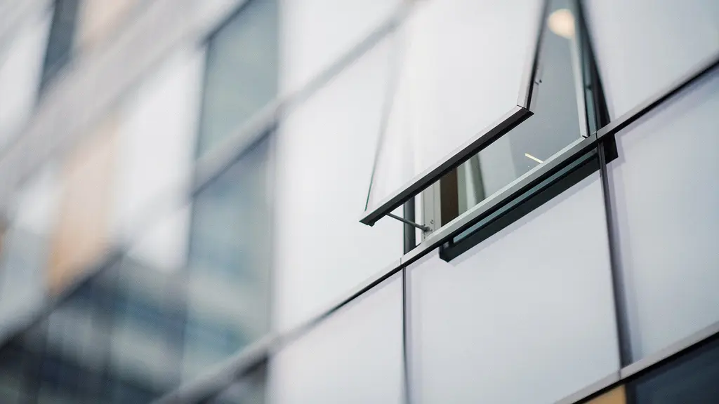
As seen in the image, the tilt function can render a building’s facade as a series of abstract color blocks, with only a single, chosen element retaining its identity. The effect is dreamlike and impossible to achieve with standard optics. It requires a precise, linear approach, where the photographer acts as a sculptor of focus, carving out a specific detail from the chaos of reality. The goal is no longer to show the building as it is, but to present a new, abstracted vision of its geometric essence.
Triangles or Squares: Which Shape Creates More Tension in a Frame?
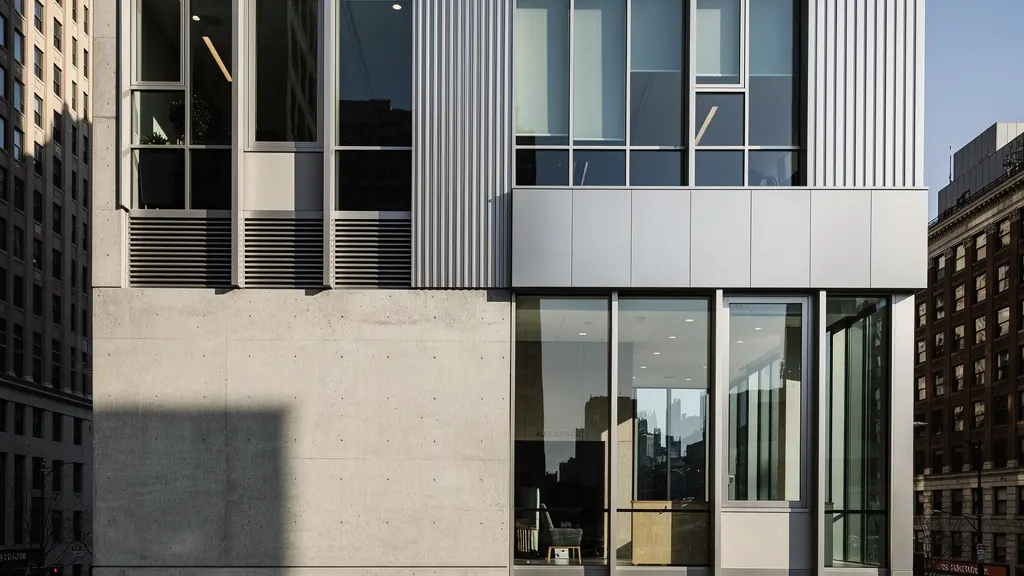
The foundation of geometric deconstruction is understanding that different shapes evoke distinct psychological responses. Architectural photography is an exercise in managing these responses. While buildings are constructed from a multitude of shapes, the dominant forms within your frame—primarily triangles and squares (or rectangles)—determine its emotional tone and level of visual tension. A square is inherently stable, its parallel and perpendicular lines conveying solidity, order, and permanence. A composition dominated by squares and rectangles feels calm, balanced, and grounded.
A triangle, by contrast, is a figure of pure energy. Its diagonal lines are dynamic and directional, pulling the eye and creating a sense of movement, instability, or even conflict. A single diagonal line introduced into a grid of squares can disrupt the entire composition, injecting tension and guiding the viewer’s focus with immense force. When composing, your task is to identify these dominant shapes and decide what feeling you want to evoke. Do you want the stability of a classical facade, or the dynamic energy of a modern, angular structure?
The most compelling abstract images often arise from the conflict between these forms. Capturing a scene with both strong rectangular grids and powerful triangular elements creates maximum visual tension—a battle between order and chaos, stability and movement. As noted in analyses of framing techniques, geometric framing is a powerful tool for directing attention, and understanding the inherent properties of shapes is key to using that tool effectively.
| Shape | Visual Impact | Psychological Effect | Best Use Case |
|---|---|---|---|
| Triangle | Dynamic, directional | Creates instability and movement | Modern angular architecture |
| Square | Static, stable | Conveys solidity and permanence | Classical symmetrical buildings |
| Combined | Maximum tension | Conflict between order and chaos | Mixed architectural styles |
The Symmetry Trap That Makes Your Photos Look Like Stock Images
Perfect, centered symmetry is one of the most tempting compositions in urban photography. It’s clean, easy to achieve, and immediately satisfying to the eye. It is also, however, a creative dead end. A perfectly symmetrical image is a closed loop; the eye sees the balance, confirms it, and moves on. There is no mystery, no lingering question. This is why flawlessly symmetrical shots often have the sterile, generic feel of a stock image. True artistic impact comes not from perfect symmetry, but from broken rhythm—a composition that establishes a pattern and then deliberately violates it.
This technique involves finding a symmetrical scene and including one deliberate imperfection. This could be a single open window on a uniform facade, a person walking off-center in a grand hall, or a unique shadow falling across a repeating pattern. This single asymmetrical element instantly becomes the focal point, breaking the monotony and forcing the viewer to engage. It creates a narrative and a sense of life within the rigid geometry. As architectural photographer Julia Anna Gospodarou advises, you must go beyond simple framing.
Forget shooting in vertical or horizontal. Rotate and tilt your camera and play with volumes.
– Julia Anna Gospodarou, Creating Award-Winning Architectural Photography
This means thinking beyond the mirror image. Focus on rhythm—the repetition of similar, but not identical, elements. A slight rotation of the camera (2-5 degrees) can also introduce subtle dynamic tension into an otherwise static scene. Furthermore, to make this vision a reality, one must be cognisant of the edges of the frame, deciding whether they should lead the eye in or out and using post-processing tools like dodging and burning to reinforce that decision.
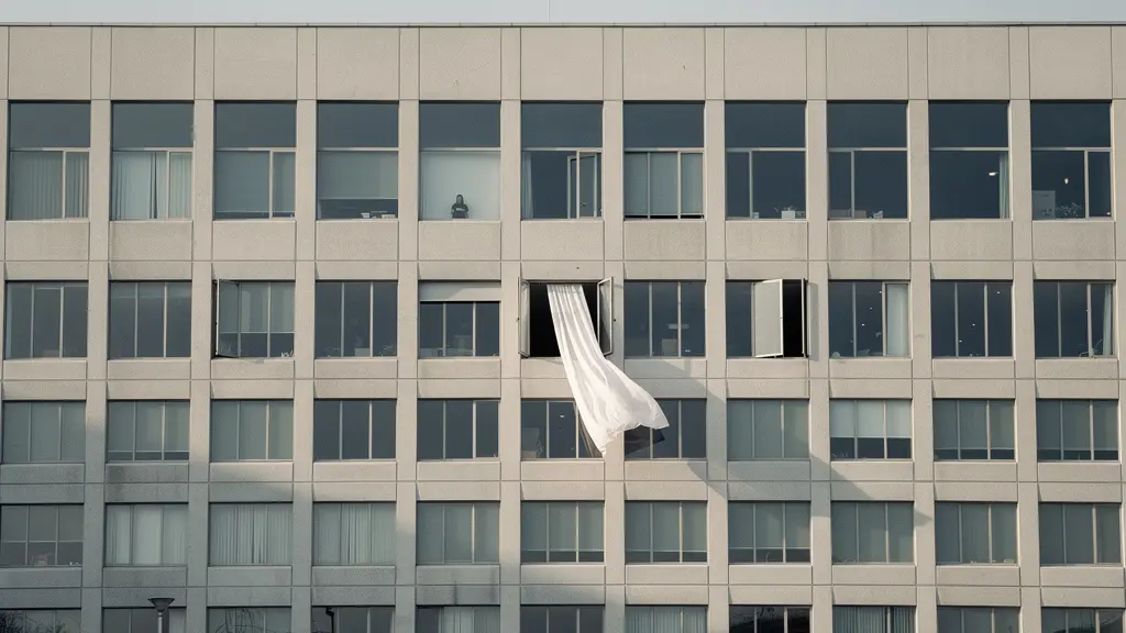
The goal is to use symmetry as a canvas, not as the final product. By establishing an expectation of order and then providing a single point of chaos, you create a far more memorable and compelling image than perfect balance could ever achieve.
How to Crop Your Geometric Images for Maximum Impact on Instagram?
On visually-driven platforms like Instagram, cropping is not merely a final adjustment; it is a critical compositional act. Too often, photographers crop simply to fit the platform’s aspect ratios (1:1, 4:5), sacrificing the geometric integrity of their image. The abstract photographer, however, uses the crop as a tool for geometric deconstruction and narrative control. The crop is your final chance to refine your statement, removing extraneous details to focus entirely on the interplay of line, shape, and form.
For abstract architectural work, a tight, aggressive crop is often more powerful. By isolating a small section of a building, you remove its context and identity, transforming it into a pure pattern field. A grid of windows ceases to be a facade and becomes an abstract collection of squares. A curved wall becomes a study in light and shadow. The objective is to crop until the subject is no longer a building, but a feeling or an idea expressed through geometry.
Furthermore, the structure of the Instagram profile grid itself offers a unique canvas for creative cropping. Instead of posting single images, consider how multiple posts can work together to form a larger visual statement. This approach allows for panoramic or triptych presentations that would be impossible in a single frame.
Case Study: Mango Street’s Profile Grid Triptych Strategy
The photography duo Mango Street, with a massive following, has expertly utilized Instagram’s grid format for creative ends. They demonstrate the power of strategic cropping by frequently splitting wide, panoramic architectural images into three separate vertical posts. When viewed individually, each post stands as a compelling abstract composition. But when viewed on their profile, the three images combine to form a breathtaking, cohesive visual narrative, proving that the crop can be used to build stories across the digital canvas, as seen in their creative use of the profile grid.
How to Align Your Landscape Curves with the Golden Spiral?
The Golden Spiral is a compositional guide rooted in mathematics, often associated with the natural curves found in landscapes, shells, and flowers. While its application in urban photography seems less obvious, the modern cityscape is rich with logarithmic curves and spiral forms, from grand spiral staircases to the sweeping facades of contemporary museums. For the abstract photographer, the Golden Spiral is not a rigid template to be overlaid, but a mindset for finding and emphasizing organic flow within a rigid environment.
The first step is to actively search for these elements. Look for the way a curved ramp interacts with a rectangular building, or how a spiraling sculpture creates a juxtaposition against a grid-like background. The goal is to capture the tension between the fluid, natural-feeling curve and the stark, man-made geometry surrounding it. As a professional, developing this unique vision is paramount, especially when you consider that in the US, photographers increasingly work as self-employed artists, with 65% being freelancers. A signature style is a business asset.
Once you identify a curve, your composition and lighting should serve to enhance it. Use light and shadow to trace the path of the spiral, concealing distracting elements and highlighting the flow of the line. In post-processing, subtle use of warp or distortion tools can help subtly conform architectural lines to better align with the spiral’s elegant proportions, though this should be done with restraint. As fine art photographers advise, every adjustment must have meaning; every enhanced line or darkened area must relate directly to your vision, not just be used for effect. The most powerful images are those where this natural, mathematical harmony feels discovered rather than forced.
How to Use the Thirds Grid to Check Horizon Lines Quickly?
The Rule of Thirds is the first compositional guideline every photographer learns: place key elements along the gridlines or at their intersections for a more balanced and engaging photo. Its most basic application is placing the horizon on the upper or lower third. For the abstract artist, however, the grid is not just for placing a single subject. It is a tool for creating a matrix of distributed interest, ensuring that the entire frame is an active part of the composition.
Instead of placing one subject on an intersection, think of the nine rectangles of the grid as individual canvases. Your goal is to create visual interest within multiple of these zones. This approach forces you to consider the entire frame, from the corners to the center. You might place a strong foreground element in the bottom left, a mid-ground texture in the center, and a compelling shadow pattern in the top right. The result is a composition that is “weighted” abstractly, with a complex balance that invites the eye to wander and explore rather than settle on a single point.
This method is about seeing the frame as a geometric arrangement. Leading lines can be used as shapes that guide the eye between these different zones of interest. The thirds grid becomes less of a rule for subject placement and more of a quick check to ensure your composition has a sophisticated, multi-layered structure.
When you look at an architectural scene through this lens, the grid helps you deconstruct it. You are no longer just photographing a building; you are orchestrating an arrangement of forms, textures, and negative spaces across a nine-part canvas. The horizon line check is just the beginning; the real work is in balancing the visual weight across the entire geometric field.
Key Takeaways
- Deconstruct, Don’t Document: Shift your mindset from capturing a building to using its geometry as a creative vocabulary.
- Embrace Imperfection: True visual interest often lies in “broken rhythms” and subverted expectations, not in perfect symmetry or flawless leading lines.
- Control Every Element: Use advanced tools like tilt-shift lenses, telephoto compression, and strategic cropping to actively shape the abstract narrative of your image.
Why Does Compression Make a City Look More Crowded Than It Is?
A telephoto lens has the unique optical property of compressing perspective, making distant objects appear closer to foreground objects than they actually are. In landscape photography, this can flatten mountains into a majestic stack. In urban photography, it creates controlled chaos. When you shoot a distant city skyline with a lens of 200mm or more, three-dimensional space collapses. Buildings separated by entire city blocks appear to be stacked directly on top of one another, their individual forms merging into a dense, overwhelming pattern field.
This is not a distortion of reality; it is a revelation of its underlying geometric density. The individual identity of each building is lost, and the city becomes a single, textured collage. This technique is the ultimate form of abstraction, where the subject is no longer “buildings” but the sheer rhythm, repetition, and overwhelming scale of the urban environment. To truly elevate this effect, shoot during the “blue hour.” The soft, cool ambient light creates an ethereal mood, while the artificial lights from within the buildings add points of warmth and depth. Using a tripod for long exposures of 15 seconds or more will render these lights as brilliant jewels within the compressed architectural tapestry.
See reality in geometric forms as the stage and the main actor as light
– Sharon Tenenbaum, Abstract Architectural Photography Workshop
By combining telephoto compression with fog, haze, or atmospheric conditions, you can further separate the buildings into distinct tonal planes, adding depth to the flattened chaos. You are no longer a photographer documenting a city; you are an artist creating a two-dimensional abstract painting out of three-dimensional reality, using light as your brush and geometry as your stage.
By moving beyond the rote application of compositional rules and embracing the deconstruction of geometry, you unlock a new level of artistic expression. The next logical step is to take this mindset out into the field and begin to consciously practice seeing the city as a vocabulary of abstract forms waiting to be arranged.