The soul of an image is not found in what is lit, but in what is deliberately concealed; mastering deep shadow is an act of artistic subtraction, not addition.
- True control begins with a calibrated workflow, ensuring the abyss you see on screen is the abyss you can print.
- Shadows must be actively sculpted with tools like black flags (negative fill) and controlled underexposure, not passively found.
Recommendation: Stop lighting your subject and start lighting your story. Embrace shadow as your primary medium to carve out emotion and transform polished images into profound art.
Your work is technically flawless. The lighting is perfect, the focus tack-sharp, the composition balanced. Yet, it feels hollow, sterile. It speaks, but it doesn’t resonate. It has the polished sheen of commercial perfection but lacks the gravitational pull of art, the kind of image that holds a viewer’s gaze and whispers a story. You’ve followed the rules of light, but you’ve ignored the power of its absence. The common advice—to find interesting shadows or use them for contrast—treats shadow as a byproduct, a passive accident.
This approach is the very reason your work feels superficial. The quest for more drama isn’t about adding more complex lighting schemes or finding more dramatic locations. It is about a fundamental shift in philosophy. It’s about learning to see, control, and wield shadow not as an absence, but as a tangible, potent element. It is the art of subtraction, of carving form from the void, of using darkness to give light its meaning and your subjects their soul. This is the path of chiaroscuro, a journey from illustrator to narrator.
This guide abandons the platitudes. We will not “find” shadows; we will command them. We will explore the technical discipline required to see and reproduce true black, the artistic choices that give it emotional purpose, and the final, critical steps to ensure the profound darkness you create in your mind is the same one that hangs on a gallery wall. Prepare to unlearn what you know about light.
Contents: Mastering the Art of Intentional Shadow
- Why Can’t You See Detail in the Shadows on Your Uncalibrated Monitor?
- How to Use Black Flags to Deepen Shadows on the Face?
- Rich Black or Dark Grey: Which Emotion Does Your Story Need?
- The Underexposure Mistake That Fills Your Shadows with Grain
- Which Fine Art Papers Have the Highest Dmax for Deep Blacks?
- Black and White or Color: Which Best Serves Your Emotional Intent?
- High Key or Low Key: Which Ratio Setup Sells Luxury Products?
- How to Ensure Your Print Matches Your Monitor Every Single Time?
Why Can’t You See Detail in the Shadows on Your Uncalibrated Monitor?
Your journey into the heart of shadow begins not with a camera, but with a screen. You cannot command what you cannot see. An uncalibrated monitor is a liar, a flattering mirror that renders deep, complex shadows as a single, crushed, and uninformative black mass. You might believe you’re crafting a subtle transition into darkness, but in reality, you are simply throwing away data. The detail you meticulously preserved in-camera is lost in a digital void, invisible to you and, consequently, absent from your final print.
The core of the problem lies in the monitor’s inability to distinguish between adjacent dark tonal values. A professional, calibrated display can reveal the subtle difference between a pure black (RGB level 0) and a near-black (RGB level 1). However, many uncalibrated consumer monitors show nothing but pure black until level 11 or 12. This means a vast range of your darkest details—the texture in a black suit, a wisp of hair against a dark background, the glint in a shadowed eye—is completely invisible to you during the editing process.
Without hardware calibration using a colorimeter or spectrophotometer, you are working blind. You are making critical artistic decisions based on false information. You might “crush the blacks” in your editing software to achieve a perception of depth, but what you are really doing is destroying subtle gradations. The first and most crucial step to mastering shadow is to forge a bond of trust with your display. Calibration is not a technical chore; it is the non-negotiable foundation upon which all meaningful work with shadow is built. It is the act of ensuring that the abyss you gaze into on your screen is the true, detailed abyss you have captured.
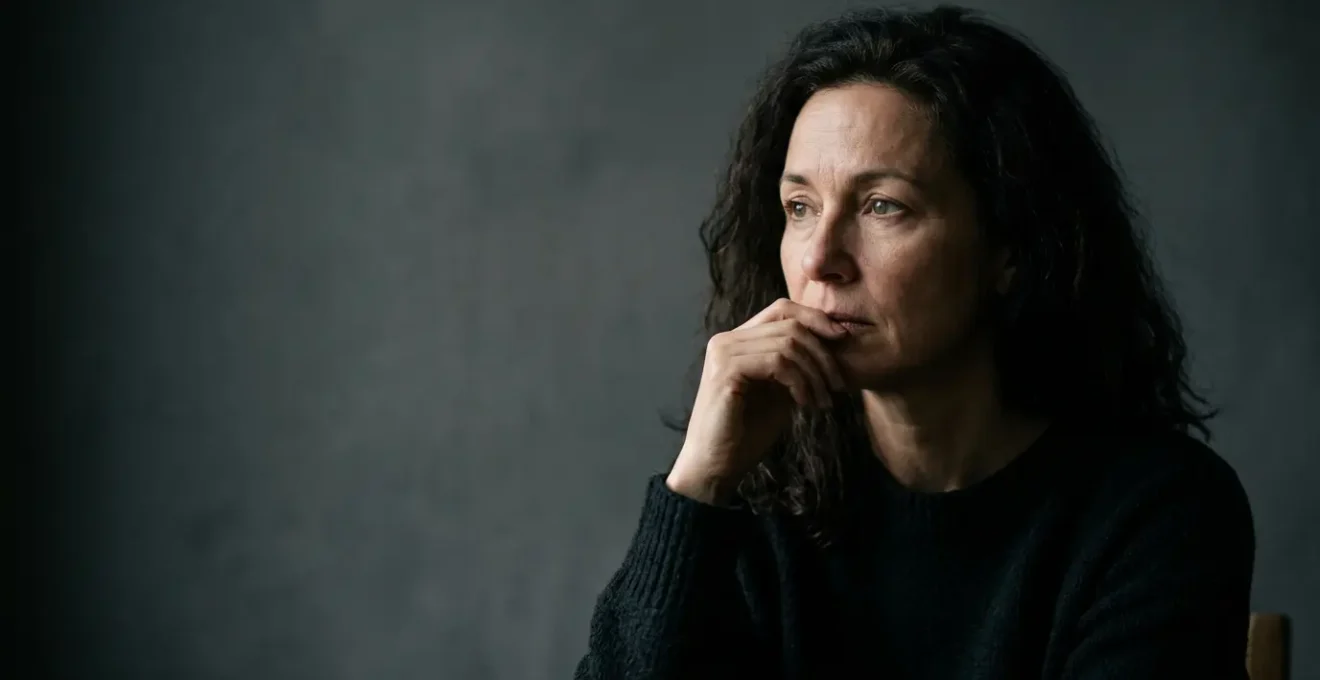
How to Use Black Flags to Deepen Shadows on the Face?
Once you can trust your eyes, you must learn to sculpt. The most potent tool in a shadow-master’s arsenal is not a light, but its opposite: the black flag. This simple piece of non-reflective black fabric is the key to moving from passively accepting ambient light to actively commanding the darkness. Using a black flag is an act of light subtraction, often called “negative fill.” Where a white reflector would bounce stray light back into the shadows, softening them and reducing drama, a black flag absorbs it. It drinks the ambient light, starving the shadows and deepening them with surgical precision.
Imagine a portrait lit by a single key light from the left. The right side of the face is in shadow, but it’s not a deep, dramatic shadow. It’s contaminated by the room’s ambient light bouncing off walls and surfaces. By placing a large black flag just out of frame on the right, you create a “light vacuum.” It intercepts that reflected light, preventing it from filling in the shadows. The result is immediate: the falloff from light to dark becomes steeper, the contrast more profound, and the shape of the face is carved out with sculptural authority. You are no longer just lighting a face; you are defining its very form with shadow.
The size and proximity of the flag control the quality of the shadow’s edge, or its penumbra. A large flag placed close to the subject will create a softer, more gradual transition into a deep, rich black. A smaller flag, or one placed farther away, will result in a harder, more defined shadow edge. This is not a blunt instrument; it is a fine-tipped brush. As the legendary editor John Loengard advised, “If you want something to look interesting, don’t light all of it.” The black flag is the physical embodiment of that philosophy—it is the tool you use to decide, with absolute intent, which parts of your story will remain unspoken.
Rich Black or Dark Grey: Which Emotion Does Your Story Need?
The ability to create a true, deep black is a technical skill. Knowing when to use it—and when to pull back—is an art. The choice between an absolute, inky black and a detailed, luminous dark grey is one of the most significant emotional decisions a photographer can make. It is the difference between a statement and a question, between finality and mystery. A true rich black, a Dmax void, feels absolute. It suggests concepts like infinity, death, the unknown, or profound isolation. It hides information completely, forcing the viewer’s mind to stop at its edge. This can be incredibly powerful, creating a graphic, bold composition where form and silhouette are paramount.
Conversely, a shadow rendered as a dark grey, rich with barely-perceptible detail, invites the viewer in. It creates a sense of unease, curiosity, and narrative tension. By allowing a whisper of information to exist within the darkness, you are telling the viewer, “There is something more here, if only you look closer.” This technique doesn’t provide answers; it poses questions and engages the viewer’s imagination, making them a participant in the story. It turns a passive viewing experience into an active investigation.
Case Study: The Narrative Power of Concealment
In his street photography, Eric Kim often uses heavy shadows inspired by film noir to create a sense of mystery and danger. By deliberately underexposing, he allows shadows to obliterate parts of his subjects, such as their face or body. This act of hiding information forces the viewer to mentally complete the picture, investing them emotionally in the scene. The shadow becomes a character in itself, its primary role being to conceal rather than reveal, transforming a simple documentary photo into an open-ended psychological narrative.
So, ask yourself what your image needs. Does it need the stark, graphic finality of a void? Or does it need the lingering, psychological tension of a secret held just out of sight? The answer dictates your approach. Crushing the blacks to pure Dmax is a valid choice for power and graphic impact. Lifting them ever so slightly to reveal a hint of texture or form is a choice for narrative depth and emotional engagement. Your control over this single variable is your control over the story’s soul.
The Underexposure Mistake That Fills Your Shadows with Grain
In the pursuit of deep, moody shadows, there is a treacherous path many artists walk: aggressive underexposure. The logic seems sound—to make things dark, give them less light. While this is true, the mistake lies in how it’s executed in-camera and “fixed” in post-production. When you severely underexpose a digital file and then try to “lift” the shadows later in software to recover detail, you are not recovering information. You are amplifying a signal that was barely recorded, and with it, you are amplifying a tremendous amount of digital noise. Your beautiful, deep shadows become a swamp of distracting, colorful grain (chroma noise) and splotchy patterns (luminance noise).
A clean shadow is not an underexposed highlight; it is a properly exposed shadow. The professional technique is known as “Exposing to the Right” (ETTR), even when creating a low-key image. This means you provide the camera’s sensor with as much light as it can handle without clipping the highlights. You then bring the exposure down in post-production. This gives you the cleanest possible file with the maximum amount of data in the dark regions. The enemy of clean shadows is a starved sensor. Therefore, a low ISO is non-negotiable. For the cleanest possible dark areas, it’s crucial to keep your ISO as low as your camera natively supports, typically between 100 and 400. High ISO settings amplify the signal before it’s even recorded, baking noise directly into the raw data where it is most visible—in the shadows.
Shooting in RAW format is your greatest ally. A JPEG file discards vast amounts of tonal information and “bakes in” the camera’s interpretation of the scene. A RAW file, by contrast, is the pure, unaltered data from the sensor. It gives you the maximum latitude to manipulate tones, to decide precisely where the black point should fall, and to pull down the exposure to create your desired level of darkness, all while preserving the integrity and detail of the shadow areas. Don’t starve your sensor in-camera; instead, feed it a healthy exposure and then sculpt the darkness later, from a position of strength and data-richness.
Black and White or Color: Which Best Serves Your Emotional Intent?
Shadow is a conversation about form, texture, and light. Color is a conversation about mood, psychology, and information. When these two conversations happen simultaneously, they can either harmonize beautifully or shout over one another. The decision to render a shadow-rich image in color or monochrome is a profound choice about your primary emotional intent. Black and white is the natural language of chiaroscuro. By stripping away color, you eliminate a major variable and a potential distraction. The viewer is forced to contend with the image on its most fundamental terms: the interplay of luminosity, the quality of the light, the shape of the forms, and the texture of the surfaces. The story becomes purely about the dance between light and its absence.
Monochrome abstracts reality, elevating a scene from a literal depiction to a more universal, timeless statement. It emphasizes the emotional weight of the shadow itself. A dark corner in a color photo is just a dark corner; in black and white, it can become a portal to the subconscious, a physical manifestation of an emotion. This is why shadow photography and black and white are such natural partners—they speak the same elemental language.
However, this does not mean color has no place in a low-key world. When used with extreme intention, color can be even more powerful precisely because of its scarcity. A predominantly dark, near-monochromatic image that contains a single, isolated element of desaturated color—a technique often seen in cinema—draws the eye with magnetic force. The color becomes the emotional heart of the image. A splash of deep red in an otherwise grey-black scene isn’t just a red object; it’s passion, or danger, or life. Using color in a low-key image requires immense restraint. It must be a deliberate, narrative choice, not an accident. Ask yourself: is the color adding to the story the shadow is telling, or is it distracting from it? If it’s not essential, remove it.
High Key or Low Key: Which Ratio Setup Sells Luxury Products?
While the soul of chiaroscuro feels rooted in fine art, its principles are the secret weapon of high-end commercial and luxury product photography. The mass market operates on a high-key basis: bright, even, shadowless light that shows every detail of a product clearly. It’s democratic, accessible, and utterly devoid of mystique. Luxury, however, is not about democracy; it is about exclusivity, desire, and rarity. And the language of rarity is low-key lighting. A low-key setup, with a high lighting ratio (a large difference between the brightest and darkest parts of the scene), doesn’t just show a product; it presents it.
This approach is masterfully employed by brands like high-end watchmakers, jewelers, and automotive companies. Consider the photography for a luxury watch. It is rarely blasted with flat light. Instead, it emerges from a pool of darkness. A single, hard sliver of light might catch the beveled edge of the case, another might glint off the sapphire crystal, and a soft glow might reveal the texture of the leather strap. The rest is left to the imagination. This technique creates a sense of discovery. The viewer feels as though they are unearthing a treasure. The darkness provides the contrast that makes the product’s polished surfaces and fine details appear more brilliant, more precious. The shadow confers value.
The key is controlling the texture and material. For brushed metals, a soft, wrapping light creates a gentle gradient that whispers “quality.” For fine leather, a low-angle side light is used to patiently caress the surface, revealing its tactile grain. For gemstones, controlled slivers of hard light are used to create specular highlights that make the stone sparkle against a deep black background, triggering a primal sense of rarity. High-key lighting says, “Here is a product for everyone.” Low-key lighting says, “Here is an object of desire for the discerning few.” It’s not just a lighting choice; it’s a strategic positioning statement.
Which Fine Art Papers Have the Highest Dmax for Deep Blacks?
The shadow you so carefully sculpted on screen is still just a ghost, an ephemeral collection of pixels. To give it physical form and true weight, you must choose its vessel: the paper. The single most important characteristic of a paper for rendering deep shadows is its Dmax, or “maximum black density.” This is a measurement of how deep and rich a black the paper can reproduce when printed. A paper with a low Dmax will render your carefully crafted abyss as a milky, disappointing charcoal grey. A paper with a high Dmax will give you a profound, velvety black that you can almost fall into.
For decades, the undisputed kings of Dmax have been the baryta papers. These are fiber-based papers with a barium sulphate coating (the baryta layer) beneath the ink-receptive layer. This coating enhances brightness and, most importantly, prevents ink from soaking too deep into the paper fibers, allowing it to sit on the surface and achieve a higher density.
Baryta papers have higher Dmax and more saturated palette. The bottom line is that for the past 10 years we have had the choice of matte papers with their appealing tactile feel but subdued look, with reduced colour gamut and lower dMax, and plastic photo papers with their higher Dmax.
– Michael Reichmann, Luminous Landscape – Battle of the Barytas
While matte papers offer a beautiful, tactile surface, they simply cannot compete with the punch and depth of a baryta or a high-quality gloss/luster paper when it comes to the richest blacks. The smooth, often glossy surface of a baryta paper reflects less ambient light from its un-inked areas, making the inked areas appear blacker by comparison. When choosing a paper for your most dramatic low-key work, Dmax should be your primary consideration. A comparison of leading papers shows a clear trend.
| Paper Name | Base Material | Weight (gsm) | Dmax Characteristics | Best For Deep Shadows |
|---|---|---|---|---|
| Hahnemühle FineArt Baryta 325 | Alpha-cellulose | 325 | Ultra-smooth high-gloss baryta, standout Dmax, saturated color | Excellent – highest Dmax in test group |
| Canson Rag Photographique | 100% cotton | 310 | One of the highest achievable Dmax on market, ultra-smooth surface | Excellent – museum-grade blacks |
| Hahnemühle Photo Rag 308 | 100% cotton | 308 | OBA-free, natural white, velvety texture, good tonal gradation | Good – blacks lack baryta-level punch but superior tonal separation |
| Harman Gloss Baryta | Fiber base | 320 | Smooth glossy surface, rich blacks, excellent detail rendering | Excellent – deep blacks with fine highlight detail |
Choosing a paper like Hahnemühle FineArt Baryta or Canson Rag Photographique is the final act of commitment to your shadow. It ensures that the emotional weight you have worked so hard to create is not lost in translation, but is delivered with its full, intended force in the final print. The data for this analysis is available in a comprehensive guide to fine art papers.
Key Takeaways
- Mastery of shadow is an active process of “light subtraction,” not a passive search for darkness.
- Your entire workflow, from monitor calibration to paper choice (Dmax), must be optimized for the faithful reproduction of black.
- The choice between absolute black (for graphic power) and detailed dark grey (for narrative tension) is a core emotional decision.
How to Ensure Your Print Matches Your Monitor Every Single Time?
The final, and often most frustrating, hurdle is the chasm between the luminous, back-lit image on your monitor and the reflective, physical object of a print. What looked like a perfect, deep shadow on screen can emerge from the printer as murky, flat, or blocked-up. This is the moment where all your work can be undone. Achieving a perfect match every time is not a dark art; it is a strict, repeatable workflow based on calibration and simulation. This process, known as soft-proofing, is the ultimate act of control.
Soft-proofing allows you to use your calibrated monitor to simulate, with remarkable accuracy, how your image will look when printed on a specific paper with a specific printer. It does this by using an ICC profile—a data file that describes the color and tonal characteristics of your printer/paper combination. Your editing software uses this profile to remap the display, temporarily showing you the limitations of the printing process. It will simulate the paper’s white point (most are not pure white) and, crucially, its Dmax. You will see your deep blacks shift to the deepest black that specific paper can actually produce.
This preview is your moment of truth. It allows you to make final, targeted adjustments to your file *for printing*. You might need to slightly open up the very deep shadows to prevent them from “blocking up” into a single black mass on paper, or adjust contrast to compensate for the difference between emissive (monitor) and reflective (print) viewing. Without soft-proofing, you are simply guessing and wasting expensive paper and ink. With it, you are making informed, precise decisions to bridge the gap between two different worlds. It is the final link in an unbroken chain of control, ensuring the shadow you conceived is the shadow you deliver.
Your Action Plan: The Professional Soft-Proofing Workflow
- Calibrate monitor: Set your monitor to standard targets (Luminance, White Point D65, Gamma 2.2) using a hardware calibration device to create an objective and repeatable viewing environment.
- Profile the monitor: After calibration, generate a monitor ICC profile. This file acts as a translator, ensuring your graphics card sends the correct color information to your specific display.
- Soft-proof with paper simulation: In your editing software (like Adobe Lightroom or Photoshop), enable soft-proofing mode. Select the correct ICC profile for your exact printer and paper combination and enable “Simulate Paper White and Black Ink.”
- Make sacrificial test prints: Print small test strips of just the most critical shadow areas of your image. Evaluate these strips under the actual lighting conditions where the final print will be displayed to fine-tune your perception.
- Edit for destination lighting: Make final tonal adjustments while soft-proofing, considering the final viewing environment. A print for a warmly lit gallery needs different adjustments than one for a coolly lit office.
Now that you possess the philosophy and the workflow, the only remaining step is to begin. Take these principles, embrace the discomfort of unlearning, and start carving your own stories from the darkness. Your art is waiting for the weight only shadow can provide.