Mastering high-end retouching means shifting focus from chasing every pixel flaw to making deliberate, output-aware choices that serve the final artistic impression.
- Effective retouching employs a triage system for imperfections, prioritizing what the viewer will actually see in the final medium.
- Technical “flaws” like chromatic aberration can be intentional artistic tools, and perfect skin texture is about preserving dimensionality, not erasing it.
Recommendation: Start your next project by defining the final output medium and viewing distance *before* you begin retouching. This single step will redefine your entire workflow.
Every dedicated retoucher knows the trance. You’re zoomed in to 300%, hunting down every stray pixel, every microscopic blemish. The pursuit of technical perfection becomes an obsession, and hours later, you zoom out to find an image that is flawlessly clean but artistically sterile. The skin looks like plastic, the edges feel unnaturally sharp, and the soul of the photograph has been lost in the granular detail. This is the retoucher’s paradox: the very tools we use to perfect an image can be the ones that ultimately destroy its character.
The common advice revolves around mastering techniques like frequency separation or meticulous sharpening workflows. While essential, these are just tactics. They don’t address the core strategic error: retouching without a clear vision of the final output. The belief that a perfect image at 300% zoom translates to a perfect print or web display is a fallacy. This approach mistakes pixel-level cleanliness for perceptual quality and often leads to over-editing, where the retoucher’s work becomes more prominent than the photographer’s vision.
But what if the key wasn’t simply to clean better, but to see differently? The true shift to a high-end standard comes from adopting an output-aware workflow. This is a philosophy where every decision—from dust spot removal to sharpening—is dictated by how the image will be consumed. It’s about achieving perceptual perfection, where the image feels flawless to the viewer in its intended context, even if “flaws” still exist at the pixel level. It’s the difference between being a digital janitor and an artistic partner.
This guide will deconstruct this advanced mindset. We will move beyond the “how” of the tools and focus on the “why” and “when” of their application. We’ll explore the science behind perceived sharpness, the art of intentional imperfection, and the discipline of knowing when to stop, enabling you to produce work that is both technically impeccable and artistically resonant.
For those looking for a refresher on the foundational tools within Photoshop before diving into these advanced concepts, the following video offers a comprehensive overview. Consider it a warm-up for the strategic thinking we are about to explore.
To navigate this deep dive into professional retouching philosophy and technique, this article is structured to address the most critical challenges. The following sections will guide you from identifying and correcting specific optical flaws to making strategic, high-level decisions that define a truly masterful final image.
Summary: A Guide to Pixel-Perfect, Artistically-Sound Retouching
- Why Does Purple Fringing Ruin the Perceived Sharpness of Prints?
- How to Use Visualize Spots Mode to Find Hidden Dust?
- Frequency Separation or High Pass: Which Retains Skin Texture?
- The Sharpening Error That Creates White Halos on Edges
- When to Stop Cleaning: The 50% Zoom Rule for Sanity?
- How to Apply Output Sharpening Based on Viewing Distance?
- Why Are Chromatic Aberrations Sometimes Desirable in Art?
- Why Do Medium-Format Sensors Create a “Look” That Full Frame Cannot?
Why Does Purple Fringing Ruin the Perceived Sharpness of Prints?
Purple fringing, a form of transverse chromatic aberration (TCA), is one of the most insidious enemies of perceived sharpness, especially in print. It manifests as a high-contrast purple or green halo along edges, most commonly where a dark object meets a bright, blown-out background. While it may seem like a minor color issue, its impact is profound. The human eye interprets sharpness based on the clean, crisp transition between edges. When this transition is contaminated by a soft, glowing line of unnatural color, it tricks the brain into seeing a softer, less-focused edge, effectively degrading the image’s acutance (edge sharpness).
The problem is magnified in print because the fixed, high-resolution nature of the medium makes these optical flaws more permanent and visible than on a backlit digital screen. A slight fringe that might be overlooked on a small web image becomes a glaring distraction on a large gallery print. Research from optical experts confirms this sensitivity; DxO’s research shows that chromatic aberration becomes visible on a print at sizes between 0.03 and 0.06 mm, a minuscule measurement that highlights how little it takes to spoil the perception of a perfectly sharp image. Correcting this isn’t just color correction; it’s a critical step in sharpness recovery.
The most effective way to combat this is through the lens correction profiles in software like Adobe Camera Raw or Capture One. These tools use a database of lens-specific flaws to automatically and precisely neutralize the aberration without affecting other parts of the image. Manual tools exist for more stubborn cases, but the automated, profile-based approach is the first and most crucial line of defense in preserving the integrity of an image’s edges before any creative retouching begins. It’s a foundational step that restores the clean canvas needed for high-end work.
How to Use Visualize Spots Mode to Find Hidden Dust?
The “Visualize Spots” feature in Adobe Lightroom and Photoshop’s Camera Raw filter is more than just a tool for finding sensor dust; it’s the foundation of a professional triage system for image cleaning. In a standard view, many spots and minor blemishes are camouflaged by image texture and color. Activating this mode creates a high-contrast, grayscale “map” of the image, exaggerating local contrast and making even the most subtle imperfections—from sensor dust to tiny skin flaws—jump out. It works by creating an embossed, inverted solarized effect, which is uniquely suited to highlighting small, sharp-edged details against smoother backgrounds.
This paragraph introduces the concept of a professional triage system. To better understand this workflow, the illustration below shows a retoucher deeply focused on this very task, where the screen reflects the abstract patterns of the Visualize Spots mode.
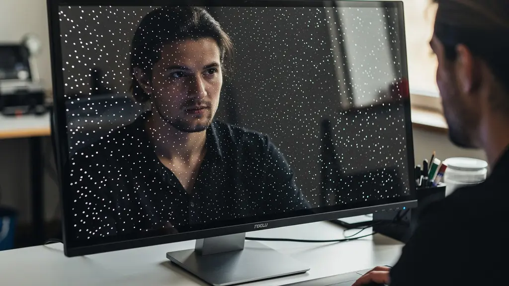
However, the expert approach is not to mindlessly clone out every white dot that appears. As demonstrated in professional workflows, the power of this mode lies in its ability to facilitate a rapid triage. This is where the art of selective perfection begins.
Professional Retouching Workflow: The Triage System
In a demonstration by retoucher John Ross, the Visualize Spots mode is the first step in a systematic triage. He categorizes spots based on their location and the final output. ‘Critical’ spots are those in “hero areas” like the primary subject’s face or a clean sky, which will be meticulously removed. ‘Secondary’ spots are those in less critical background areas, which are cleaned but with less precision. Finally, a significant number of spots are categorized as ‘ignore’—these are flaws located within busy textures (like foliage or fabric) that would be completely invisible in the final print or web version. This system saves immense time and prevents the over-cleaning that leads to a sterile image.
By using Visualize Spots not as a mandate to clean everything, but as a map to make intelligent, output-aware decisions, the retoucher shifts from a reactive to a strategic mindset. This ensures that effort is focused where it has the most impact on the viewer’s perception, preserving natural texture and saving valuable production time.
Frequency Separation or High Pass: Which Retains Skin Texture?
In the world of high-end skin retouching, the debate between Frequency Separation (FS) and High Pass sharpening is often a source of confusion. Both are powerful techniques, but they serve fundamentally different purposes and have vastly different impacts on skin texture. Understanding which to use, and when, is crucial for achieving natural, high-quality results. The key distinction lies in what each technique separates and manipulates: FS separates tone and texture into different layers, while High Pass isolates edge contrast.
Frequency Separation is a comprehensive retouching method. It deconstructs the image into a high-frequency layer (containing fine details like pores, hairs, and blemishes) and a low-frequency layer (containing color, tone, and form). This allows the retoucher to smooth out tonal transitions and remove blotchiness on the “low” layer without destroying the inherent skin texture on the “high” layer. When done correctly, FS preserves the original base texture; however, if the low layer is blurred too aggressively, it can destroy the subtle dimensionality that makes skin look real, resulting in a “plastic” look.
High Pass, on the other hand, is not a full retouching technique but a method for enhancing texture. It creates a gray layer that emphasizes edges and micro-contrast. When blended over the image (typically with a Soft Light or Linear Light blending mode), it amplifies the existing texture rather than preserving it in isolation. It’s excellent for adding a final “pop” to textures that may have been slightly softened during the retouching process, but it is not a tool for sculpting form or correcting tonal issues. Using it to fix major flaws will only result in an over-sharpened, gritty appearance.
The choice between them is a matter of purpose, not preference. For a clear breakdown of their roles, a comparative analysis is most useful, as detailed in an in-depth guide on retouching fundamentals.
| Technique | Best For | Texture Preservation | Workflow Speed |
|---|---|---|---|
| Frequency Separation | Sculpting form and tone | Preserves base texture | Slower, more control |
| High Pass | Enhancing micro-texture | Emphasizes existing texture | Faster, less flexible |
In a professional workflow, these techniques are not mutually exclusive. A retoucher might use Frequency Separation for the foundational work of correcting skin tones and removing blemishes, and then apply a very subtle High Pass layer at the end to restore or enhance the crispness of the skin’s micro-texture. The goal is always to retain the dimensionality and organic nature of the skin.
The Sharpening Error That Creates White Halos on Edges
One of the most telling signs of amateur sharpening is the presence of “halos”—bright, ghostly outlines that appear along high-contrast edges. This artifact is a direct result of improper use of the Unsharp Mask (USM) or Smart Sharpen filters in Photoshop. It occurs when the “Amount” and “Radius” settings are pushed too far. The sharpening algorithm works by increasing contrast along edges: it darkens the dark side of an edge and lightens the light side. When the Radius is too large, this lightening effect “spills over” from the edge, creating an unnatural white line that screams “digital.”
This error fundamentally misunderstands the goal of sharpening. The objective is not to make the image “sharper” in a global sense, but to enhance local acutance—the viewer’s perception of sharpness at key edges. Halos destroy this illusion by drawing attention to the sharpening process itself. A perfectly sharpened image is one where the viewer perceives incredible detail without ever noticing that it has been sharpened. The presence of halos is a failure to achieve this transparency.
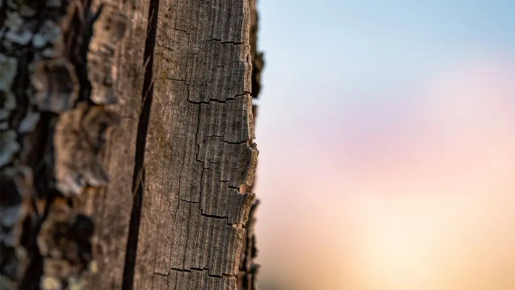
The image below illustrates the kind of natural edge contrast that professional sharpening seeks to enhance, not create. The goal is to subtly boost the transition between the textured bark and the soft background, without introducing any artificial artifacts.
Avoiding this common pitfall requires a disciplined and targeted approach. Instead of applying one heavy-handed sharpening layer to the entire image, professionals use a combination of precise settings, masks, and multiple layers to apply sharpening only where it is needed, and in a way that remains invisible to the viewer. This ensures that details are enhanced while transitions remain natural and free of distracting artifacts.
Action Plan: Professional Sharpening Workflow to Avoid Halos
- Set Precise Values: Use small radius values, typically between 0.5 and 1.5 pixels, paired with higher amount settings. This localizes the sharpening effect directly to the edge.
- Target the Mid-tones: Apply sharpening primarily to the mid-tones using luminosity masks. Sharpening deep shadows introduces noise, and sharpening bright highlights causes clipping and harshness.
- Isolate with Selections: Use Photoshop’s ‘Focus Area’ selection or manual masking to isolate only the in-focus edges of your subject, preventing out-of-focus areas from being sharpened unnaturally.
- Use Multiple Layers: Create separate, targeted sharpening layers for different parts of the image (e.g., one for eyes, one for hair, one for clothing) with settings optimized for each texture.
- Judge at 100%: Always evaluate the effects of your sharpening at 100% zoom. This is the only way to accurately see the pixel-level impact and spot any emerging halos before they become a problem.
When to Stop Cleaning: The 50% Zoom Rule for Sanity?
The infinite zoom capability of modern software is both a blessing and a curse. It allows for incredible precision, but it also creates the “retoucher’s trap”: an endless cycle of cleaning imperfections that are completely invisible at any normal viewing distance. This is where the most valuable skill in retouching comes into play: the discipline to know when to stop. There is no universal “50% zoom rule,” but this concept points to a larger, more critical philosophy of output-aware retouching. The real rule is not a percentage, but a principle.
This principle is best articulated by a core tenet of professional post-production. As stated in the editorial standards of leading photography publications, the guiding philosophy is one of perceptual, not absolute, perfection.
If you can’t see the flaw at the final print size from its intended viewing distance, it doesn’t exist.
– Professional Retouching Philosophy, Photography Life Editorial Standards
This simple but profound statement should be the mantra of every retoucher. It reframes the job from “eliminating all flaws” to “eliminating all distracting flaws.” The key variables become the final output size and the intended viewing distance. A blemish that is invisible on an Instagram post might be a glaring issue on a 30-inch fine art print viewed from two feet away. Conversely, spending 20 minutes cloning out subtle texture variations in a background that will be compressed for the web is an exercise in futility.
This isn’t about laziness; it’s about efficiency and preserving the integrity of the image. Excessive cleaning can strip an image of its natural texture, making it look artificial. It also represents a point of diminishing returns, where a huge amount of time yields a negligible improvement in perceived quality.
Time vs. Quality: The 80/20 Rule in Retouching
An analysis of professional workflows reveals a clear pattern of diminishing returns. Research from platforms like PiXimperfect, led by Unmesh Dinda, shows that approximately 80% of the perceived quality improvement in a standard portrait retouch happens within the first 20% of the total retouching time. The subsequent 80% of the time is spent chasing the final 20% of perfection, an effort that is often invisible to the average viewer. For most commercial work, exceeding 30-45 minutes per image pushes well past the point of meaningful return on investment.
A practical method is to periodically zoom out to the approximate final viewing size during your workflow. If you’re retouching for a magazine page, hold your hand up to the screen to estimate the size. If it’s for the web, zoom out until the image is the size it would be on a typical monitor. If you can’t see the flaw you were just working on, it’s time to move on. This practice saves your sanity and produces a more natural, believable result.
How to Apply Output Sharpening Based on Viewing Distance?
Output sharpening is the final, and perhaps most critical, step in a professional workflow. It is entirely distinct from the “creative” or “capture” sharpening done earlier in the process. Its sole purpose is to compensate for the softening that occurs when an image is resized and prepared for a specific output device—be it a printer, a web browser, or a mobile screen. The amount and type of sharpening required are directly dependent on two factors: the resolution of the output medium and the intended viewing distance.
A common mistake is to apply a single, generic sharpening setting to all exports. This fails to account for how the human eye perceives detail at different distances and resolutions. For example, a large gallery print viewed from ten feet away requires a different sharpening approach than a small 4×6 print held in the hand. The large print needs more aggressive sharpening with a larger radius to ensure edges are defined from a distance, while the same settings on a 4×6 print would look harsh and over-processed.
The principle is simple: the lower the viewing resolution (or the greater the viewing distance), the more aggressive the sharpening needs to be. An image destined for a high-resolution Retina display needs only subtle sharpening, as the screen itself preserves much of the detail. Conversely, a standard-definition web image that will be viewed on a variety of screens requires more sharpening to maintain apparent crispness. For example, an image prepared for a YouTube thumbnail, with recommended dimensions of only 1280×720 pixels, must be sharpened more aggressively than its full-resolution counterpart to appear sharp and eye-catching at a small size.
A professional workflow involves creating specific output sharpening recipes for different destinations. This is often done via actions or presets in Photoshop. A typical set of recipes might include:
- Large Print (e.g., 24×36″): Higher Amount, larger Radius (e.g., 1.5-3.0 pixels) to define broad structures.
- Small Print (e.g., 8×10″): Moderate Amount, smaller Radius (e.g., 0.8-1.5 pixels) for fine detail.
- High-Res Web (e.g., Portfolio Site): Low Amount, very small Radius (e.g., 0.3-0.5 pixels).
- Low-Res Web (e.g., Social Media): Moderate Amount, small Radius (e.g., 0.5-0.8 pixels) after resizing.
This tailored approach ensures that every version of the image is perceived as optimally sharp in its intended context, demonstrating a mastery of the final step in the digital darkroom.
Why Are Chromatic Aberrations Sometimes Desirable in Art?
While retouchers spend countless hours removing unwanted chromatic aberration (CA), in certain artistic contexts, it is not only desirable but deliberately introduced. This seemingly contradictory practice stems from a desire to evoke a specific mood, add a sense of organic realism to digital footage, or replicate the nostalgic character of vintage optics. In these cases, CA ceases to be an “error” and becomes an intentional textural and emotional element. It is a tool for controlled, or *intentional*, imperfection.
The aesthetic appeal of CA often lies in its ability to subvert the sterile perfection of modern digital sensors and lenses. A perfectly corrected image can sometimes feel too clean, too clinical. A subtle fringe of color along an edge, particularly the kind produced by classic anamorphic or vintage cinema lenses, can add a layer of tangible, filmic character. It reminds the viewer, often subconsciously, of an older, more analog process, lending the image a sense of nostalgia, dreaminess, or even psychological unease.
This technique is particularly prevalent in filmmaking, where directors and cinematographers carefully select lenses based on their unique flare and aberration characteristics. The goal is not technical perfection but emotional impact. A clean, modern lens might be used for a documentary, while a vintage anamorphic lens with pronounced CA might be chosen for a science fiction or period drama to create a distinct visual world.
Intentional Chromatic Aberration in Film Production
Professional filmmakers, especially in the sci-fi and thriller genres, deliberately use anamorphic lenses which are known for their controlled chromatic aberration. This effect is used to create a sense of atmospheric depth and psychological tension. The subtle color fringing and distorted bokeh add an organic imperfection that helps digitally captured footage feel more authentic and less “perfect.” It’s a key ingredient in creating a cinematic “look” that separates a high-end production from sterile digital video, effectively using a technical flaw as a narrative tool.
For photographers and retouchers, this offers a valuable lesson. While removing distracting purple fringing from a commercial product shot is non-negotiable, allowing or even subtly enhancing the gentle, warm aberration from a vintage portrait lens might be the very thing that gives the image its unique character. It is the ultimate expression of an expert’s confidence: knowing the rules of perfection so well that you know exactly when and how to break them for artistic effect.
Key Takeaways
- The ultimate goal is “perceptual perfection”: an image that feels flawless to the viewer in its final context, not at 300% zoom.
- Implement a triage system for cleaning. Categorize flaws as critical, secondary, or ignorable based on location and final output to save time and preserve texture.
- Techniques are tools, not rules. Use Frequency Separation for form, High Pass for texture, and know when to break the rules by embracing “intentional imperfection.”
Why Do Medium-Format Sensors Create a “Look” That Full Frame Cannot?
The term “medium-format look” is often discussed in hushed, reverent tones among photographers and retouchers. It’s frequently attributed to a magical, three-dimensional quality and an impossibly smooth transition between tones. While some of this is subjective, much of this distinct aesthetic is grounded in concrete technical advantages that full-frame sensors cannot replicate. It’s not just about more megapixels; it’s about the quality and depth of the data captured.
The first major factor is the sensor’s physical size. A larger sensor, when used with a lens of a corresponding focal length, produces a shallower depth of field than a smaller sensor at the same field of view and aperture. This creates a more dramatic and rapid falloff from sharp focus to soft background, which is a key component of the “3D pop” associated with medium format. The transition (or “tonal roll-off”) is smoother and more gradual, which is particularly flattering for portraits.
The second, and arguably more important, advantage for a retoucher is the superior color depth. While most full-frame cameras capture images in 14-bit RAW files, medium format cameras typically capture in 16-bit. This may not sound like a huge difference, but it is exponential. A 14-bit file can record 16,384 tonal values per color channel, whereas a 16-bit file can record 65,536 tonal values—four times as much information. This wealth of data provides incredibly smooth gradations, especially in subtle tones like skin or clear skies. It allows for extreme pushing and pulling of tones in post-production without the risk of banding or posterization, which can easily occur with 14-bit files.
The Retouching Advantage of 16-Bit Files
An analysis of commercial beauty retouching workflows by leading training platform PHLEARN highlights this difference. The analysis shows that 16-bit medium format files enable retouchers to perform extreme tonal adjustments, such as heavy dodging and burning or color grading, without introducing banding artifacts. This additional data is what facilitates a “painterly” retouching style, where tones can be sculpted with the precision of a digital brush. This level of manipulation is often impossible with the more compressed data from 14-bit files, especially in areas of smooth gradients.
This combination of optical depth and data richness is what constitutes the medium-format “look.” It gives the retoucher a superior canvas to work on—one with more dimensionality, smoother tones, and greater flexibility. It’s the ultimate example of how superior technical capture at the pixel level directly enables greater artistic freedom and a higher-quality final image, reinforcing the idea that the best retouching starts with the best possible data.
By shifting your mindset from a pixel janitor to an artistic strategist—one who understands optical flaws, leverages advanced techniques with purpose, and always retouches for the final output—you can elevate your work from technically clean to truly masterful. Start your next project not by zooming in, but by first defining the final frame.
Frequently Asked Questions on High-End Retouching
Is frequency separation a destructive editing technique?
Technically, when performed correctly using smart objects and layers, Frequency Separation is a non-destructive workflow. However, it can become practically destructive to the image’s quality if misapplied. Aggressively blurring the low-frequency (tone) layer can destroy the subtle dimensionality and form of a subject, leading to a flat, “plastic” look that is impossible to recover. The key is subtlety and preserving the natural transitions of light and shadow.
What is the single best sharpening radius to use in Photoshop?
There is no single “best” radius; it is entirely context-dependent. However, for most high-resolution images, professional retouchers typically work with a very small radius, usually between 0.5 and 1.5 pixels. A smaller radius targets only the finest edges, preventing the creation of halos. The “Amount” is then adjusted to control the intensity. The rule is to sharpen for a specific texture and output size, not to follow a generic formula.
How can I remove chromatic aberration without losing image detail?
The most effective and least destructive method is to use the automated Lens Correction profiles in Adobe Camera Raw, Lightroom, or Capture One. These profiles are designed for your specific lens and remove CA based on known optical data, preserving maximum detail. If manual removal is necessary, use the eyedropper tool in the manual CA correction panel to select the fringe color and adjust the sliders carefully, ensuring you are zoomed to 100% to monitor the effect on edge detail.