Contrary to popular advice, painting your small studio pure white is one of the fastest ways to destroy professional-level lighting control.
- Uncontrolled white walls create “light contamination,” filling in your shadows and killing contrast, resulting in flat, amateur-looking images.
- Professional results in a compact space come from thinking like an architect—strategically subtracting light and designing deliberate zones for tech, talent, and workflow.
Recommendation: Instead of bouncing light everywhere, embrace negative fill. Use black panels, flags, and even dark walls to carve your light and create the depth and drama that defines professional work.
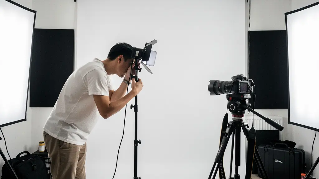
For many emerging photographers, the dream of a professional studio meets the reality of a spare room, a corner of the garage, or a small apartment. The immediate instinct is often to fight the space: paint the walls bright white to make it feel bigger, buy more lights to overpower the dimness, and cram equipment wherever it fits. You follow all the standard advice, yet your images still lack that crisp, dimensional quality. The shadows are muddy, the highlights feel flat, and the overall look doesn’t match the vision in your head. This is a common frustration, stemming from a fundamental misunderstanding of how small spaces behave.
The internet is filled with tips on collapsible backdrops and versatile gear. While useful, these are just tools. The real secret to unlocking professional results in a confined area isn’t about the equipment you add, but about how you command the environment itself. It requires a shift in mindset: you are not a decorator filling a room; you are a studio architect designing a precision instrument. Every surface—from the walls to the floor—is a potential tool for shaping light, and every inch of floor space is valuable real estate for a safe and efficient workflow.
But what if the key wasn’t simply adding more light, but strategically subtracting it? What if the “best” floor surface was the one you could change in minutes? This guide abandons the generic tips and dives into the spatial architecture of a small studio. We will deconstruct the common mistakes that sabotage your work, from the “light contamination” caused by white walls to the micro-vibrations that soften your focus. You will learn to engineer your limited space for maximum control, turning its constraints into your creative advantage and producing work that looks like it came from a high-end commercial studio.
This article provides a blueprint for transforming your home setup. We will cover everything from mastering light control to designing an ergonomic and safe workflow, giving you the architectural principles needed to elevate your photography.
Contents: Optimizing Your Home Studio Space
- Why Are White Walls Destroying Your Contrast Control?
- How to Set Up a Tethering Station That Won’t Trip the Talent?
- Concrete or Wood: Which Floor Surface Is Better for Light Bounce?
- The Height Mistake That Prevents You From Using Hair Lights
- Where to Position the Client Monitor for Maximum Approval Rates?
- Battery or AC: Which Strobe System Fits a Traveling Fine Art Photographer?
- The Flagging Mistake That Ruins Your Shadow Depth
- Why a Rigid Tripod Is the Most Underrated Tool for Sharpness?
Why Are White Walls Destroying Your Contrast Control?
The most repeated advice for small spaces is to paint the walls bright white. The logic seems sound: it makes the room feel larger and bounces light, creating a bright, airy feel. For interior design, this is perfect. For precision photography, it’s a disaster. In a compact studio, white walls create a ‘light echo chamber’. Your key light hits the subject, then bounces off the wall behind them, the wall to the side, and the wall behind you, filling in every shadow you painstakingly tried to create. This is light contamination, and it is the primary culprit behind flat, low-contrast images. You lose control of your lighting ratios, and your ability to sculpt with shadow vanishes.
True lighting mastery in a small space isn’t about adding light; it’s about subtractive lighting. You must have the ability to absorb light and create “true black” where you need it. This is why many professional studios are painted neutral gray or even black. It gives the photographer a neutral starting point, where the only light in the scene is the light they intentionally place. As photographer Jake Hicks argues, space limitations are not an excuse for poor lighting control. The ability to manage light is what separates professional-looking work from snapshots, and that starts with taming your walls.
Instead of fighting a bright room, architect it. Use large, portable black panels or V-flats to build temporary “walls” that absorb light. You can position them to eliminate bounce from a specific direction, deepen the shadows on one side of your subject’s face, or create a sliver of negative fill to enhance form. This approach turns your small room from an uncontrollable bounce house into a modular, controllable environment where you dictate exactly where the light goes—and, more importantly, where it doesn’t.
Action Plan: Implementing a Zone System for Light Control
- Position V-flats or portable black panels at 45-degree angles to your subject to create dedicated light absorption zones.
- Use a light meter to measure the difference in ambient light between the uncontrolled white wall areas and your new black panel zones to quantify your control.
- Place gray cards at multiple points in your setup to assess any color cast being introduced by residual wall bounce.
- If color cast is present, apply color correction gels to your strobes based on the gray card readings to neutralize the effect.
- Fine-tune the angle and distance of your panels to achieve the precise key-to-fill contrast ratio desired for your shot.
How to Set Up a Tethering Station That Won’t Trip the Talent?
In a small studio, every square foot is prime real estate. A poorly planned tethering station—a laptop on a rickety table with cables snaking across the floor—is not just inefficient; it’s a safety hazard. It creates a trip wire for you, your talent, and your clients, while also breaking the creative flow. The solution is to think like an architect and design a dedicated, secure, and compact “tech zone.” This isn’t about finding a spare corner; it’s about creating an ergonomic cockpit that integrates seamlessly into your shooting workflow without occupying valuable floor space.
The first principle is to establish a “safe triangle” of movement. Visualize three distinct zones on your floor: one for the photographer’s movement, a central one for the talent, and a third, protected zone for all technology. This ensures clear pathways and prevents accidental collisions with expensive gear. This approach is so effective that some photographers, like Aaron Taylor, have proven that a professional business can run from a tiny 150-square-foot office, demonstrating that it’s all about intelligent spatial organization.
To achieve this, get your technology off the floor. Instead of a cart or table that eats up a 2×2 foot area, consider these vertical solutions:
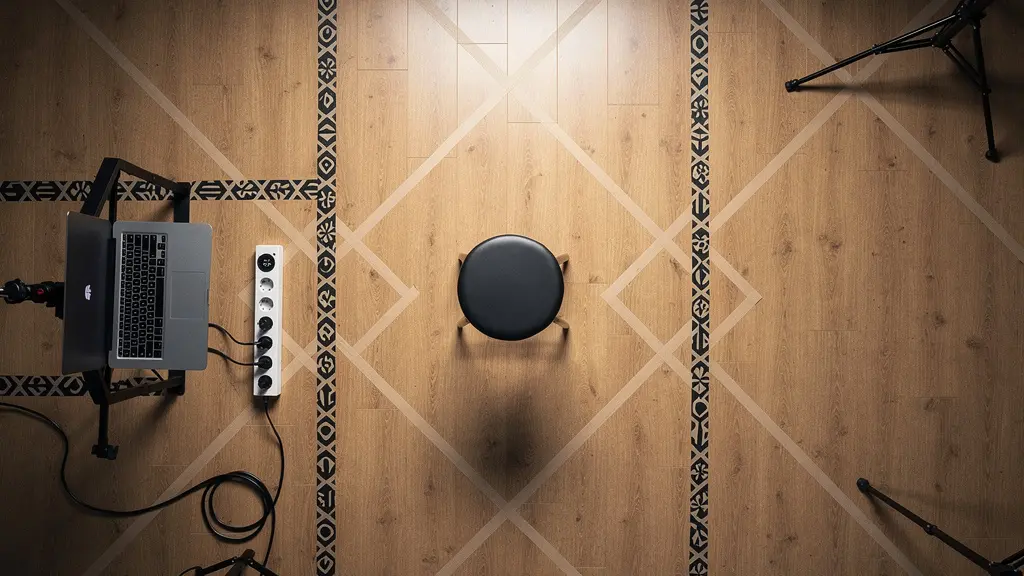
As the overhead view shows, a vertical setup is key. A laptop tray mounted on a dedicated light stand has a footprint of just a few square inches. A wall-mounted articulating arm offers even greater space saving, keeping the floor completely clear. Run your tether cable and power cords upwards along the stand or wall, securing them with gaffer tape or reusable cable ties. This vertical cable management eliminates the primary trip hazard and keeps the shooting area clean and professional. Your tether station becomes a secure, fixed point in your studio’s architecture, not a temporary, hazardous obstacle.
Concrete or Wood: Which Floor Surface Is Better for Light Bounce?
The question of the “best” floor for a studio often leads to a debate between the industrial feel of concrete and the warmth of wood. However, from a lighting architect’s perspective, this is the wrong question. Both surfaces present challenges in a small space. A polished concrete floor can create harsh, specular highlights that are difficult to control. A warm-toned wooden floor will inevitably bounce warm light back into your scene, creating a color cast that contaminates skin tones and makes color correction a nightmare. A permanent floor surface gives you a permanent lighting problem.
The professional solution is not to choose one surface, but to build a system that allows for modular control. Your existing floor is just a sub-floor; the true “surface” is what you put on top of it. This is where large rolls of seamless paper or sheets of linoleum become your most powerful tool. Need a clean, neutral white surface with a soft, diffuse bounce? Roll out white paper. Need to completely kill floor reflection and create dramatic, low-key lighting? Roll out black paper or a matte black linoleum sheet. This approach gives you complete control over the color and quality of your bounced light on a shot-by-shot basis.
This modular strategy is a core tenet for many DIY studio setups. As product photography experts have noted, using temporary surfaces like paper or linoleum allows for instant changes to the lighting characteristics of a space without making permanent alterations. You can even create hybrid zones. For example, place a sheet of black linoleum directly under your subject to control the immediate reflections, while allowing the surrounding wooden floor to add a subtle, warm ambient fill from a distance. This turns your floor from a passive, problematic element into an active, controllable lighting modifier.
The Height Mistake That Prevents You From Using Hair Lights
One of the most common frustrations in a home studio with standard 8-foot ceilings is the inability to get proper separation between the subject and the background. A hair light or kicker, placed high and behind the subject, is essential for creating that professional-looking edge of light that makes them “pop.” However, booming a light on a standard stand often means the stand itself intrudes into the frame, or the ceiling is simply too low to get the desired angle. This height constraint forces many photographers to abandon separation lights altogether, resulting in images where the subject blends into the background.
The mistake is thinking horizontally with floor-based stands. The architectural solution is to think vertically. You need to create overhead mounting points without permanently altering your room. The most elegant solution for this is a Varipole or Autopole system. These are heavy-duty, spring-loaded poles that brace between the floor and ceiling, using tension to create an incredibly stable vertical support. They take up only a few inches of floor space and can be installed in seconds without a single screw. By clamping a crossbar between two autopoles, you can create a complete overhead grid system for mounting lights, flags, and reflectors anywhere in your room, regardless of the low ceiling.
If an autopole system isn’t feasible, other solutions exist. A light with a grid or a snoot modifier can create a very narrow, focused beam that acts as a hair light from a lower angle without spilling onto the background. You can also use “negative hair lighting,” where you place a black flag just above and behind the subject’s head to create a dark edge, enhancing separation through shadow rather than highlight. For a truly DIY approach, a simple crossbar mounted in a doorway can serve as a temporary overhead rigging point. The key is to stop seeing the low ceiling as a limitation and start seeing it as a boundary to engineer around with creative mounting solutions.
Where to Position the Client Monitor for Maximum Approval Rates?
In a commercial shoot, the client’s approval is paramount. In a small home studio, the client monitor is often an afterthought—a laptop balanced precariously, forcing the client to hover over your shoulder. This setup is not only unprofessional but also psychologically counterproductive. It creates a physical barrier, fosters a sense of critique rather than collaboration, and leads to inefficient feedback loops. The placement of the client monitor is a critical piece of spatial psychology that directly impacts workflow and approval rates.
The goal is to create a “collaborative cockpit” rather than a separate “client area.” The monitor should not be placed directly in front of the client as if they are watching a movie. Instead, it should be positioned to the side, at roughly a 30-degree angle from the subject’s eyeline. This arrangement, recommended by video studio design experts, encourages a team dynamic. You, the photographer, and the client are looking at the image together, from a shared perspective. It invites conversation and partnership, turning the review process into a creative huddle.
Ergonomics are equally important. The monitor should be at a comfortable, seated eye level to prevent neck strain during long shoots. A dedicated seating area, positioned 3-4 feet from the screen, creates a comfortable “comfort zone” that feels inviting, not intrusive. This dedicated zone also serves a practical purpose: it keeps the client safely out of the main shooting area and away from cables and light stands. By architecting this small but crucial part of your studio, you transform the client experience from one of passive judgment to active participation, leading to faster approvals and a more professional, collaborative atmosphere on set.
Battery or AC: Which Strobe System Fits a Traveling Fine Art Photographer?
While the title asks about a traveling photographer, for the home studio owner, this question is even more critical and relates to a different set of constraints: power and safety. AC-powered strobes are often cheaper per watt-second and offer unlimited runtime, which seems ideal. However, there’s a hidden danger. Most residential circuits are not designed to handle the high-power draw of multiple studio strobes firing simultaneously. As photography experts at B&H Photo warn, plugging multiple AC strobes into a single circuit can lead to tripped breakers, inconsistent power delivery, or even create a fire hazard.
Battery-powered strobes, while having a higher initial cost, solve this problem entirely. They are completely independent of your home’s electrical grid, ensuring power consistency and eliminating the risk of overloading circuits. This independence also provides a massive workflow advantage in a small space: the absence of power cables. A studio floor cluttered with AC cords is a tangled, dangerous mess. A battery-powered setup is clean, fast to configure, and allows you to reposition lights instantly without worrying about finding a nearby outlet or rerouting cables.
The choice ultimately depends on your specific needs and how you architect your workflow. A hybrid system can offer the best of both worlds, using a main AC-powered key light and smaller, battery-powered strobes for fill and hair lights. Here’s a breakdown of the considerations for a home studio environment:
| System Type | Power Consistency | Setup Speed | Maintenance | Cost |
|---|---|---|---|---|
| Battery Strobes | Independent from circuits | Fast, cable-free | Charging management required | Higher initial cost |
| AC Strobes | Unlimited runtime | Cable routing needed | Minimal, plug and forget | Lower cost per watt/second |
| Hybrid System | Best of both | Flexible positioning | Mixed management | Highest investment |
For the small home studio, the safety, flexibility, and clean setup of battery strobes often outweigh the convenience of unlimited AC power. It’s a strategic investment in an efficient and hazard-free creative environment.
The Flagging Mistake That Ruins Your Shadow Depth
In a large studio, photographers have an arsenal of tools to control light: massive flags, cutters, and an abundance of space to position them. In a small home studio, adding more stands and flags can quickly turn the room into an impassable forest. The common mistake is to believe that you need dedicated equipment for every task. The architectural approach is to see the environment itself as your primary light-shaping tool. Your doorway, a dark-painted wall, or even the shadow cast by a piece of furniture can become a flag.
This concept of environmental flagging is a game-changer for small spaces. For example, if you have a white wall behind your subject that’s bouncing unwanted fill light, you don’t necessarily need a 4×4 black flag. Instead, open a nearby doorway to reveal a darker hallway behind it. That doorway becomes a massive source of “negative fill,” a black hole that subtracts light and carves out the side of your subject, adding depth and dimension. This is a technique used by creative photographers like Jake Hicks, who emphasizes using the environment itself to add depth without cluttering the space with extra gear.
The key to effective flagging isn’t just about blocking light; it’s about controlling the softness of the shadow’s edge, known as the penumbra. A flag placed close to the light source creates a soft, graduated shadow. A flag placed closer to the subject creates a hard, defined shadow. By “feathering” your flag—angling it so that only its edge is influencing the light—you can create beautiful, subtle gradients of light to dark. You can even use a piece of white foam core just outside a shadow area to gently bounce back a tiny amount of light, giving the shadow detail without killing its depth. Your small space is full of potential flags; you just have to learn to see them.
Key takeaways
- Embrace Subtractive Lighting: Professional contrast comes from absorbing light with black surfaces, not just bouncing it with white ones.
- Design for Workflow: Treat your space like an architect. Create dedicated zones for tech, talent, and movement to ensure safety and efficiency.
- Control Every Surface: Your walls, floor, and ceiling are not passive backgrounds; they are active lighting tools that must be controlled with modular solutions.
- Go Vertical: Overcome height limitations by using tension poles and wall mounts to get lights off the floor and into optimal positions.
- Dampen Micro-Vibrations: A rigid tripod isn’t just for long exposures; it’s essential for eliminating the imperceptible vibrations in a home that rob your images of critical sharpness.
Why a Rigid Tripod Is the Most Underrated Tool for Sharpness?
In the age of high ISO and image stabilization, many photographers see a tripod as a tool only for long exposures or landscape work. In a small home studio, they might even see it as another bulky object taking up precious floor space. This is a critical oversight. In a controlled studio environment, the single most underrated tool for achieving tack-sharp, pixel-perfect images is a heavy, rigid tripod. Its primary role isn’t to combat camera shake from your hands; it’s to combat the environment itself.
Home studios are built on floors that vibrate. Unlike the solid concrete slabs of commercial studios, residential wooden floors transmit every footstep, every passing truck, and every hum from the HVAC system. These are imperceptible micro-vibrations, but they are devastating to image sharpness. Even the subtle vibration from your camera’s own mirror slap can be enough to soften the fine details in a portrait or product shot. A flimsy, budget tripod will do little to stop this; it may even amplify the vibrations. A solid, rigid tripod acts as a vibrational dampener, isolating the camera from the unstable environment and preserving every ounce of detail your lens can capture.
Investing in a solid tripod is an investment in consistency. It locks down your composition, allowing you to focus entirely on directing your subject and refining your lighting, knowing that every frame will be perfectly aligned. This is essential for focus stacking in product photography or creating composites in portraiture. While some guides suggest that a tripod is a place to save money, with options starting low, true professionals understand that a rigid support system is the bedrock of a sharp image. It is the final piece of the architectural puzzle, ensuring that all your careful work in lighting and composition is rendered with a level of sharpness that defines professional quality.
By shifting your perspective from that of a decorator to that of a studio architect, you can transform any small room into a high-performance creative space. Master these principles of spatial and lighting control, and you will unlock the professional results you’ve been striving for.