True mastery of portrait lighting is not artistic guesswork; it is the application of repeatable, mathematical science.
- Professional results depend on precise measurement with an incident light meter, not in-camera histograms.
- Specific ratios are commercial tools: high ratios (4:1+) sell luxury and prestige, while low ratios (2:1) convey accessibility.
Recommendation: Abandon guessing your power settings and adopt a meter-based workflow to achieve predictable, investment-grade results in every session.
For many studio photographers, achieving consistent, dramatic lighting feels like a frustrating guessing game. You adjust a key light, tweak a fill, take a test shot, and repeat, hoping to stumble upon that perfect balance of light and shadow. You’ve heard the generic advice: use higher contrast for more drama. But this approach lacks precision and, more importantly, repeatability. What if one portrait is a masterpiece of chiaroscuro, and the next, with a slightly different setup, falls flat? This inconsistency is the barrier between amateur results and professional, marketable art.
The common wisdom often points towards using your camera’s histogram or simply “eyeballing” the scene. While these methods can get you in the ballpark, they measure reflected light, which is easily fooled by the subject’s clothing or skin tone. The secret of the masters isn’t a better eye; it’s a better system. They don’t guess; they measure. They treat light as a quantifiable element to be controlled with mathematical precision. This is the fundamental shift in thinking that separates good photographers from great ones.
This guide abandons ambiguous advice and instead provides a systematic, numbers-driven framework for mastering lighting ratios. We will move beyond the “what” and into the “how” and “why.” You will learn to wield an incident light meter as a tool for absolute control, understand the commercial mandate behind high and low key setups, and master the art of negative fill to sculpt shadows with intention. This is the science that underpins truly dramatic and, most importantly, repeatable portraiture.
This article provides a comprehensive breakdown of the technical and artistic principles you need. The following sections will guide you through each critical element, from foundational concepts to advanced techniques for achieving flawless results.
Summary: A Systematic Approach to Dramatic Lighting Ratios
- What Defines an Investment-Grade Creation in the Current Art Market?
- How to Use an Incident Light Meter to Nail Ratios Every Time?
- High Key or Low Key: Which Ratio Setup Sells Luxury Products?
- The Flagging Mistake That Ruins Your Shadow Depth
- How to Adjust Ratios for Different Skin Complexions?
- Why Do You Need +1.5 Stops on the Background for Pure White?
- How to Use Black Flags to Deepen Shadows on the Face?
- How to Choose Studio Strobes That Maintain Color Consistency Across 500 Shots?
What Defines an Investment-Grade Creation in the Current Art Market?
An “investment-grade” portrait is defined by more than just a pleasing aesthetic; it is the product of technical perfection and artistic consistency. In the current art market, collectors and clients are paying for a signature style that is recognizable and flawlessly executed every time. This means moving beyond happy accidents and establishing a deliberate, repeatable lighting methodology. A photographer’s ability to consistently produce a specific look and feel is what elevates their work from a simple service to a valuable asset. The lighting ratio is the mathematical foundation of that signature style.
Consider the workflow of a professional who has honed their craft. They are not discovering the light on set; they are executing a pre-visualized plan. This is where a specific, chosen ratio becomes a creative signature. As professional photographer Jim Zuckerman states, a 3:1 lighting ratio is his go-to for fine art portraits because it delivers drama while revealing all the necessary details to perfectly define the subject. This deliberate choice, applied consistently, has become part of his artistic identity, creating a portfolio of work that balances technical excellence with a clear vision.
Building this level of quality requires a structured approach. It involves mastering a specific range of ratios, using precise tools for measurement, and documenting your setups to ensure that you can recreate your best work on demand. This discipline is what transforms a photograph into an investment-grade creation with lasting value.
Action Plan: 5 Steps to Create Investment-Grade Portrait Lighting
- Master the 2:1 to 4:1 ratio range to create three-dimensionality without unattractive deep shadows.
- Use a handheld incident light meter for precise, repeatable lighting setups that define professional work.
- Develop a signature lighting style by consistently applying your preferred ratio across your portfolio.
- Document your exact lighting setups, including power settings and distances, to ensure consistency across series.
- Test your chosen ratio with different skin tones to ensure versatility while maintaining your artistic vision.
How to Use an Incident Light Meter to Nail Ratios Every Time?
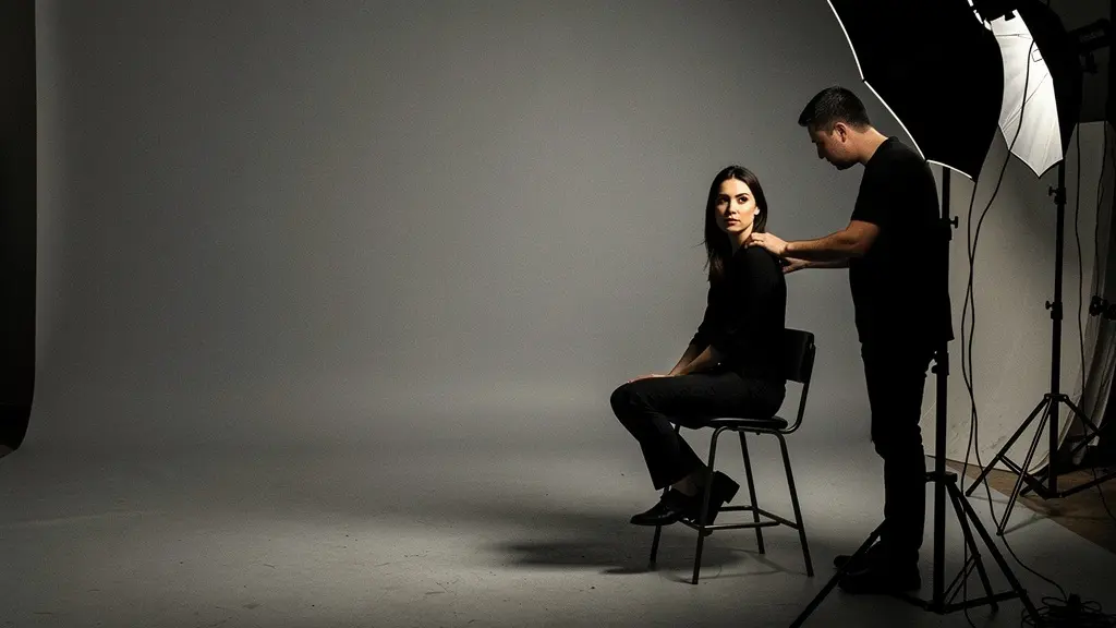
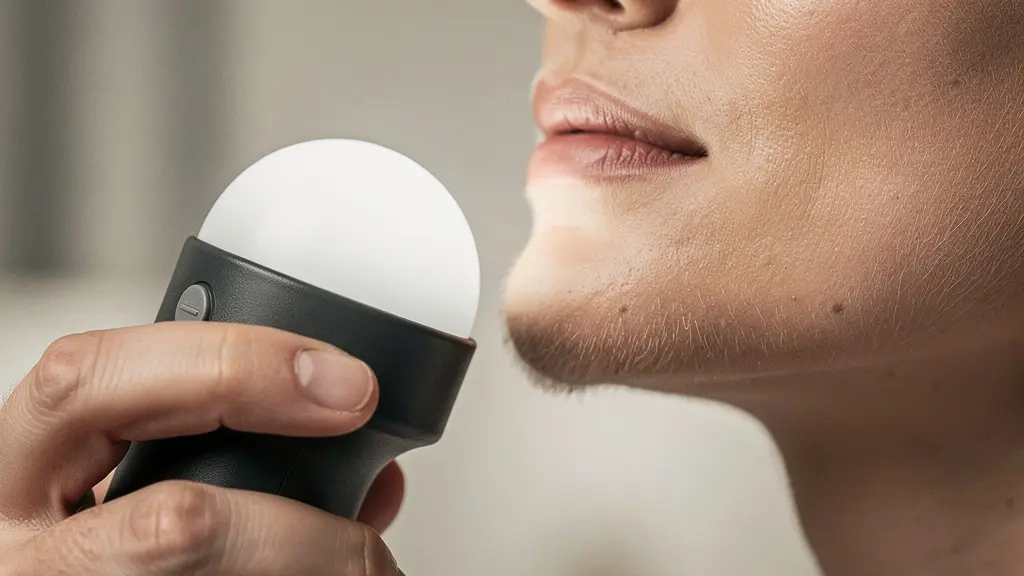
The single most important tool for moving from guessing to precision is the handheld incident light meter. Unlike your camera’s meter, which reads reflected light and can be fooled by a white dress or dark suit, an incident meter measures the actual quantity of light falling onto your subject. This provides an objective, repeatable baseline, making it the cornerstone of any professional lighting workflow. Using one is not complex; it’s a simple, four-step process that guarantees perfect exposure and predictable ratios.
The process begins with your main light source. First, turn off all other lights. Position your key light where you want it, then hold the incident meter at your subject’s position, with the white dome pointing directly at the key light. Adjust the power of your strobe until the meter gives you your desired aperture (e.g., f/8). This is your anchor point. Second, turn off the key light and turn on your fill light. With the meter in the same position but now aimed at the fill light, adjust its power until you get the reading that corresponds to your desired ratio. For a 2:1 ratio (one stop difference), you’d aim for f/5.6. For a 4:1 ratio (two stops), you’d aim for f/4. The popular 3:1 ratio is preferred by many professionals as it creates a pleasing, dimensional look that works well within the tonal latitude of most sensors.
Third, once both lights are set, take a test shot with both strobes firing. The beauty of this system is that the result will be technically perfect. Any fine-tuning from this point is a minor artistic choice, not a major technical correction. Finally, and most critically for creating an investment-grade portfolio, document your settings: the f-stops for key and fill, the power settings on each strobe, and their distances from the subject. This systematic approach ensures you can replicate that exact lighting setup weeks, months, or years later with absolute fidelity.
High Key or Low Key: Which Ratio Setup Sells Luxury Products?
The choice between a high-key (low contrast) and low-key (high contrast) lighting style is not merely aesthetic; it is a strategic commercial decision. The lighting ratio you select sends a powerful psychological message to the consumer. For luxury brands, particularly in sectors like Swiss watches, aged spirits, or high-end automobiles, the objective is to convey prestige, mystery, and exclusivity. This is the domain of low-key lighting and high lighting ratios. The deep shadows and controlled highlights created by a 4:1, 8:1, or even higher ratio suggest seriousness and premium quality, making it the preferred choice for heritage luxury brands.
This strategy is confirmed by industry experts. As the creative team at Depositphotos noted in their recent report, ” Monochrome high-contrast photography—where pure white meets pure black—is experiencing a renaissance for premium product marketing.” Inversely, high-key lighting, with its bright feel and low 1:1 or 2:1 ratios, communicates cleanliness, optimism, and accessibility. This makes it ideal for cosmetics, wellness products, and e-commerce brands targeting a broader, more aspirational market. Understanding which ratio serves which market is critical for any commercial photographer.
The following table breaks down the strategic application of these two opposing lighting styles, linking the technical setup to the commercial objective.
| Aspect | High-Key (Low Ratio) | Low-Key (High Ratio) |
|---|---|---|
| Target Market | Aspirational & accessible luxury | Exclusive & heritage luxury |
| Product Examples | Cosmetics, wellness products | Swiss watches, aged spirits |
| Psychological Impact | Cleanliness, optimism, space | Prestige, mystery, seriousness |
| Typical Ratio | 1:1 to 2:1 | 4:1 to 8:1 |
| Background Treatment | Pure white, minimal shadows | Deep black, dramatic shadows |
The Flagging Mistake That Ruins Your Shadow Depth
One of the most common and destructive mistakes in studio lighting is assuming that control is only about adding light. In reality, mastering dramatic ratios is equally about subtracting light with intention. The biggest culprit that ruins carefully crafted shadow depth is uncontrolled bounce. If you are shooting in a room with white walls or a low white ceiling, stray light from your strobes will bounce back into your shadows, effectively acting as an unwanted fill light. This “environmental fill” lowers your lighting ratio, flattens the image, and destroys the dramatic, sculpted look you worked so hard to create.
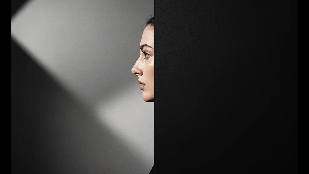
The solution is an active and aggressive use of black flags, V-flats, or any large, non-reflective black surface. This technique, known as “negative fill,” is the art of absorbing light to prevent it from contaminating your shadows. The critical mistake many photographers make is placing flags too close to the subject, which can create harsh, unnatural shadow edges. For general bounce control, position large flags or V-flats at least four feet from your subject, strategically blocking the reflective surfaces of your studio. In uncontrolled locations with white walls, you can even create a “portable black box” around your subject with two or three large flags to reclaim control over your contrast.
Beyond controlling environmental bounce, you must also watch for “self-flagging” issues. The reflection from a model’s white shirt collar or even the natural sheen on their skin can act as a tiny fill light, subtly destroying the ratio under the jawline. Careful wardrobe selection and the use of smaller flags (often called “dots and fingers”) for precision negative fill are the marks of a photographer who has achieved true mastery over shadow. You are no longer just lighting a subject; you are sculpting it by adding and taking away light with purpose.
How to Adjust Ratios for Different Skin Complexions?
A common misconception is that high-contrast lighting ratios cannot be used on darker skin tones. This is fundamentally incorrect. The key is not to abandon dramatic ratios but to adapt your technique to ensure accurate rendering and detail preservation across all complexions. The goal is to properly expose the skin first, then build the ratio from that solid foundation. Professionals often use a spot meter and a Zone System-based workflow for this, placing Caucasian skin on Zone VI and darker African skin on Zone V as their respective anchor points for correct exposure. Once the key light is set to render the skin perfectly, the fill light can be adjusted to create any desired ratio, from soft to dramatic.
The primary challenge with darker complexions is not the shadows, but the management of specular highlights—the bright, mirror-like reflections on the skin. These highlights can “blow out” and lose detail far more easily than on lighter skin. The solution is not to reduce your lighting ratio, but to increase the size and softness of your light source. A large octabox or a diffused umbrella will create larger, softer specular highlights that retain texture and detail. Additionally, using polarizing filters on both your lens and your light sources is a highly effective advanced technique for controlling sheen and saturation without sacrificing the drama of your ratio.
Furthermore, lighting adjustments should be made based on the specific portrait’s objective. For instance, a stronger, more chiseled look for a man’s business portrait might call for a 4:1 to 6:1 ratio to emphasize facial structure. Conversely, a softer 2:1 ratio is often applied to women’s portraits to highlight hair and maintain flattering facial features. The fundamental principle remains: establish a correct base exposure for the specific skin tone, then build your ratio with full confidence that you are preserving detail and texture.
Why Do You Need +1.5 Stops on the Background for Pure White?
Achieving a truly pure, “clipped” white background is a non-negotiable technical standard for high-volume e-commerce and product photography. Merely placing your subject in front of a white seamless paper is not enough; if lit with the same light as your subject, the background will render as a light gray. To achieve a perfect digital white (RGB 255, 255, 255), you must light the background independently and overexpose it relative to the subject. The professional benchmark for this is a precise and measurable quantity.
The rule is simple and mathematical: your background lights must provide an exposure that is +1.5 to +2 stops brighter than the key light on your subject. For example, if your incident meter reads f/8 on the subject, you need to adjust your background lights until your meter reads between f/13 and f/16 when measured at the background. This level of overexposure guarantees that the background will be completely blown out to pure white without any texture or detail. As confirmed by professional e-commerce photography guidelines, an exposure of +1.5 to +2 stops overexposure ensures 255 pure white, which is the industry standard.
This isn’t just an aesthetic choice; it’s a critical workflow optimization. Professional studios report that maintaining this +1.5 stop standard enables the use of automated background removal tools in post-production software like Photoshop. This saves countless hours of tedious manual masking, especially in high-volume shoots where thousands of product images need clean, consistent white backgrounds. By adhering to this simple mathematical rule during the shoot, you drastically increase post-production efficiency and ensure commercial-grade consistency across your entire catalog.
How to Use Black Flags to Deepen Shadows on the Face?
Negative fill is far more than a corrective measure; it is an active, artistic process of carving dimension into a face. As photographer Dawn Wayand eloquently puts it in her guide, ” Negative fill isn’t about making things darker; it’s the active, artistic process of carving shape and dimension into a face by taking light away, connecting directly to the classical art principle of Chiaroscuro.” When you place a black flag near your subject’s face, you are not just creating a shadow; you are sculpting the cheekbones, defining the jawline, and adding a profound sense of three-dimensionality that a simple key-and-fill setup can never achieve on its own.
The effect of your negative fill is determined by the size of the tool and its distance from the subject. A large 4×4′ black solid placed a few feet away will gently increase overall contrast by absorbing ambient bounce. However, for precision sculpting, smaller tools brought in much closer are required. A small piece of black foam core held just out of frame can cast a hard-edged, defined shadow to chisel a jawline. Tiny “dots and fingers” on flexible arms can be positioned with surgical precision to take away a sliver of light under a cheekbone, making it pop. The key is to match the tool to the desired effect.
This table illustrates how different negative fill tools produce distinct shadow characteristics, allowing you to choose the right one for your artistic intent.
| Tool Type | Size | Distance from Subject | Shadow Effect |
|---|---|---|---|
| 4×4′ Black Solid | Large | 3-4 feet | Soft, gentle contrast increase |
| Black Foam Core | Small | 1-2 feet | Hard-edged, defined shadow |
| Black V-Flat | Large vertical | 2-3 feet | Shadow wrap affecting side and front |
| Dots and Fingers | Tiny | 6-12 inches | Precision sculpting of specific features |
Key Takeaways
- Lighting ratios are a mathematical science, not a guessing game; use an incident meter for repeatable, professional results.
- Low-key lighting (high ratios like 4:1+) conveys luxury and exclusivity, while high-key (low ratios like 2:1) signals accessibility.
- Actively subtract light using black flags (negative fill) to control bounce and sculpt deep, dimensional shadows.
How to Choose Studio Strobes That Maintain Color Consistency Across 500 Shots?
The entire system of repeatable, mathematical lighting falls apart if your tools are inconsistent. The final pillar of professional portraiture is choosing studio strobes that deliver unwavering consistency in both power output and color temperature from the first shot to the five-hundredth. While continuous lighting has its uses, for this level of precision, strobes are superior. As photographer Tamara Lackey notes, “Strobe lighting is easier to dial in for white balance and color consistency from shot to shot. All resulting photos remain consistent for easier post production.”
When evaluating professional-grade strobes, the single most important specification to look for is color temperature stability. Over the course of a long shoot, as a strobe heats up and its capacitors are repeatedly discharged, cheaper units will exhibit noticeable shifts in color. This can result in a warm, yellowish cast on shot 400 that wasn’t there on shot 10, creating a post-production nightmare. High-end strobes are engineered with advanced circuitry to minimize this fluctuation.
The professional benchmark you should be looking for is a stated tolerance of ±150K or less, with the best units holding even tighter. According to professional studio lighting standards, a ±75K color temperature tolerance is required for high-end commercial work where exact color reproduction is paramount. Investing in strobes that meet or exceed this standard is not a luxury; it is a fundamental requirement for producing a consistent, investment-grade body of work. This technical specification is the hardware that guarantees your carefully measured lighting ratios are rendered with the same color fidelity, shot after shot.
Now that you are equipped with the science and methodology, the final step is to put this knowledge into practice. Move away from guesswork and commit to a deliberate, measurement-based workflow. Begin by mastering your incident light meter, documenting your setups, and investing in tools that deliver the consistency your art deserves.