Forget everything you know about just ‘displaying’ your art; success in a crowded fair is about psychological warfare for the eyes.
- Visual clutter is your number one enemy, scientifically proven to reduce brain processing efficiency and repel viewers.
- Strategic use of minimalism, color, and lighting aren’t aesthetic choices—they are cognitive triggers to command attention.
Recommendation: Stop thinking like an artist and start thinking like a strategist. Weaponize your space to control the viewer’s experience from 20 feet away to 2 feet away.
You’ve spent months, even years, creating a body of work you’re proud of. You’ve secured a spot at a prestigious art fair, surrounded by hundreds of other talented artists. Yet, as the crowds flow past, you notice a soul-crushing pattern: a brief glance, a moment of disinterest, and they move on. Your booth, your art, has become part of the visual noise. The common advice—”make your booth look nice,” “network,” “show your best work”—is painfully generic. It’s what everyone is doing, and it’s why most artists remain invisible.
This isn’t just bad luck; it’s a failure of strategy. Most artists approach their booth with the mindset of a decorator, when they should be thinking like a cognitive psychologist. The human brain is hardwired with specific biases and processing limits. In a visually saturated environment like an art fair, it actively works to ignore information to prevent overload. Your competition isn’t the artist next to you; it’s the viewer’s over-stimulated brain looking for an excuse to look away.
But what if you could hack this system? What if, instead of politely asking for attention, you could psychologically command it? The key isn’t to add more, but to be more deliberate. It’s about using the principles of visual processing, cognitive load, and attention triggers to make your booth a beacon in the chaos. This is not about aesthetics; it’s about strategic visual warfare.
This guide will deconstruct the psychology of attention in a crowded space. We will move beyond decorating tips and into a tactical framework, exploring how to manipulate composition, color, curation, and lighting to create an undeniable visual statement that stops viewers, holds their focus, and draws them in for the conversation that leads to a sale.
To navigate this strategic approach, we’ve broken down the essential psychological weapons you’ll need to master. The following sections will guide you through each tactic, from understanding the brain’s aversion to clutter to crafting a powerful, unforgettable visual narrative.
Summary: Psychological Tactics for Art Fair Dominance
- Why Do Viewers Ignore 80% of Images with Cluttered Compositions?
- How to Use Complementary Colors to Trigger Immediate Visual Engagement?
- Minimalism vs. Complexity: Which Strategy Holds Attention Longer?
- The Curation Mistake That Exhausts the Viewer Before They Buy
- How to Light Your Art to Maximize Texture and Contrast?
- Why Do 80% of Portfolios Fail to Communicate a Clear Message?
- Edge Placement vs. Thirds Intersection: Which Creates More Unease?
- How to Craft a Visual Statement That Resonates with Art Collectors?
Why Do Viewers Ignore 80% of Images with Cluttered Compositions?
The single greatest sin in an art fair booth is visual clutter. It’s not just “messy”; it’s a direct assault on the brain’s ability to process information. When a viewer’s eyes scan a crowded booth with no clear focal point, their brain doesn’t see a rich collection—it sees cognitive work. This triggers an immediate, subconscious aversion. Research from Princeton University’s Neuroscience Institute reveals that an excess of objects in our visual field actively competes for neural representation, tiring out our cognitive functions. In short, clutter exhausts your potential buyers before they’ve even had a chance to truly see your art.
This isn’t a matter of taste; it’s a matter of science. In a high-stimulus environment, the brain becomes a ruthless filter. It prioritizes what is easy to process. A cluttered composition demands high cognitive load, forcing the brain to work harder to identify individual elements and find a pattern. The result? It gives up. In fact, a recent breakthrough study by Yale neuroscience researchers discovered that an 80% reduction in information flow efficiency occurs when visual clutter is present. Your visually dense booth isn’t showcasing your range; it’s creating a neurological traffic jam that viewers are biologically programmed to avoid.
Your first strategic mission is to declare war on clutter. This means removing anything that doesn’t serve a specific purpose in guiding the viewer’s eye. Every piece of art, every label, every piece of furniture must have a role. By simplifying the visual field, you lower the cognitive barrier to entry, making your booth an oasis of clarity in a desert of noise. This is the foundation upon which all other attention-grabbing tactics are built.
How to Use Complementary Colors to Trigger Immediate Visual Engagement?
Once you’ve cleared the clutter, your next weapon is color. But not just any color—strategic, targeted color used as a biological attention trigger. The human visual system is hardwired to respond with heightened alertness to certain color combinations, particularly complementary pairs like red/green and blue/orange. When these opposing colors are placed next to each other, they create an effect known as “simultaneous contrast” or “color vibration,” which causes the boundary between them to shimmer. This subtle visual disturbance is nearly impossible for the brain to ignore, acting as a powerful magnet for the eye from across a crowded room.
This isn’t about making your booth “colorful.” It’s about precision. Placing a small, intense orange accent against a dominant deep blue background doesn’t just look good; it creates a point of compelling emotional and visual tension. This technique allows you to direct the viewer’s gaze exactly where you want it: towards your most powerful piece. Think of it as a sniper shot of color rather than a shotgun blast. You can use these pairings at key focal points or even in fine patterns near an artwork’s edge to create a vibration that is visible from a distance, luring viewers in for a closer look.
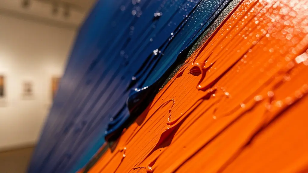
As seen in this example, the interaction between deep blues and vivid oranges creates an almost electric boundary. This isn’t just an aesthetic effect; it’s a neurological event. By layering complementary glazes or strategically placing works that feature these pairs, you enhance the perceptual luminescence of your art. It’s a way to make your work physically stand out and command attention before the viewer has even processed the subject matter. Master artists have long used opposite colors to express power and contrast, and in the competitive context of an art fair, this technique is your unfair advantage.
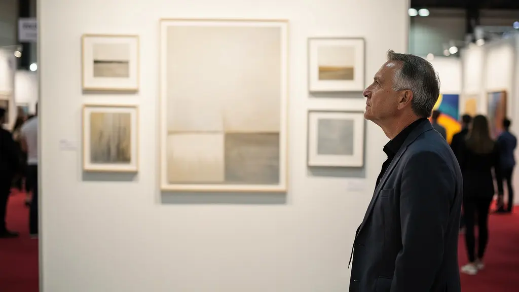
Minimalism vs. Complexity: Which Strategy Holds Attention Longer?
With the battle for the initial glance underway, you face a critical strategic decision: minimalism or complexity? This isn’t a style choice, but a functional one that dictates how and for how long a viewer will engage with your work. A minimalist display—featuring one or two large, bold pieces on a clean wall—is a long-range weapon. It has high “processing fluency,” a term psychologists use to describe the ease with which information is processed. As the Gallery System Exhibition Design Team notes:
A clean, clear composition has high processing fluency, which creates a subtle, positive emotional response, while clutter creates low fluency, which feels jarring and unpleasant.
– Gallery System Exhibition Design Team, Display Techniques for Art Exhibitions
This positive feeling makes a minimalist booth attractive from over 20 feet away, capturing attention in a crowded hall with a single, powerful message. Conversely, a complex display—a “salon-style” hang or a collection of intricately detailed smaller works—is a short-range tool. It requires high cognitive load and is best for holding the attention of viewers who are already engaged and standing within 5-10 feet of your booth. It invites deep exploration and can increase viewing duration from seconds to minutes, but it is ineffective at attracting attention from a distance.
The choice depends entirely on your strategic goal and the nature of your art. The following table breaks down the tactical applications of each approach:
| Display Aspect | Minimalist Approach | Complex Approach | Best Use Case |
|---|---|---|---|
| Capture Distance | Effective from 20+ feet | Effective from 5-10 feet | Minimalist for booth attraction |
| Cognitive Load | Low (easy processing) | High (requires focus) | Minimalist for crowded environments |
| Viewing Duration | 15-30 seconds average | 2-5 minutes average | Complex for engaged viewers |
| Information Retention | Single strong message | Multiple layered meanings | Depends on audience intent |
| Optimal Lighting | Dramatic spotlighting | Even, detailed illumination | Match to artwork style |
Ultimately, the most effective strategy often involves a hybrid model: use a minimalist, high-impact wall to draw viewers in from afar, and then present a more complex, richly detailed section within the booth to reward their closer inspection. This two-stage attack first captures the eye and then engages the mind.
The Curation Mistake That Exhausts the Viewer Before They Buy
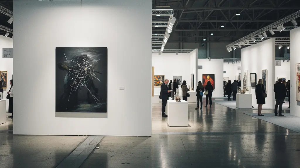
One of the most common and fatal curation mistakes an artist can make is showing too much work. Driven by the fear of not showing “the right piece,” they hang everything they can fit on the walls. This doesn’t increase their chances of a sale; it induces decision fatigue, a state of mental exhaustion that makes potential buyers less likely to make any choice at all. When faced with 20 different artworks of varying sizes and themes, the viewer’s brain is overwhelmed. Instead of carefully considering each piece, it shuts down and moves on to a booth that is easier to comprehend.
The solution is to be a ruthless editor and implement a strategy of hierarchical curation. Your booth is not a storage unit; it’s a narrative. You must guide the viewer’s experience by making deliberate choices for them. The core principle is to choose one or two “hero” pieces per wall. These are your strongest, most representative works and should be given pride of place, often at a larger scale than the surrounding art. These anchor pieces form the core of your story.
All other works in the booth become supporting characters. They should be grouped logically—by theme, color relationship, or conceptual thread—in small “chunks” of no more than 3-5 pieces. This visual grouping helps the brain categorize information, drastically reducing cognitive load. As the image above demonstrates, a clear hierarchy with a dominant focal point creates a sense of order and purpose. It communicates confidence and tells the viewer, “Start here. This is what matters.” This curated approach ensures your collection is truly appreciated, rather than just scanned and dismissed.
How to Light Your Art to Maximize Texture and Contrast?
Lighting is not an afterthought; it is a transformative tool that can make or break your presentation. The difference between amateur and professional display often comes down to strategic lighting. Poor lighting can flatten textures, wash out colors, and create distracting glare. Professional lighting, however, does the opposite: it enhances color accuracy, carves out texture, and creates a sense of drama that attracts the eye. It provides the optimal conditions for a serious collector to evaluate the quality and detail of your work.
One of the most powerful techniques for art with physical texture (like impasto painting or sculpture) is raking light. This involves positioning your light source at a sharp angle (typically 15-30 degrees) relative to the artwork’s surface. This low angle casts micro-shadows across the surface, dramatically revealing every brushstroke, tool mark, and textural detail. It transforms a flat-looking piece into a dynamic, three-dimensional object. This technique is a secret weapon for adding perceived value and sophistication to your work.
Implementing this requires more than just pointing a lamp. It requires a systematic approach to creating a dynamic and controlled lighting environment. The right lighting not only showcases your work but also sets the mood of your entire booth, making it more engaging.
Your Action Plan: Implementing Strategic Lighting
- Assess your work: Identify pieces with significant texture that would benefit most from raking light. Plan to position them where you can control the angle of light.
- Source the right gear: Invest in or rent adjustable track lighting with LED bulbs. LEDs offer excellent color temperature control and energy efficiency, which is crucial for long fair hours.
- Execute the raking angle: Position your track lights so they hit the textured artwork from a steep 15-30 degree angle, either from the side, top, or bottom, to create those critical micro-shadows.
- Set the mood with color temperature: Choose a 3000K warm white light to create an intimate, inviting atmosphere for earthy or traditional work, or a 4000K-5000K cool white for a crisp, clinical, and modern feel.
- Plan for dynamic changes: Use dimmers or adjustable heads to modify the lighting throughout the day. Highlighting different details at different times can make your booth feel more dynamic and re-engage repeat visitors.
Why Do 80% of Portfolios Fail to Communicate a Clear Message?
An artist’s portfolio, and by extension their booth, often fails for one simple reason: a lack of a coherent visual signature. Many artists mistakenly believe that showing a wide variety of styles, subjects, and techniques demonstrates versatility. In reality, it communicates confusion. A collector walking through a fair is trying to build a mental model of who you are as an artist. If your work jumps from abstract expressionism to photorealism to whimsical illustration, you don’t give them a clear identity to latch onto. You become a jack of all trades and a master of none, and therefore, forgettable.
The data backs this up. Exhibition strategy research indicates a 75% improvement in artist recognition when a portfolio and display maintain a consistent visual signature. Consistency doesn’t mean every piece looks the same. It means they share a common DNA—a unique perspective, a recurring theme, a signature color palette, or a distinctive technique. This consistency is the foundation of your artistic brand.
A powerful psychological principle to leverage here is the Serial Position Effect, which states that people disproportionately remember the first and last items in a series. Successful artists weaponize this. They don’t hang their work randomly; they “start with a bold first statement,” placing their most iconic and representative piece at the primary entrance to their booth. They then close the visual loop with another powerful, thematically-linked piece at the exit. This “primacy and recency” strategy frames the entire experience, creating a strong, coherent mental model of the artist’s identity that sticks with the collector long after they’ve left the booth.
Edge Placement vs. Thirds Intersection: Which Creates More Unease?
The composition within your individual artworks is a powerful tool for emotional manipulation. Where you place your subject matter is not an arbitrary decision; it’s a direct line to the viewer’s subconscious. The most common and “safe” compositional tool is the Rule of Thirds, where key elements are placed at the intersection points of a 3×3 grid. This creates high perceptual fluency; it feels balanced, satisfying, and comfortable for the brain to process, encouraging extended and peaceful viewing.
However, comfort is not always the goal. To create drama, suspense, or a feeling of unease that demands attention, you must deliberately break this rule. One of the most effective ways to do this is with edge placement. Placing a key subject right at the edge of the canvas, or even cropping it, creates unresolved visual tension. The viewer’s brain subconsciously wants to see the “rest” of the subject, creating a feeling of anticipation or discomfort. This technique is incredibly effective for themes of marginalization, suspense, or a story that continues outside the frame. It makes the viewer an active participant in completing the narrative, which is far more engaging than passive observation.
The choice between these compositional strategies allows you to control the psychological response to your work. Are you aiming for classic beauty and stability, or dynamic tension and unease? Neither is “better,” but they serve radically different strategic purposes. This table outlines the distinct emotional impact of various placements:
| Placement Strategy | Psychological Effect | Viewer Response | Best Application |
|---|---|---|---|
| Rule of Thirds Intersection | High perceptual fluency, satisfying | Comfortable viewing, extended engagement | Classic beauty, stability themes |
| Edge Placement | Unresolved visual tension | Discomfort, anticipation | Themes of marginalization, suspense |
| Central Placement | Direct confrontation | Immediate focus, quick assessment | Portrait work, singular subjects |
| Off-Balance Placement | Dynamic movement sensation | Eye movement activation | Action, transformation themes |
By understanding and deploying these compositional tactics, you can embed a specific emotional journey directly into the DNA of your art. You are no longer just painting a subject; you are architecting a psychological experience.
Key Takeaways
- Your booth’s primary enemy is visual clutter, which creates negative cognitive load and repels viewers. Clarity is your greatest weapon.
- Minimalism is a long-range attraction tool; complexity is a short-range engagement tool. Use them strategically.
- Curation is not about showing everything; it’s about building a narrative with a clear visual hierarchy to prevent decision fatigue.
How to Craft a Visual Statement That Resonates with Art Collectors?
Ultimately, all these tactics—color, lighting, curation, composition—must converge to serve a single, powerful goal: crafting a visual statement. This statement is the holistic impression your booth leaves on a collector. It’s your unique point of view, your brand, and your value proposition all communicated in a single, non-verbal experience. A weak statement is forgettable; a strong one is magnetic. A key component of a strong statement is demonstrating range without sacrificing identity. As the Museum of Modern Art Advisory puts it in their guide:
Include range demonstration through varied subjects, techniques, or scales that show artistic versatility without compromising coherent identity or diluting artistic impact. Strategic variety demonstrates capability while maintaining focused artistic vision.
– Museum of Modern Art Advisory, Art Fair & Exhibition Strategy Guide
This means your visual statement must be built on a foundation of intellectual scarcity. It must project a unique line of inquiry that sets you apart from the sea of other artists. This is achieved by ensuring absolute consistency between your visual work, your written artist statement, and how you present yourself. It’s about showing a clear trajectory, prioritizing recent work that represents your current artistic development, and creating a compelling narrative flow that ends with your strongest pieces to leave a lasting impression.
Your booth should tell a story that goes beyond the current body of work. It should hint at an ongoing artistic investigation, projecting future value and intellectual depth. This is what truly resonates with serious collectors. They aren’t just buying an object; they are investing in an artist’s vision and career trajectory. Your visual statement is your pitch, proving that you are an artist with a future worth investing in.
By moving from a decorator’s mindset to a strategist’s, you transform your booth from a passive display into an active tool of engagement. Apply these psychological principles not as a checklist, but as a new way of thinking to command attention and make your work unforgettable.