Fragmented photography is not a collage trend; it’s a rebellion against the single, static viewpoint.
- Deconstructing a subject reveals a multi-faceted truth that a “perfect” single shot conceals.
- True mastery lies in controlling the chaos through deliberate composition, not just shattering the image.
Recommendation: Stop capturing reality and start interrogating it. Use fragmentation to force your viewer into an active dialogue with your work.
The single photograph is a beautiful lie. It freezes one-thousandth of a second from a single angle and presents it as the whole story. For experimental photographers, this lie is no longer enough. We crave a language that captures the flux of time, the multiplicity of perspective, and the fractured nature of memory itself. The herd follows trends, churning out Hockney-esque pastiches in Photoshop or using mirror filters for “cool effects.” They mistake the technique for the purpose.
This is a fundamental error. We are not here to decorate. We are here to dissect. The deconstructive approaches of Cubism and fragmentation are not about making pretty collages; they are about dismantling the viewer’s passive gaze. It’s about wielding perceptual authority to show not just what the subject looks like, but the experience of looking at the subject over time.
But if this is our goal, how do we move beyond chaotic noise into profound abstraction? The answer lies in a paradox: we must learn the rules of composition so we can break them with intent. This is not a tutorial on software settings. This is a manifesto on wielding fragmentation as a philosophical tool. We will explore why shattering an image reveals a deeper truth, how to architect this controlled chaos, and how to avoid the common pitfalls that turn a powerful statement into a messy scrapbook page.
To guide you on this path of visual deconstruction, this article is structured to build your understanding from the conceptual ‘why’ to the practical ‘how’. Explore the sections below to master this disruptive art form.
Table of Contents: A Manifesto for Deconstructing the Photographic Frame
- Why Does Breaking the Subject Reveal More Than Showing It Whole?
- How to Composite Multiple Angles into a Cohesive Portrait?
- Physical Mirrors or Digital Layers: Which Method Creates Better Distortion?
- The Composition Error That Turns Abstraction into Messy Noise
- How to Guide the Eye Through a Shattered Image Composition?
- Why Do Leading Lines Fail If They Point to Nowhere?
- How to Match Grain Patterns Between Source Images?
- How to Use Intentional Camera Movement (ICM) for Painterly Effects?
Why Does Breaking the Subject Reveal More Than Showing It Whole?
A “perfect” photograph offers a passive experience. The viewer consumes it whole and moves on. A fragmented image, however, makes a demand: it forces the viewer to become an active participant in the creation of meaning. This isn’t just an artistic theory; it’s rooted in cognitive psychology. The brain is a pattern-matching machine, hardwired to complete the incomplete. This is the Gestalt principle of Closure, a powerful tool in the hands of a disruptive artist.
As Zhang et al. explain in their research on perceptual organization:
The human brain has an inherent ability to fill in gaps to perceive figures as complete wholes, even when parts are missing or fragmented. This phenomenon is known as Closure in psychology, one of the Gestalt laws of perceptual organization.
– Zhang et al., Investigating the Gestalt Principle of Closure in Deep Convolutional Neural Networks
By breaking the subject, you are not destroying it; you are opening a dialogue with the viewer’s subconscious. You present the pieces, and their mind works to assemble the puzzle, creating a stickier, more memorable, and deeply personal connection to the work. It’s the difference between being told a story and being given the clues to uncover it yourself. Recent findings even suggest a threshold for this effect; research from 2024 shows that fragmentation engages active perception up to a 30% occlusion threshold, beyond which the image can degrade into pure noise. Your job as an artist is to dance on that very edge, providing just enough information for the mind to grasp while leaving enough unsaid to ignite the imagination. This is the revealed truth: the whole becomes more profound precisely because it was never shown.
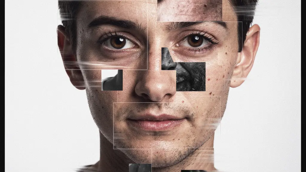
How to Composite Multiple Angles into a Cohesive Portrait?
The goal of a fragmented portrait is not to create a Frankenstein’s monster of features but to construct a “temporal collapse”—a single frame that holds multiple moments and perspectives. To prevent this from descending into chaos, you need an anchor. The “Anchor Feature Technique” is a powerful method for structuring your composition around a single, powerful point of focus, typically the eyes.
The eyes are the traditional seat of identity in a portrait. By keeping them relatively stable while the world fragments around them, you create a powerful point of entry for the viewer. From there, the other fragments can radiate outwards, showing shifts in expression, light, and angle. This creates a micro-narrative of emotion and movement. Here’s a battle plan:
- Start with a foundation of at least 20 photographs of your subject, capturing a wide array of angles and micro-expressions.
- Identify your anchor feature—usually the eyes—and decide on its placement. Using the rule of thirds for this anchor creates an immediate sense of dynamic balance.
- Vary your focal points across shots. Focus on the nearest eye in one frame, the tip of the nose in another, the edge of the hair in a third. This creates pockets of sharpness that guide the eye.
- Move around the subject. Even a slight shift in your position between shots introduces new perspectives that are crucial for the deconstructive effect.
- When compositing, lock down the position of your anchor feature. Arrange the peripheral fragments to radiate outwards or spiral around it, creating a sense of controlled explosion.
- Introduce variety by mixing portrait and landscape orientations for your fragments. This breaks the monotony of a simple grid and adds visual rhythm.
This method allows you to build a cohesive whole from disparate parts. The result is not a shattered image, but a re-constituted one, imbued with the energy of multiple moments in time.

As you can see, the anchor provides a stable point of entry, while the surrounding fragments create a narrative of subtle emotional shifts. This is how you control the chaos.
Physical Mirrors or Digital Layers: Which Method Creates Better Distortion?
The debate between analog and digital is often a false one. The real question is not which is “better,” but which type of distortion serves your artistic intent. Are you seeking the organic, unpredictable chaos of the physical world or the clean, reproducible precision of the digital realm? Your choice of method is a choice of philosophy. The physical approach—using broken mirrors, cut-and-paste collage, or layered prints—embraces serendipity. Each crack in a mirror, each tear in the paper introduces an element of chance that cannot be perfectly replicated. It’s an aesthetic of authentic warping and tangible texture.
Case Study: Lucas Simões’ Hand-Cut Geometries
The work of Brazilian artist Lucas Simões is a testament to the power of physical fragmentation. By hand-cutting and layering up to ten physical photographs of the same portrait, he creates three-dimensional objects. This mixed-media approach demonstrates how physical manipulation introduces authentic texture and dimensionality that digital methods struggle to replicate. Each cut creates unpredictable shadows and depth, turning the photograph from a flat image into a sculptural artifact.
Conversely, digital layering in software like Photoshop offers absolute control. It allows for geometric precision, clean edges, and infinite iteration. This is the methodology of Synthetic Cubism—building up a new form—versus the Analytic Cubism of breaking an existing one down. A comparative analysis in an article on advanced collage techniques highlights this fundamental difference:
| Aspect | Physical Mirrors/Cut & Paste | Digital Layers/Compositing |
|---|---|---|
| Control Level | Serendipitous, unpredictable | Precise, reproducible |
| Aesthetic Quality | Organic warping, authentic chaos | Clean edges, geometric precision |
| Time Investment | Immediate results, no post-processing | Extensive editing time required |
| Artistic Reference | Analytic Cubism (breaking down) | Synthetic Cubism (building up) |
| Best For | One-off artworks, exhibitions | Commercial work, iterations |
Neither is superior. The physical method gives you an artifact; the digital method gives you an image. The former is a performance of destruction and reconstruction, while the latter is an act of meticulous design. Choose the path that aligns with the statement you want to make.
The Composition Error That Turns Abstraction into Messy Noise
The single greatest mistake in fragmented photography is the “homogenization trap.” This occurs when the artist, in an attempt to create a complex image, makes every fragment equal in size, importance, and visual weight. The result is not complexity; it’s an impenetrable wall of visual noise. The viewer’s eye has nowhere to land, nowhere to rest, and no path to follow. The image becomes illegible. Abstraction without structure is just a mess.
To avoid this, you must consciously architect a visual hierarchy. Think like a composer arranging a symphony, not like a machine tiling a floor. You need loud moments and quiet moments, dominant themes and subtle accents. This introduces a rhythm that guides the viewer through the composition. The goal is to create intentional visual dissonance—a clash that resolves into a new kind of harmony—rather than just random noise. The gaps between your fragments are as important as the fragments themselves; this negative space becomes the “unseen geometry” that directs the eye.
This architectural approach ensures that even in a shattered image, there is a clear order. The dominant pieces grab attention, the sub-dominant pieces develop the theme, and the accents add rhythm and detail. Without this hierarchy, you lose your perceptual authority over the viewer’s experience.
Your Action Plan: Escaping the Homogenization Trap
- Establish Hierarchy: Designate 1-2 fragments as dominant, occupying roughly 40% of the visual real estate. These are your anchors.
- Build Support: Create 3-4 sub-dominant elements that take up the next 30% of the composition, supporting the main theme.
- Add Rhythm: Use the remaining 30% for smaller accent fragments that create movement and fill out the composition.
- Unify Tonality: Apply a consistent color grade across all fragments after compositing. This is the glue that holds the disparate pieces together and prevents tonal dissonance.
- Sculpt Negative Space: Pay close attention to the gaps between fragments. These channels should not be random; they must create intentional pathways and directional flow for the eye.
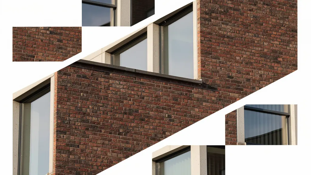
How to Guide the Eye Through a Shattered Image Composition?
In a traditional photograph, leading lines are obvious: a road, a fence, a river. In a fragmented image, the “unseen geometry” is more subtle but infinitely more important. The eye is not guided by lines within the photos, but by the network of vectors created by the edges of the fragments themselves. This is your new set of leading lines. Mastering this is how you retain control and guide the viewer’s journey through your constructed reality.
As artist Diana Nicholette Jeon states, this is about building a new language of connection:
Juxtaposition, layering, fragmentation are collage techniques and are a way to think outside the box and create new metaphors. These convey emotion and dimensions, allowing viewers to create their own narrative.
– Diana Nicholette Jeon, Photography and Collage – Thinking About Photo
The ultimate master of this technique is David Hockney. His “joiners” are not random assortments; they are meticulously mapped visual journeys. They demonstrate how to build a network of pathways that feel both chaotic and inevitable.
Case Study: The Fragment Edge Networks in Hockney’s ‘Pearblossom Highway’
David Hockney’s monumental ‘Pearblossom Highway, 11-18th April 1986, #2’ is composed of over 750 individual photographs. A deep dive into this work on an analysis of his photographic work reveals that it’s a masterclass in guiding the eye. The hard edges where the photos meet form an intricate web of implicit leading lines. The blue of the sky in one fragment aligns with another, the edge of the road sign in a third points toward the horizon in a fourth. Hockney deliberately creates “saccade paths”—natural jump points for the eye—and places focal anchors like road signs at key intersections. He also includes “islands of calm,” larger, less-detailed fragments that give the viewer a place to rest before continuing their visual exploration. It’s a controlled riot of information, perfectly orchestrated.
To implement this, you must think of your composition as a map. The edges of your fragments are the roads. Do they lead to points of interest (anchor features, high-contrast areas)? Or do they lead off the edge of the frame into nothingness? You must intentionally direct this traffic, creating a visual flow that feels dynamic yet purposeful. Your composition should be a conversation, not a shouting match.
Why Do Leading Lines Fail If They Point to Nowhere?
In fragmented work, a leading line that terminates abruptly at a random edge is a “dead end.” It’s a promise of a visual journey that is suddenly and disappointingly broken. An image with too many dead ends feels frustrating and incomplete, not in an intriguing, abstract way, but in a poorly designed one. The viewer’s eye is led down a path only to hit a wall, breaking the flow and shattering engagement. This is a critical failure of perceptual authority.
Every line, whether explicit within a fragment (like a road) or implicit (the edge of a fragment), must have a purpose. It must either connect to another element, point toward your anchor feature, or guide the eye to a deliberate “exit point” off the frame. An exit point feels intentional; it completes a visual thought. A dead end feels like an error. The human brain has a limited capacity for tracking multiple visual paths simultaneously; studies on visual perception show viewers can track a maximum of 6-7 visual elements at once. If most of your leading lines are dead ends, you quickly overwhelm this capacity with unresolved paths, creating cognitive chaos.
Distinguishing exit points from dead ends is a matter of intent. Here’s how to audit your composition:
- The Finger Test: Physically trace each major line with your finger. Does it connect to another fragment in a logical way, or does it just stop?
- Directional Flow: Ensure that lines originating from peripheral fragments generally point *toward* your central anchor feature, not away from it. This creates an inward gravitational pull.
- Saccade Paths: Create deliberate jump points. A line in one fragment might align perfectly with a line in a non-adjacent fragment, encouraging the eye to leap across the negative space.
- Grid Alignment: Use the rule of thirds grid as a guide. Placing the edges of your most important fragments along these lines creates a more natural, harmonious flow.
- Bridge or Redirect: If you identify a dead end, you have two choices: bridge it by adding or adjusting a fragment to continue the line, or redirect it by rotating the problematic fragment so the line points to something meaningful.
A successful fragmented image is a closed circuit of visual energy. A failed one leaks that energy from a dozen unresolved dead ends. Sealing these leaks is what separates the amateur from the artist.
Key Takeaways
- Fragmentation as Philosophy: Deconstruction is not an aesthetic effect, but an intellectual tool to reveal a deeper, multi-faceted truth.
- The Power of the Anchor: A stable anchor feature is essential to ground the composition and provide a point of entry for the viewer amidst the chaos.
- Control Through Hierarchy: Avoid visual noise by establishing a clear hierarchy of dominant, sub-dominant, and accent fragments to guide the eye.
How to Match Grain Patterns Between Source Images?
Grain is the soul of the image. It’s the texture, the atmosphere, the analog fingerprint. In a fragmented composition, inconsistent grain across different pieces can create a jarring and unintentional dissonance. A smooth, digital-looking fragment placed next to a gritty, high-ISO piece screams “Photoshop” and breaks the illusion. Achieving textural cohesion is paramount for a unified artwork.
The most direct method is the “Master Grain Layer” technique. This involves compositing all your fragments as clean, grain-free images first. Once the entire composition is locked, you apply a single, uniform film grain emulation layer over the top of everything. This acts as a textural veneer, binding all the disparate elements together with a consistent pattern. For analog purists, the principle is the same: shoot all your source images on the same film stock and use a consistent development process. Digital shooters should aim to shoot all fragments at the same ISO setting to maintain a consistent noise pattern from the start.
However, once you understand the rule, you can break it with intent. Grain can become a narrative device. You can create a depth illusion by applying heavier, more pronounced grain to fragments you wish to recede into the background, and finer grain to foreground elements. But the truly avant-garde move is to use grain mismatch as a form of “temporal collapse.”
Case Study: Dafna Talmor’s Constructed Landscapes
Photographer Dafna Talmor’s “Constructed Landscapes” series is a brilliant example of intentional grain mismatch as a narrative tool. As explored in a feature by the photography journal Lensculture, Talmor combines negatives from different film stocks, formats, and even different eras. By splicing a grainy, vintage black-and-white landscape with a crisp, modern color negative, she creates a collision of timelines within a single frame. The grain pattern itself becomes a signifier of time. The inconsistency is not an error; it is the entire point of the image, representing the fragmented nature of memory and place.
So, the choice is yours. Do you unify with grain to create a cohesive whole, or do you weaponize its inconsistency to tell a more complex story about time and texture? The first approach is about craft; the second is about concept.
How to Use Intentional Camera Movement (ICM) for Painterly Effects?
Why should your fragments be sharp, static captures of reality? Why not generate fragments that are already abstract, fluid, and painterly? Intentional Camera Movement (ICM) is a radical technique for creating your source material. Instead of deconstructing a sharp image, you are capturing motion and energy itself, then using those blurs and streaks as your compositional building blocks.
This is not about random shaking. ICM is a controlled process. The speed of your shutter and the direction of your movement are your new paintbrushes. A slow shutter speed of 1-2 seconds combined with a smooth, horizontal drag can transform a landscape into a serene, Rothko-like field of color. A faster 1/15s shutter with a frantic, jerky vertical movement can turn a portrait into a frenzied expressionist scream. The emotion is baked directly into the fragment.
Here is a workflow for using ICM as a source for fragmentation:
- Set Shutter for Emotion: Use 1/15s or faster for frantic energy and sharp streaks; use 1/2s to 2s for smooth, serene flow and blended colors.
- Layer Static and Motion: Capture one static, sharp exposure of your subject for reference, then layer it with multiple ICM exposures to create a composite where form emerges from motion.
- Direct the Movement: Use vertical drags to elongate features in a portrait, suggesting majesty or melancholy. Use horizontal drags in a landscape to emphasize expanse and horizon.
- Rotate for Deconstruction: Physically rotating the camera during a long exposure creates spiraling fragments that directly mimic the multi-perspective view of Cubism.
- Match Movement to Emotion: The direction of your movement can carry symbolic weight. An upward drag can feel hopeful and aspiring; a downward motion can feel heavy and somber.

By using ICM, you are no longer just a photographer documenting the world. You become a painter capturing its energy. Your fragments are not pieces of a subject, but pieces of light, time, and emotion. This is the final step in breaking free from the tyranny of the static frame.
The path is now clear. The tools are in your hands. Stop trying to capture a perfect, single-frame replica of the world. It’s a fool’s errand. Instead, embrace the multiplicity of the moment. Shatter the frame, deconstruct perception, and build a more profound, more honest truth from the pieces.