
The secret to a flawlessly realistic photomontage isn’t artistic intuition; it’s a forensic, scientific methodology applied to light, texture, and perspective.
- Flawless composites are built by deconstructing and reverse-engineering the physical properties of each source image, not just blending them.
- Inconsistencies in shadows, grain, and perspective are the primary giveaways that instantly break the illusion of realism.
Recommendation: Adopt a VFX supervisor’s mindset. Treat every element—from light source direction to digital noise patterns—as a piece of evidence that must be perfectly aligned to create a cohesive and believable final image.
You’ve meticulously masked a subject, placed it onto a new background, and yet, something is fundamentally wrong. The image feels disconnected, artificial—a clear fake. This frustration is common among digital artists who aspire to create surreal worlds that fool the human eye. The conventional wisdom focuses on the tools: mastering the pen tool, using layer masks, or applying basic color correction. While these skills are necessary, they are merely the entry point. They address the *what*, but not the critical *why* behind seamless integration.
The distinction between a simple collage and a professional photomontage lies in its commitment to realism. The goal is not just to combine images, but to create a new, singular reality that appears to have been captured by a single camera lens at a single moment in time. This requires moving beyond artistry and adopting the mindset of a VFX supervisor—a mindset rooted in what can be called light forensics and perspective integrity. The most powerful composites are not “painted” into place; they are scientifically reverse-engineered.
The belief that “getting it close enough” will suffice is the primary saboteur of realism. The human eye, and by extension the brain, is an incredibly sophisticated engine for detecting inconsistencies in the physical world. A shadow cast in the wrong direction, a texture that lacks cohesive grain, or a horizon line that defies the laws of physics are all signals that instantly shatter the illusion. True mastery is achieved by treating compositing not as a creative act, but as the meticulous reconstruction of a physically plausible scene.
This guide deconstructs the core technical pillars required to achieve this level of realism. We will dissect the science of shadows, the unification of texture, the critical choice of source material, and the non-negotiable discipline of layer management. By approaching each composite as a forensic investigation, you will learn to build images that are not just visually interesting, but truly and seamlessly believable.
To guide you through this technical deep dive, this article is structured to build your skills from the most critical foundations to the advanced nuances of professional compositing. The following summary outlines the key areas we will dissect to elevate your work from basic montage to photorealistic art.
Table of Contents: A Guide to Flawless Photorealistic Compositing
- Why Does Mismatched Shadow Direction Ruin Your Composite Instantly?
- How to Match Grain Patterns Between Source Images?
- Stock Photos or Custom Shoots: Which Yields Better Montages?
- The Horizon Line Mistake That Gives Away Your Photomontage
- How to Organize 100+ Layers Without Losing Your Sanity?
- How to Composite Multiple Angles into a Cohesive Portrait?
- The Sharpening Error That Creates White Halos on Edges
- Luminosity Masks or Color Range: Which Selects Highlights Better?
Why Does Mismatched Shadow Direction Ruin Your Composite Instantly?
Shadows are the primary language an image uses to describe its light sources. When this language is inconsistent, the entire narrative collapses. A mismatched shadow is not a minor flaw; it is a fundamental contradiction that the viewer’s brain cannot reconcile. An object lit from the top left cannot cast a shadow to its left. This logical break instantly signals that the object does not belong in the scene, creating the dreaded “pasted-on” look. The core principle of light forensics begins here: every shadow must have a plausible origin from a single, unified light environment. As one professional guide notes, when a composite feels wrong, it’s often because it is lacking one of the core fundamentals, with lighting being the most crucial.
To achieve realism, you must analyze the primary light source in your background plate. Identify its direction, quality (hard or soft), and color temperature. Every shadow you create for a new element must slavishly adhere to these three properties. For instance, a hard, direct sun will create shadows with sharp, well-defined edges, while an overcast sky will produce soft, diffuse shadows with gradual falloffs. Ignoring this distinction is a guarantee of failure. The goal is to make the new element’s shadow indistinguishable from the shadows of existing objects in the scene.
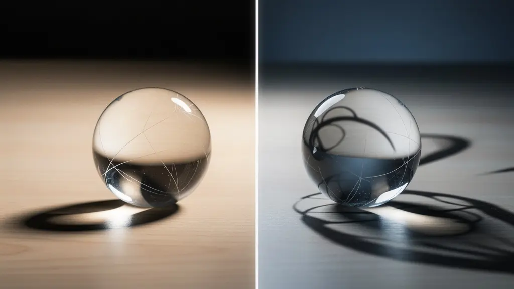
As the visual comparison demonstrates, coherent shadows anchor an object to its environment, while mismatched shadows create an immediate sense of visual dissonance. Beyond direction and softness, the contact shadow is a critical detail. This is the small, dark, and sharply defined shadow that occurs exactly where an object makes contact with a surface. Its absence makes objects appear to float weightlessly, another instant giveaway. Mastering shadows is less about artistic skill and more about meticulous observation and replication of real-world physics.
Action Plan: Your Checklist for Perfect Shadow Matching
- Analyze Light with Threshold Layers: Use Threshold Adjustment Layers as a diagnostic tool. They help you precisely measure the highlight and shadow values in both the subject and background images to ensure they match.
- Work with Similar Lighting: For a higher chance of success, start with source images captured in similar lighting conditions (e.g., both shot outdoors on a sunny day). This simplifies the matching process significantly.
- Sample Shadow Color: Shadows are rarely pure black or grey. Sample the color from existing shadows in the background plate (e.g., the blue/cyan tint of shadows on a clear day) and apply it to your new shadows using a clipped Color Balance layer.
- Build a Contact Shadow: Create a new layer and paint a small, dark shadow exactly where your object touches the ground or another surface. This is a non-negotiable step to ground your subject.
- Match Highlight and Shadow Levels: Use adjustment layers like Curves or Levels, clipped to your subject, to ensure the brightest highlights and darkest shadows on your subject perfectly align with the tonal range of the background environment.
How to Match Grain Patterns Between Source Images?
After light, texture is the next frontier of photorealism. Every digital photo and film scan has a unique textural fingerprint: its grain or noise pattern. When you combine an element from a clean, low-ISO digital camera with a background shot on high-ISO film, the textural mismatch is jarring. One part of the image is smooth and clinical, while the other is organic and grainy. This textural dissonance breaks the illusion that both elements were captured by the same device. The principle of Texture Unification dictates that all image components must share a plausible and consistent grain structure.
The process begins with analysis. You must zoom in to 100% or more on both your source image and your background plate to examine their respective textures. Is the noise fine-grained or blotchy? Is it monochromatic (luminance noise) or filled with colored specks (chrominance noise)? A common mistake is to simply add a generic noise layer over the entire composite. A more refined approach involves adding noise primarily to the new element to make its texture match the most prominent grain pattern in the background. Tools in Photoshop, such as the “Add Noise” filter set to “Monochromatic,” provide a starting point, but a truly professional result often requires more nuanced techniques.
For a precise, data-driven approach, you can even use Photoshop’s Match Color command, which includes an option to use image statistics to show color distribution and can help neutralize and blend textures. Understanding the fundamental difference between digital noise and film grain is also crucial for making the right stylistic choices, as they impart vastly different feelings to the final image.
This technical distinction is vital for achieving a specific look. The following table, based on an analysis of composite photography techniques, breaks down the key differences:
| Characteristic | Digital Noise | Film Grain |
|---|---|---|
| Pattern Type | Random, electronic | Organic, structured |
| Color Component | Chrominance noise (color artifacts) | Luminance-based, monochromatic |
| Distribution | Uniform across image | Varies with exposure zones |
| Visual Feel | Digital, harsh | Organic, nostalgic |
| Best For | Modern digital composites | Vintage or cinematic effects |
Stock Photos or Custom Shoots: Which Yields Better Montages?
The quality of a composite is predetermined by the quality of its ingredients. No amount of Photoshop wizardry can fully compensate for source images with mismatched lighting, perspective, and resolution. This brings up a critical strategic decision: using readily available stock photography versus commissioning a custom photoshoot. While high-quality paid stock imagery exists, it presents significant limitations. The primary issue is a lack of control; you are forced to work with the lighting, angle, and perspective that already exist. This often means your composite begins with a fundamental compromise.
Furthermore, stock photos, by their nature, are generic. They are designed to be widely applicable, which often makes them forgettable and un-impressionable. There’s always the risk that another business is using the same image, diluting its impact. A custom shoot, while requiring a greater upfront investment in time and resources, provides the ultimate level of control. It allows you to establish the lighting environment, camera angle, lens choice, and perspective from the outset, ensuring every element is captured with the final composite in mind. This pre-emptive alignment is the most efficient path to a seamless result.
The value of this control cannot be overstated. When you direct a shoot, you are not just capturing an object; you are capturing it within a system of light and perspective that you have designed to be perfectly consistent. This aligns with the forensic approach to compositing, where every variable is controlled. As the experts at SmartBug Media point out in their analysis of web design imagery:
A professional photographer will account for lighting and composition—things your coworker with an iPhone might not consider. Professionals also can better focus on staging the subject involved so that pictures look less posed and more authentic.
– SmartBug Media, Website Redesign: Stock Imagery vs. Custom Photography
This statement underscores the core advantage: a custom shoot provides you with elements that are already 90% of the way to a perfect composite, minimizing the corrective work needed in post-production. While stock photos can serve a purpose for background elements or textures, for key subjects, a custom shoot is the superior choice for achieving flawless realism.
The Horizon Line Mistake That Gives Away Your Photomontage
If shadows describe the light source, the horizon line and perspective describe the camera’s position in space. Perspective Integrity is the principle that every object in a scene must conform to the same set of geometric rules, as if viewed through a single lens from a single vantage point. The most common and egregious violation of this principle is a mismatched horizon line. If your background was shot from a low angle, its horizon line will be high in the frame. If you then composite a subject shot from a high angle (with a low horizon line), the two worlds will never align. This creates a disorienting, physically impossible image that immediately reads as fake.
To avoid this, you must first identify the horizon line in your background plate. If it’s not visible (e.g., an interior shot), you can deduce it by following converging lines (a technique known as vanishing point analysis). Once established, you must ensure that any new element you introduce is scaled and transformed to respect this same horizon. This means that if you are using a source image of a person, you must know or estimate the camera height at which they were photographed to ensure their eye level aligns correctly with the established horizon.
Beyond the horizon, other factors contribute to perspective integrity. Atmospheric perspective, for instance, dictates that objects farther away from the camera appear to have lower contrast, reduced saturation, and a color shift towards the ambient atmospheric color (typically blue or grey). A distant mountain composited into a scene without this effect will look like a cardboard cutout. Similarly, you must account for lens distortion; an element shot with a wide-angle lens will have different distortion characteristics than a background shot with a telephoto lens, and this mismatch must be corrected.
Ultimately, a successful composite requires you to become a master of angles and horizon lines. You are not just placing an object; you are placing it within a three-dimensional geometric space and must ensure it obeys all of that space’s rules. By planning your composite with real-world perspective in mind, you build a foundation of believability that no amount of color correction can fake.
How to Organize 100+ Layers Without Losing Your Sanity?
A complex photomontage can easily exceed 100 layers, comprising base images, masks, color adjustments, lighting effects, textural overlays, and diagnostic layers. Without a rigorous organizational system, this complexity becomes unmanageable, leading to a chaotic and inefficient workflow. Layer Discipline is not a mere preference; it is a professional necessity for maintaining control, facilitating revisions, and ensuring a non-destructive process. A disorganized layer stack is a recipe for confusion, making it impossible to isolate and adjust specific elements without unintended consequences.
As demonstrated in professional workflows, the first step is always to ensure your workspace is properly configured to minimize confusion. This extends directly to layer organization. Professionals do not simply stack layers randomly. They employ systematic structures, often using a combination of layer groups, color coding, and specific naming conventions. For instance, a “By Function” organization method might group all layers related to color correction into one blue-coded folder, all lighting effects into a yellow-coded folder, and all masks into a red-coded folder. This allows the artist to quickly navigate to the exact adjustment they need to make.
Another powerful technique is the use of Smart Objects. By converting a subject and all its initial adjustment layers into a single Smart Object, you create a self-contained, non-destructive unit. You can then apply global adjustments (like final color grading or grain) to the Smart Object without permanently altering the layers inside. This “atomic” structure is fundamental to a flexible and professional workflow, allowing for infinite tweaks without degrading image quality.
The choice of system depends on project complexity, but adopting one is mandatory. Here is a comparison of common methods used by professionals:
| Organization Method | Best For | Color Code | Typical Layer Count |
|---|---|---|---|
| By Function | Complex composites | Red: Masks, Blue: Color, Yellow: Light | 50-200+ layers |
| By Object | Simple montages | Group by subject | 10-50 layers |
| Atomic Structure | Professional workflow | Base/Elements/Adjustments/Effects | 100+ layers |
| Smart Object Links | Multi-file projects | Purple: External links | Unlimited |
How to Composite Multiple Angles into a Cohesive Portrait?
Compositing multiple angles of the same subject into a single, cohesive portrait—a technique seen in surrealist art and conceptual photography—presents a unique set of challenges. This is not simply about blending; it’s about grafting anatomical or structural elements from different perspectives while maintaining a plausible whole. Success hinges on selecting a “master plate” and then meticulously warping, lighting, and blending the secondary angles to conform to its dominant perspective and lighting scheme.
The first step is choosing the primary angle that will serve as the foundation of the portrait. This master plate dictates the overall lighting and perspective. Once selected, each additional element from a different angle must be treated as a foreign object to be integrated. The Puppet Warp tool becomes invaluable here, allowing for subtle, organic adjustments to the perspective of a secondary element to make it appear as if it belongs to the master plate’s viewpoint. For example, a profile view of a face can be slightly warped to align with a three-quarters view of the head.
Lighting and color consistency are paramount. Each added element must have its lighting and color adjusted to match the master. This involves creating clipped adjustment layers, such as Hue/Saturation, to unify the color palette. You can drag the hue slider until the object’s color perfectly matches, ensuring a harmonious look. The Liquify tool is then used for the final, delicate blending of seams, ensuring that the transition between grafted elements is anatomically believable and smooth. This process is a microcosm of all compositing principles applied with surgical precision.
- Select Your Master Plate: Choose the primary photo that will serve as the base for your portrait. All other elements will be conformed to this image’s perspective and lighting.
- Isolate and Place Secondary Elements: Use a precise selection tool, like the Object Selection Tool, to isolate elements from your other photos and place them on new layers in your master document.
- Adjust Perspective with Puppet Warp: Use the Puppet Warp tool to subtly bend and reshape the secondary elements to match the perspective and curvature of the master plate.
- Unify Lighting and Color: Create clipped Hue/Saturation or Curves adjustment layers for each new element. Adjust hue, saturation, and brightness until the element’s color and light direction seamlessly match the master plate.
- Blend Seams with Liquify and Masks: Use the Liquify tool for fine-tuned anatomical adjustments at the seams. Refine the blend with soft-edged layer masks to create a smooth, invisible transition between the different angles.
The Sharpening Error That Creates White Halos on Edges
Sharpening is the final touch that can bring a composite to life, but it’s also a step where many artists destroy their hard work. The most common and destructive sharpening error is the creation of bright, unnatural “halos” along high-contrast edges. This artifact occurs when a standard sharpening filter, like Unsharp Mask, is applied globally and too aggressively. The filter works by increasing contrast along edges, but when pushed too far, it creates a bright line on one side of the edge and a dark line on the other. This white halo is an immediate sign of digital over-processing and shatters the illusion of a natural photograph.
The core problem with traditional sharpening is that it affects both the texture (fine detail) and the tone (color and brightness) of an image simultaneously. A much more sophisticated and professional technique that avoids this issue is frequency separation. This advanced method involves splitting the image into two separate layers: a high-frequency layer containing only the texture and fine details, and a low-frequency layer containing the color and tones. By doing this, you can apply sharpening exclusively to the high-frequency (texture) layer. This sharpens the actual details of the image without affecting the underlying colors and tones, completely preventing the formation of edge halos.
Case Study: Advanced Sharpening with Frequency Separation
Professional workflows, such as those demonstrated in a detailed tutorial by Photoshop instructor Unmesh Dinda, heavily advocate for techniques that isolate adjustments. The frequency separation method is a prime example. By separating the image into texture (high frequency) and color/tone (low frequency), an artist can apply a sharpening filter (like High Pass) only to the texture layer. The result is a crisp, detailed image that retains natural edge transitions. This technique allows for aggressive sharpening of details like fabric weave or skin pores without creating the tell-tale white halos on silhouettes, preserving the photorealistic quality of the composite.
This method provides a level of control that is impossible with standard filters. It allows you to deliver a sharp, impactful final image that looks crisp and detailed, not artificially processed. Mastering frequency separation or similar selective sharpening techniques is a hallmark of a professional retoucher and a critical skill for any composite artist dedicated to realism.
Key takeaways
- Light Forensics is Non-Negotiable: A composite’s realism is primarily determined by the consistency of its lighting. Every shadow’s direction, softness, and color must correspond to a single, unified light source.
- Perspective Integrity Creates Cohesion: All elements must obey the same geometric rules, defined by a single horizon line and camera viewpoint. Mismatched perspectives instantly break the illusion.
- Selection Purity is Foundational: The quality of your masks determines the quality of your blend. Advanced tools like Luminosity Masks provide the precision needed for seamless edge integration.
Luminosity Masks or Color Range: Which Selects Highlights Better?
The final pillar of a seamless composite is the quality of its selections. A poorly defined edge or a “halo” from a sloppy mask is an unforgivable flaw. While basic tools like the Magic Wand have their place, professional results demand more precise methods for selecting complex areas like highlights, shadows, and midtones. The two primary contenders for this task are the Color Range command and the more advanced technique of Luminosity Masks. The choice between them depends on the required balance of speed and precision.
Selection Purity, the principle of creating a perfect, artifact-free mask, is the ultimate goal. The Color Range command offers a fast and effective way to create a broad selection based on color or tonal values. It is excellent for creating a quick base mask, for instance, by selecting all the highlights in a sky. However, its precision can be limited, and it may require significant manual refinement with a brush to perfect the mask.
Luminosity Masks, on the other hand, offer unparalleled precision. This technique involves creating masks based on the brightness values of the image itself, allowing you to generate hyper-specific selections for different tonal ranges (e.g., “bright highlights,” “dark midtones,” “deep shadows”). While the setup is more complex—often involving creating multiple channels—the resulting masks are perfectly feathered and tailored to the image’s specific tonality. This makes them the superior choice for nuanced adjustments, such as brightening only the brightest highlights without affecting the adjacent midtones.
A professional workflow often combines these tools. The following table, informed by an analysis of professional selection methods, outlines when to use each technique.
| Method | Speed | Precision | Best Use Case |
|---|---|---|---|
| Color Range | Fast | Good for broad selections | Matching Colors in Photoshop quick and easy |
| Luminosity Masks | Slower setup | Unparalleled precision | Nuanced tonal adjustments |
| AI Selection Tools | Instant | Good starting point | Quick base mask creation |
| Calculate Command | Advanced | Hyper-specific | Complex mask combinations |
By adopting this forensic, methodical approach—from analyzing shadows to perfecting selections—you move beyond simple image combination. You become an architect of believable worlds, equipped with the technical discipline to create photomontages that are not just seen, but believed. The next logical step is to apply this rigorous methodology to your next project, starting with a critical analysis of your source material.