
The mastery of specular highlights lies not in their elimination, but in their intentional control to sculpt the final image.
- Small changes in light distance drastically alter exposure due to the Inverse Square Law, impacting highlight intensity.
- The choice between hard and soft light is determined by whether you need to reveal micro-texture (fabric weave) or define macro-form (product curves).
Recommendation: Stop treating highlights as problems to fix. Instead, start designing them as primary elements that define the shape, texture, and emotional impact of your subject.
For any photographer working with still life, products, or fine art, a specular highlight can feel like an unpredictable enemy. That brilliant, sharp reflection on a glossy surface can either define an object’s form beautifully or blow out into a distracting, detail-less void. The common advice is often to “make the light softer” or “use a polariser,” but this only scratches the surface. These approaches treat the highlight as a problem to be minimized or removed entirely.
True mastery, however, comes from a shift in perspective. Instead of fighting reflections, the expert photographer learns to command them. They understand that a highlight is not noise; it is information. It’s a brushstroke of light that can be shaped, sized, and placed with intention to carve out form, reveal intricate texture, and even guide the viewer’s eye. This isn’t about avoiding bright spots; it’s about learning to sculpt with light itself, treating the highlight as a fundamental design element.
This article moves beyond the basics. We will deconstruct the physics of reflection, explore the tools and techniques for precise control, and ultimately reframe your understanding of specular highlights. We will analyze why small adjustments yield dramatic results, how to create luxurious gradients, and how to make technical choices that serve the emotional impact of the final image. By the end, you’ll see highlights not as a challenge, but as your most powerful tool for defining three-dimensional reality on a two-dimensional plane.
For those who prefer a visual format, the following video offers a concise demonstration of how light-to-subject distance fundamentally controls highlight appearance.
To build a complete understanding of light control, this guide is structured to walk you through the core principles, from the physics of light to the art of its application. The following sections will provide a detailed roadmap for mastering specular highlights in your work.
Summary: A Photographer’s Guide to Shaping Light and Reflection
- Why Does Moving Your Light 5 Inches Change the Reflection Entirely?
- How to Create Smooth Gradients on Glossy Surfaces?
- Bare Bulb or Softbox: Which Reveals Texture Better?
- The Exposure Error That Clips Highlights Without Recovery
- How to Shape Catchlights to Make Portraits Look More Alive?
- Silver vs. White Interiors: Which Softbox Lining Suits High-Contrast Art?
- Why Do Crushed Shadows Destroy the Emotional Impact of Your Image?
- What Defines an Investment-Grade Creation in the Current Art Market?
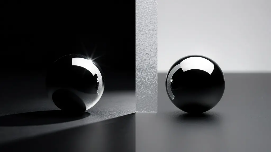
Why Does Moving Your Light 5 Inches Change the Reflection Entirely?
The relationship between a light source and a subject is governed by one of photography’s most fundamental and often misunderstood principles: the Inverse Square Law. This physical law dictates that the intensity of light is inversely proportional to the square of the distance from the source. In practical terms, this means that even a small change in the distance between your light and your subject results in a dramatic change in brightness. Doubling the distance doesn’t halve the light; it quarters it.
This principle is the secret behind why moving a light just a few inches can completely transform a specular highlight. When a light is very close to a subject, the distance from the light to the nearest part of the subject and the farthest part is significant. This creates a rapid “falloff,” where the light is much brighter on the near side than the far side, resulting in a smaller, more intense highlight and a quick transition to shadow. This gives the light a “harder” quality, even from a large source.
As you move the light further away, the relative distance between the near and far sides of the subject becomes negligible compared to the total distance from the light. The light becomes more even and consistent across the object. According to core photography physics, this is not a subtle effect; moving a light from just 6 to 11 inches away can result in a 75% reduction in light intensity at the subject. Understanding this exponential change is the first step toward intentional control, allowing you to precisely dictate the size, intensity, and falloff of your specular highlights simply by adjusting distance.
How to Create Smooth Gradients on Glossy Surfaces?
The hallmark of high-end product photography is often not the sharpness of the highlight, but the smoothness of its gradient. A beautiful, long, and seamless transition from light to dark across a curved, glossy surface screams luxury and professionalism. This effect doesn’t happen by accident or by simply pointing a large softbox at the subject. It is meticulously crafted by controlling the *quality* and *shape* of the light reflection, often using a technique known as “book lighting.”
The core concept is to create a very large, graduated light source that reflects onto the subject. Instead of lighting the object directly, you light a large reflective or diffuse surface, and it’s the reflection of *that surface* that forms the highlight. Imagine you are photographing a wine bottle. The highlight you see is not a reflection of the bulb; it is a reflection of the entire softbox. To create a smooth gradient, you need to make that reflected source appear graduated.
The book lighting technique is a masterclass in this approach. It involves bouncing your primary light source into a large white card or reflector, and then placing a diffusion panel between that reflector and the subject. The light is softened once when it hits the reflector, and a second time as it passes through the diffusion. By adjusting the angles and distances of these three elements—light, reflector, diffusion—you can precisely control the shape and feathering of the gradient that appears on your glossy product. This method gives you ultimate control over the highlight’s terminator line, the edge where light transitions into shadow, turning a simple reflection into a deliberate design element.
Bare Bulb or Softbox: Which Reveals Texture Better?
The universal advice for beginners is to use the largest softbox possible to create soft, flattering light. While this is often true for minimizing unwanted reflections, it is a gross oversimplification. When the goal is to reveal and emphasize texture, a hard, direct light source like a bare bulb is often superior. The choice between hard and soft light is a strategic one, dependent on the type of texture you wish to capture: micro-texture or macro-texture.
Micro-texture refers to fine, surface-level details like the weave of fabric, the grain in wood, or the pores on skin. A hard, specular light source excels at revealing this. Its small, direct rays create tiny, sharp shadows behind each minute imperfection, making the texture pop. A large softbox, by contrast, would wrap light into these crevices, filling the shadows and effectively smoothing over and hiding the very detail you want to showcase.
Macro-texture, on the other hand, refers to the larger forms and shapes of the subject—the folds in a piece of fabric, the curves of a product, or the features of a face. Here, a large, soft light source is king. It wraps around the form, creating gentle, gradual transitions that define the object’s three-dimensional shape without introducing the confusing, chaotic micro-shadows that a hard light would produce on a larger scale. According to the experts at Premium Beat in their article “The Importance of Capturing and Controlling Specularity,” this distinction is critical: bouncing the same light into a silver umbrella creates numerous small, hard reflections that accentuate specularity.
| Light Source | Micro-Texture Effect | Macro-Texture Effect | Best Application |
|---|---|---|---|
| Bare Bulb (Hard Light) | Excellent – Creates sharp, defined shadows | Poor – Too harsh, creates confusion | Wood grain, fabric weave, skin pores |
| Softbox (Soft Light) | Poor – Shadows too soft | Excellent – Defines form naturally | Fabric folds, facial features, product curves |
| Gridded Stripbox | Good – Semi-hard shadows | Good – Controlled direction | Hybrid solution for both texture types |
Ultimately, the choice is not about which light is “better,” but which is appropriate for the story the texture needs to tell. The master photographer has both tools in their arsenal and knows precisely when to deploy each one.
The Exposure Error That Clips Highlights Without Recovery
In the digital photography era, we’re often told “protect the highlights.” This is sound advice, but it’s dangerously incomplete. The most common and fatal mistake isn’t just overexposing a highlight; it’s clipping a single color channel within that highlight. This is an error from which there is no recovery, turning valuable image data into a flat, colorless void.
Your camera’s sensor captures light through red, green, and blue filters. A “blown highlight” occurs when one or more of these channels becomes so saturated with light that it records the maximum possible value (255 on an 8-bit scale). When all three channels clip, you get pure, detail-less white. However, the real trap is when only one channel clips. This is common with highly saturated colors under intense light, like the skin of a red apple or a deep blue flower petal. Your camera’s histogram might look perfectly fine, showing no overall luminance clipping, but deep in the data, the red or blue channel is completely maxed out.
This is a catastrophic data loss. Once a channel is clipped to its maximum value, the camera has no information about the subtle variations in tone or texture that existed in that color. It’s gone forever. When you try to “recover” these highlights in post-production by reducing the exposure, the software has no data to work with. It can only guess, which often results in ugly, unnatural gray patches or bizarre color shifts. A seemingly safe exposure can be deceptive, as even highlights that appear intact can have one channel completely blown out, making true recovery impossible.
The only solution is prevention. This means relying on in-camera tools like “zebra stripes” or a live RGB histogram to monitor not just overall brightness, but the individual color channels. The goal is to “Expose To The Right” (ETTR)—pushing the exposure as bright as possible—without allowing a single one of those three precious channels to clip. This ensures you capture the maximum amount of information, preserving the delicate tonality that defines a beautiful highlight.
How to Shape Catchlights to Make Portraits Look More Alive?
In portraiture, the eyes are everything. And within the eyes, the catchlights—the specular reflections of your light sources—are the spark of life. A portrait with dull, lifeless eyes is just a document; a portrait with carefully shaped, well-placed catchlights is a connection. Shaping these tiny reflections is a subtle art that elevates a good portrait to a great one.
The shape, size, and position of a catchlight are direct reflections of your lighting setup. A large octagonal softbox will create a large, soft, octagonal catchlight. A bare bulb will create a small, sharp point of light. A window will create a large, soft, square catchlight. The shape tells a story about the environment and influences the mood. Round catchlights often feel more natural and energetic, while large, square ones can feel calmer and more serene. Multiple catchlights can add complexity and depth, but can also become distracting if not placed with care.
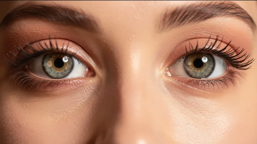
The traditional placement is at the 10 o’clock or 2 o’clock position, mimicking the natural reflection of the sun, but this is merely a starting point. The goal is to use the catchlight to enhance the shape and moisture of the eye, making it appear more three-dimensional and “alive.” A single, dominant catchlight is often best, supported by the subtler reflections and specular highlights that naturally occur on a living human face.
Case Study: Mark Wallace’s Specular Control Demonstration
In a demonstration for CreativeLive, photographer Mark Wallace masterfully illustrates the pervasiveness of specular highlights on the human face. By having a model apply excessive lip gloss, he shows how reflections are not just in the eyes. He systematically points out how light reflects differently from the glossy lips, the catchlights in the eyes, individual strands of hair, and key facial landmarks like the collarbones, jawline, and cheekbones. This exercise serves as a powerful reminder that a portrait photographer isn’t just lighting a face; they are managing a complex series of specular reflections to sculpt form and emotion.
Ultimately, shaping catchlights is about intentionality. It’s about seeing these tiny points of light not as accidents, but as crucial compositional elements that you, the photographer, have complete creative control over.
Silver vs. White Interiors: Which Softbox Lining Suits High-Contrast Art?
When choosing a softbox, photographers often focus on its size and shape, but the interior lining—typically silver or white—plays an equally critical role in defining the quality of light. The choice is not merely aesthetic; it fundamentally alters the contrast, efficiency, and specularity of your light source. For photographers creating high-contrast, dramatic work, this decision is paramount.
A white interior acts as a true diffuser. It creates a very broad, soft, and even source of light. The light bounces around inside the softbox, scattering in all directions before emerging from the front diffusion panel. This results in lower contrast, slower light falloff, and a beautiful “wrapping” quality that is very forgiving. It’s excellent for creating soft, flattering light for beauty work or when you need to minimize texture and shadows.
A silver interior, by contrast, is far more specular. It doesn’t scatter light as much as it reflects it in a more directional manner. While the front diffusion panel still softens the output, the quality of light remains punchier, more efficient, and higher in contrast. As the Premium Beat editorial team explains, a silver lining essentially creates “lots of small, hard reflections of the light.” This can add a “silvery” or crisp texture to skin and surfaces, making each pore or detail stand out with its own tiny specular reflection. This quality makes it ideal for dramatic portraits, edgy fashion, or any artistic application where high contrast and crisp detail are desired.
| Lining Type | Light Quality | Contrast Level | Falloff Speed | Efficiency |
|---|---|---|---|---|
| Silver Interior | Specular, focused, punchy | Higher contrast | Faster falloff | More efficient light output |
| White Interior | Diffuse, broader, softer | Lower contrast | Slower falloff | Less efficient, softer wrap |
For high-contrast art, a silver-lined modifier is often the superior choice. It provides the “snap” and specularity needed to carve out shapes from a dark background and create a dynamic, energetic mood. The white interior, while an excellent tool for soft beauty, can sometimes produce light that is too flat or “milky” for work that relies on deep shadows and crisp highlights.
Why Do Crushed Shadows Destroy the Emotional Impact of Your Image?
In the pursuit of perfect highlights, it’s dangerously easy to neglect the other end of the tonal scale: the shadows. An image is a delicate balance of light and dark, and “crushed” shadows—areas of pure, detail-less black—can be just as destructive to an image’s emotional impact as blown highlights. When shadows lose detail, they cease to be areas of mystery and form, becoming flat, empty holes in the composition.
Good shadow detail provides a sense of volume, depth, and realism. Even in a low-key, high-contrast image, the viewer’s brain expects to see subtle information in the dark areas. This detail anchors the image in reality and provides a crucial reference point that makes the highlights feel brighter and more vibrant by comparison. When you crush the blacks, you sever this connection. The scene becomes graphically harsh and digital, losing the organic feel that gives an image its emotional resonance.
The key is not to eliminate shadows, but to control them. This means ensuring that your darkest areas retain some measure of information, falling into what Ansel Adams defined as Zone II or III in his Zone System—dark, but not pure, featureless black. This is achieved not just in post-processing, but primarily during the shoot. Using a large white reflector to gently bounce light back into the shadows (known as “fill light”) can lift them just enough to preserve detail without compromising the high-contrast mood. The goal is to maintain a foundation of shadow detail upon which the entire tonal structure of the image is built.
Action Plan: Audit for Shadow Detail Preservation
- Points of contact: Use reflectors to bounce light from the main source back into the shadows. A large white reflector placed near the subject provides soft, mellow fill.
- Collecte: During the shoot, establish your shadow detail as a baseline reference point before setting your final highlight brightness.
- Cohérence: Use negative fill (black cards) selectively to add depth, not globally in a way that crushes all shadow information into black.
- Mémorabilité/émotion: Constantly check your camera’s histogram to ensure that the graph is not hard-clipped on the far left (black) side.
- Plan d’intégration: Think in terms of the Zone System. Your most important shadow areas should retain enough information to be considered Zone II or Zone III, not pure black.
Without this foundation, the highlights, no matter how perfectly controlled, float in a meaningless void. A truly impactful image is a symphony of tones, and the shadows are its essential, resonant bassline.
Key Takeaways
- The Inverse Square Law is not a suggestion; it’s a physical law that causes dramatic changes in light intensity with small adjustments in distance.
- The choice between hard and soft light is a strategic decision based on whether you need to render micro-texture (with hard light) or macro-form (with soft light).
- Unrecoverable highlights are most often caused by clipping a single color channel (R, G, or B), an error that a standard luminance histogram might not show.
What Defines an Investment-Grade Creation in the Current Art Market?
In the contemporary art market, what separates a technically proficient photograph from an investment-grade work of art? While subject matter, composition, and conceptual depth are crucial, there is an underlying technical signifier that curators and collectors consistently recognize: the mastery of light. More specifically, it is the intentional, non-accidental control of light, particularly specular highlights, that often elevates an image to the highest level.
A simple documentary photograph might capture a highlight by chance, but a master’s work reveals a highlight that has been designed. It has been shaped, placed, and rendered with absolute precision to serve the image’s purpose. It carves the form of a subject out of darkness, defines the texture of a surface with surgical accuracy, and imparts a specific emotional tone. This level of control demonstrates a profound understanding of the medium that goes far beyond simply operating a camera. It is this visible intentionality that signals a higher order of artistic creation.
Mastery of Light is a key signifier of an investment-grade artist… The intentional, non-accidental control of specular highlights separates a master’s work from a simple documentarian.
– Art Market Analysis, Contemporary Photography Valuation Principles
This is not just an abstract idea; it has a tangible effect on perceived value. For instance, studies and professional experience show that in product photography, professional gradient lighting techniques make products look more luxurious and desirable. This same principle applies to the fine art world. A photograph that demonstrates an effortless command of light feels more valuable because it is palpably more difficult to create. It is the result of deep knowledge, meticulous planning, and flawless execution. It is the signature of an artist who is not merely recording the world, but actively shaping it with light.
Therefore, mastering the control of specular highlights is not just a technical exercise. It is a direct path to creating work with greater emotional impact, deeper sophistication, and ultimately, higher artistic and commercial value. Begin today to implement these strategies and transform your relationship with light.
Frequently Asked Questions About Highlight Control
What is the difference between luminance and color channel clipping?
Luminance clipping affects the overall brightness of an area, turning it pure white. Color channel clipping is more subtle and dangerous; it occurs when one specific color channel (e.g., red) is completely lost to overexposure, even if the overall area doesn’t look fully blown out. This loss of color information is impossible to recover in post-processing and leads to unnatural color shifts.
Should I always use zebra stripes or highlight warnings?
For any serious work involving precise highlight control, these tools are non-negotiable. Professional photographers rely on them in real-time to “ride the edge”—placing highlights as brightly as possible for maximum data capture, right up to the point just below clipping. They remove the guesswork from exposure.
What’s the ETTR principle for highlights?
ETTR, or “Expose To The Right,” is a digital photography strategy that prioritizes highlight data over shadow detail during capture. It means setting your exposure to be as bright as possible without clipping any highlights. This maximizes the signal-to-noise ratio in the sensor’s raw data, leading to a cleaner file with more information, which can then be adjusted in post-processing. It’s the most effective way to ensure you have the highest quality data to work with.