Perspective compression is the visual director’s most potent tool for rewriting spatial reality and dictating emotional tone.
- It’s not the lens itself, but the increased distance from your subject that flattens the Z-axis, making the background appear larger and closer.
- This spatial manipulation can be used to create narrative juxtaposition between distant elements or to abstract the three-dimensional world into graphic patterns.
Recommendation: Instead of focusing on focal length, consciously control the camera-to-subject distance to master the psychological impact of your frame.
As a visual director, your primary canvas is not the scene itself, but the viewer’s perception of it. You are a manipulator of space. The common understanding is that to make a distant mountain, moon, or skyscraper loom large behind a subject, you simply need a long telephoto lens. This is a dangerous oversimplification. This belief frames perspective compression as a technical byproduct, a “trick” a lens performs. The reality is far more potent and deliberate. The booming $2.95 billion telephoto lens market is driven by content creators, but many wield these tools without grasping the true source of their power.
The secret isn’t in the glass itself. The act of compression—of flattening the Z-axis and making foreground and background appear to collide—is born from distance. By moving far away from your subject and using a telephoto lens to reframe them, you fundamentally alter the spatial relationships within the frame. This isn’t just about making things look “closer”; it’s about creating psychological scale, forging visual connections between unrelated objects, and controlling the emotional texture of an image, from claustrophobic density to epic grandeur.
This guide moves beyond the platitudes of lens choice. We will deconstruct the mechanics of spatial manipulation. You will learn not just how to make a background loom, but why it affects the viewer, how it alters character, and how to use it as a precise narrative device. We will explore how to flatten reality into abstract patterns and, crucially, how to avoid the common mistake of creating a composition so compressed that it becomes visually impenetrable. This is your manual for bending space to your will.
This article dissects the art and science of perspective compression, providing a roadmap for cinematographers and photographers to move from technical execution to intentional spatial storytelling. Explore how this powerful technique can transform your visual narrative.
Summary: How to Compress Perspective to Make Distant Backgrounds Loom Large?
- Why Does Compression Make a City Look More Crowded Than It Is?
- How to Bring the Moon Closer to Your Foreground Subject?
- Nose Distortion or Ear Flattening: How Focal Length Changes Faces?
- The Compression Mistake That Removes All Sense of Depth
- How to Use Compression to Show the Relationship Between Two Distant Objects?
- How to Flatten Three Dimensions into Graphic Patterns?
- Why Do Viewers Ignore 80% of Images with Cluttered Compositions?
- How to Manage Depth of Field in Large Format Fine Art Printing?
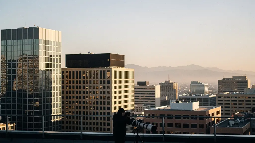
Why Does Compression Make a City Look More Crowded Than It Is?
Perspective compression is a tool of psychological warfare on the senses. In an urban environment, it transforms the perceived space between buildings from meters into millimeters. This effect is not an illusion created by the lens, but a reality dictated by your position as the observer. When you stand far away from a city block and use a telephoto lens to frame a shot, you are minimizing the relative distance differences between near and far buildings. A building 1km away and another 1.2km away appear almost on the same plane. This is the essence of Z-axis flattening.
The result is that distinct architectural layers—facades, windows, balconies, fire escapes—are stacked upon one another, creating a dense, almost impenetrable wall of texture and pattern. The visual cues our brains use to perceive depth, such as diminishing size and atmospheric haze, are radically reduced. This forced proximity generates a powerful feeling of claustrophobia and overwhelming density. The city no longer feels like a space you can move through, but a solid mass that presses in on the viewer.
As you can see in this composition, the space between buildings dissolves. The architecture ceases to be a series of individual structures and becomes a single, complex graphic pattern. For a cinematographer, this is a potent way to visually communicate themes of overpopulation, social pressure, or the suffocating nature of modern life. You are not simply capturing a crowded city; you are actively manufacturing the feeling of being crowded.
How to Bring the Moon Closer to Your Foreground Subject?
The classic “giant moon” shot is the ultimate demonstration of manipulating psychological scale. The moon’s physical size doesn’t change, but its apparent size relative to a foreground subject is entirely under your control. The key, once again, is not the focal length alone but your distance from the subject. As the PhotoPills team, experts in celestial photography, explain, it’s a two-part equation.
One question fellow photographers regularly ask me is how I make the Moon look so big. Well, there are 2 major factors that you should take into consideration: The shooting spot determines the size of the Moon relative to the subject size. So the further away you are from the subject, the bigger the Moon will look like. The focal length determines the Moon size in the frame. And that’s because a telephoto lens compresses perspective.
– PhotoPills Editorial Team, PhotoPills Moon Photography Guide
To make the moon appear enormous behind a person, a building, or a mountain, you must move miles away from that foreground object. From that great distance, you use a super-telephoto lens (400mm, 600mm, or even longer) to frame both the subject and the moon. Because you are so far from your subject, the vast distance to the moon becomes less significant in relative terms. This compression magnifies the background. In one famous shot of the moon behind One World Trade Center, the photographer was 25 miles away, resulting in the moon appearing to have a diameter of 1,236 feet—over two-thirds the height of the skyscraper itself. This is psychological scaling in action, turning a celestial body into a colossal, tangible presence in your narrative.
Here is a simplified workflow for achieving this effect:
- Maximize Distance: Position yourself as far as possible from your foreground subject. This is the single most important factor for increasing the apparent size of the moon.
- Use Super-Telephoto Lenses: Employ focal lengths of 200mm or more, with 400-800mm being ideal for truly dramatic results.
- Plan with Precision: Use an app like PhotoPills or The Photographer’s Ephemeris to plan the exact time and location for perfect alignment.
- Shoot at Twilight: Capture your image during the blue hour (just before sunrise or after sunset) to balance the bright exposure of the moon with the ambient light on your foreground.
Nose Distortion or Ear Flattening: How Focal Length Changes Faces?
Nowhere is the manipulative power of perspective more intimate or character-defining than in portraiture. The choice between a wide-angle and a telephoto lens is not a technical decision; it’s a casting decision. A wide-angle lens (e.g., 24mm or 35mm) requires you to get physically close to your subject. This proximity exaggerates perspective, making features closer to the lens, like the nose, appear larger and more prominent, while features further away, like the ears, diminish. This creates what is often called extension distortion, resulting in a caricature-like effect that can feel dynamic and immersive, but often unflattering.
Conversely, a telephoto lens (e.g., 85mm, 135mm, or 200mm) forces you to step back. From this increased distance, the relative distances between the nose, eyes, and ears become negligible. The face flattens, or compresses. The nose appears smaller, the jawline can seem wider, and the ears become more visible. This is compression flattening, which is generally considered more classically “flattering” as it slims prominent features. However, it also changes our perception of the person’s character.
Scientific Impact of Focal Length on Perception
This isn’t just aesthetic opinion; it’s backed by science. A revealing study published in PLOS ONE explored how focal length affects our judgment of facial traits. Raters were asked to judge photos of the same faces taken with different lenses. The results were clear: the study concluded that photographs taken with a 50mm focal length were perceived as significantly less attractive and dominant compared to those taken with longer focal lengths. Shorter focal lengths produced faces with a smaller facial width-to-height ratio, fundamentally altering the perceived shape and character of the subject.
As a director, this means your lens choice is a narrative one. Do you want your character to feel open, slightly distorted, and intimately close to the audience (wide-angle)? Or do you want them to appear more composed, reserved, perhaps more stoic or powerful, observed from a distance (telephoto)? You are not just choosing a lens; you are choosing a personality.
The Compression Mistake That Removes All Sense of Depth
While perspective compression is a powerful tool, its overuse can lead to a critical compositional failure: the creation of a flat, confusing, and visually uninteresting image. When you compress space too aggressively, you risk eliminating all the visual cues that guide the viewer’s eye through the frame. The foreground, midground, and background collapse into a single plane, leaving the viewer with no sense of scale, distance, or spatial hierarchy. The image becomes a wall of information without a pathway for the eye to follow. This is the ultimate compression mistake—sacrificing dimension entirely.
This often happens when shooting perpendicular to a scene, like a flat wall of mountains or buildings, with no overlapping elements to create layers. The resulting image lacks the tension and dynamism that comes from a well-structured three-dimensional space. The key is to use compression to manipulate depth, not obliterate it. You want to control the relationship between planes, not merge them into one.
To counteract this, you must consciously reintroduce depth cues into your compressed composition. This can be achieved through several techniques that work with the flattened perspective to create a more sophisticated visual experience.
Techniques to Restore Depth in a Compressed Scene:
- Atmospheric Perspective: Utilize natural elements like fog, haze, or mist. These elements are more dense in the distance, creating visible layers and separating the background from the foreground even in a compressed shot.
- Color Theory: Leverage the principle that warm colors (reds, yellows) appear to advance while cool colors (blues, cyans) appear to recede. Compose your shot to place cooler tones in the background.
- Selective Focus: Use a shallower depth of field to render one plane tack sharp while letting others fall slightly out of focus. This immediately establishes a visual hierarchy and guides the eye.
- Inclusion of Foreground Elements: Frame your shot with elements at varying distances in the foreground. Even in a compressed scene, these provide crucial scaling and depth references.
- Angled Shooting: Avoid shooting perfectly perpendicular to your subject. Shooting at a slight angle creates diagonal lines that lead the eye through the flattened space, restoring a sense of dynamism.
How to Use Compression to Show the Relationship Between Two Distant Objects?
The most profound use of perspective compression is for narrative. It allows you to create a visual juxtaposition between two or more elements that are physically separated by vast distances, forging a new relationship between them that exists only within your frame. This is where the visual director moves from observer to author, making a statement by forcing two ideas into a single visual sentence. You can place a child playing in the foreground and, through compression, make a distant industrial power plant loom directly behind them, creating an immediate story of innocence versus industry, nature versus machine.
This technique relies on the viewer’s understanding of reality. We know the power plant isn’t actually touching the playground, but by visually equating their scale, you create a powerful metaphor. The space between them is annihilated to serve the story. The physical distance is irrelevant; the narrative proximity is everything.
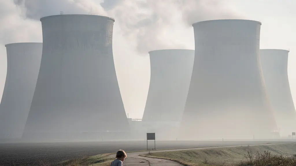
This image demonstrates the principle perfectly. The small human figure is visually linked to the massive industrial structures. The compression creates a scale relationship that generates emotional tension and prompts the viewer to ask questions about the connection between these two elements.
Narrative Juxtaposition: The “Death Star” Moon
Photographer Daniel López took this concept to an extreme level in a famous video of a moonset behind a volcano. By setting up his ultra-telephoto lens about 10 miles (16km) away from the volcano, he was able to capture the moon setting in real-time. The immense compression, combined with the tiny silhouettes of people on the volcano’s ridge, transforms the scene. The moon no longer looks like a distant, passive orb. It becomes a colossal, apocalyptic sphere that seems to be colliding with the Earth, creating a powerful and unsettling narrative straight out of science fiction.
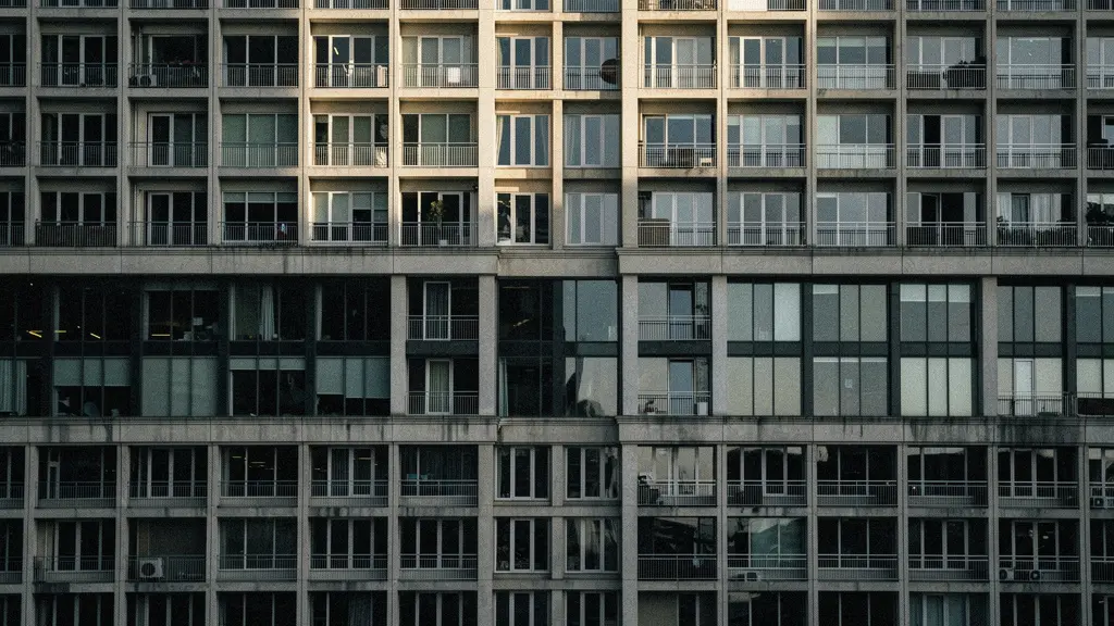
How to Flatten Three Dimensions into Graphic Patterns?
Taken to its logical extreme, perspective compression becomes a tool for abstraction. It allows you to strip away the three-dimensional identity of a scene and transform it into a two-dimensional study of line, shape, texture, and color. By using a long telephoto lens and positioning yourself perpendicular to a subject with repeating elements—such as the windows on a skyscraper, rows of trees in an orchard, or waves on the sea—you can effectively erase the Z-axis. The world becomes a flat canvas.
This is a deliberate move away from literal representation and towards graphic abstraction. The subject is no longer “a building” but a grid of repeating rectangles and shadows. The subject is no longer “the ocean” but a tapestry of undulating lines and light. In this mode, you are not documenting reality; you are mining it for its underlying patterns. The goal is to create an image that is compelling on a purely formal level, where the interplay of shapes is the primary point of interest.
This requires a different way of seeing. You must learn to scan your environment not for subjects, but for patterns. It’s a hunt for repetition, rhythm, and texture that can be isolated and flattened into a compelling composition. This is less about storytelling in a narrative sense and more about creating a powerful, visceral visual statement.
Your Action Plan: Abstracting Reality with Compression
- Identify Pattern-Rich Scenes: Start with a standard lens to scan your environment for areas with strong repeating elements, such as architecture, agriculture, or natural formations.
- Isolate with Telephoto: Switch to a lens of 200mm or more to isolate a small section of the pattern, removing all distracting contextual elements from the frame.
- Achieve Maximum Flattening: Position your camera as perpendicular as possible to the surface of the pattern. Any angle will reintroduce a sense of perspective that works against total abstraction.
- Ensure Edge-to-Edge Sharpness: Use a mid-range aperture like f/8 to f/11. This ensures that the entire compressed plane is in sharp focus, reinforcing the two-dimensional, graphic quality of the image.
- Enhance in Post-Production: Use processing techniques like increasing micro-contrast (clarity or texture) to further emphasize the definition and rhythm of the pattern.
Key Takeaways
- Perspective compression is a function of distance-to-subject, not just focal length; get far away to make backgrounds loom.
- This technique can be used narratively to create visual juxtaposition, or graphically to abstract scenes into patterns.
- To avoid flat, uninteresting images, consciously reintroduce depth cues like atmospheric perspective, selective focus, or color theory.
Why Do Viewers Ignore 80% of Images with Cluttered Compositions?
The human brain is wired for efficiency. When presented with a visual scene, it seeks pathways, hierarchy, and points of interest. A traditional wide-angle composition with clear leading lines invites the eye to explore, moving from foreground to background along a defined path. Engagement is high because the brain is actively participating in a journey through the image. However, a highly compressed, pattern-heavy composition fundamentally changes this cognitive process. The title’s “80%” figure, while illustrative, points to a real phenomenon: viewers can quickly disengage from compositions that feel like impenetrable visual noise.
When depth is flattened, the eye no longer has a path to follow. Instead, it scans the frame more like a block of text, jumping between points of high contrast or breaks in the pattern. If there is no clear focal point or resting place, the brain can become overwhelmed or bored, leading to quick disengagement. The image is recognized as “cluttered” and dismissed. As a director, your challenge is to use compression to create compelling density without creating cognitive overload. You must manage visual attention within the flattened space.
This means that even within an abstract pattern, you must provide an anchor for the eye. This could be a single element that breaks the repetition, a subtle shift in color or light, or a clear focal point established through selective focus. The following table breaks down how eye movement changes with composition, based on insights from visual analysis.
| Composition Type | Eye Movement Pattern | Attention Focus | Viewer Engagement |
|---|---|---|---|
| Wide-angle (24-35mm) | Following paths, exploring depth | Multiple interest points | Extended viewing time |
| Compressed telephoto (200mm+) | Scanning like text, jumping between contrasts | Pattern breaks, single elements | Quick pattern recognition |
| Normal (50mm) | Natural exploration | Subject-focused | Moderate engagement |
How to Manage Depth of Field in Large Format Fine Art Printing?
Translating a compressed digital image into a physical, large-format fine art print introduces a final layer of complexity. On screen, the image is a source of light. As a print, it is a surface reflecting light, and the viewer’s physical interaction with it changes everything. The management of depth of field (DoF), both in-camera and in post-production, becomes critical to the print’s success. A highly compressed scene can often benefit from a deep DoF to render all the stacked layers with clarity, but this can also enhance the “flatness” problem.
As photographer Toshiki Nakanishi notes when discussing the challenge of capturing a sharp moon and a dim foreground, there is a delicate balance between aperture, shutter speed, and ISO to achieve the desired sharpness without introducing motion blur. This balance is fundamental to a clean print.
To capture the details in the moon along with the dim twilight atmosphere, I narrowed the aperture to f/11 and reduced exposure compensation to EV -1.3. This will cause the shutter speed to slow, so increase the ISO speed and use a sturdy tripod. You don’t want to shoot with a shutter speed that is too slow, not just because of camera shake but also because of the moon’s natural movement!
– Toshiki Nakanishi, Canon Asia – Creating the Illusion of a Larger Moon
Once captured, the preparation for printing involves creating a hierarchy of depth through subtle, targeted adjustments. This is not about faking depth, but about guiding the viewer’s eye across the physical object. Techniques like dodging and burning can be used to subtly darken background elements and brighten foreground ones, creating a sense of separation. Selective sharpening, applied more heavily to the primary subject and less to the background, also creates a powerful perceptual cue. The choice of paper itself is a final tool; a heavily textured matte paper can enhance the graphic quality of an abstract compressed pattern, while a smoother paper might be better for a scene where you’ve worked to restore a sense of dimensionality.
Print Preparation Checklist for Compressed Images:
- Apply Targeted Dodging and Burning: Subtly darken receding planes and lighten advancing ones to restore a sense of dimensional depth.
- Enhance Micro-Contrast Selectively: Apply clarity or texture adjustments only to the key focal planes to make them pop.
- Apply Selective Sharpening: Create a depth hierarchy by applying more sharpening to your main subject and progressively less to elements further in the background.
- Choose Paper Wisely: Use textured matte papers to emphasize graphic patterns or smoother satin/lustre papers to preserve subtle dimensional details.
- Consider Viewing Distance: The impact of compression changes with how close the viewer stands to the print. Make test prints to find the optimal size for your intended effect.
Your frame is a canvas where space is relative. Start manipulating the Z-axis to tell more powerful stories, moving from passive observer to active visual author.