Many photographers believe compelling abstract images require exotic subjects. The truth is the opposite: the most powerful abstract art is found by deconstructing the familiar world around you. This guide isn’t about finding new things to shoot, but about training your eye to see the scenes you walk past every day as a collection of pure color, texture, and form. It’s a fundamental shift in perception from seeing objects to seeing compositions.
As photographers, we are trained to document. We frame the mountain, capture the portrait, and record the event. Our cameras are tools for capturing a recognizable reality. But what happens when the goal is not to show what something *is*, but to explore the feelings, textures, and shapes that lie hidden within it? This is the territory of abstract photography, a discipline that often seems inaccessible, reserved for artists who find bizarre subjects in far-off places. We look at a weathered wall, a puddle of oil, or a tangle of wires and see just that—a wall, a puddle, a mess.
The common advice—”look for patterns” or “get in close”—only scratches the surface. These are actions, not a mindset. The real challenge is learning how to perform a kind of visual deconstruction, to intentionally break down the familiar and ignore its function in order to see its graphic potential. This isn’t about finding abstract subjects; it’s about developing an abstract way of seeing everything. It’s the art of capturing an image that asks a question rather than stating a fact.
This article will guide you through that perceptual shift. We won’t just cover techniques; we will explore the ‘why’ behind them, from the power of proximity and intentional movement to the critical role of artistic intent. You will learn how to turn the mundane into the mysterious and develop a richer, more personal photographic voice by seeing the world not as a collection of things, but as an infinite canvas of abstract possibilities.
To guide you on this exploratory journey, this article breaks down the core concepts and techniques for seeing and capturing the abstract in the world around you. The following sections will provide a roadmap for transforming your perception and your photography.
Summary: Unlocking the Abstract in the Ordinary
- Why Does Getting Closer Often Create a Stronger Abstract Image?
- How to Use Intentional Camera Movement (ICM) for Painterly Effects?
- Color Fields or Textural Gradients: Which Anchor an Abstract Series?
- The “Accidental” Mistake: Distinguishing Art from Blurry Snapshots
- How to Determine the Minimum Print Size for Abstract Impact?
- Why Does Breaking the Subject Reveal More Than Showing It Whole?
- How to Flatten Three Dimensions into Graphic Patterns?
- Black and White or Color: Which Best Serves Your Emotional Intent?
Why Does Getting Closer Often Create a Stronger Abstract Image?
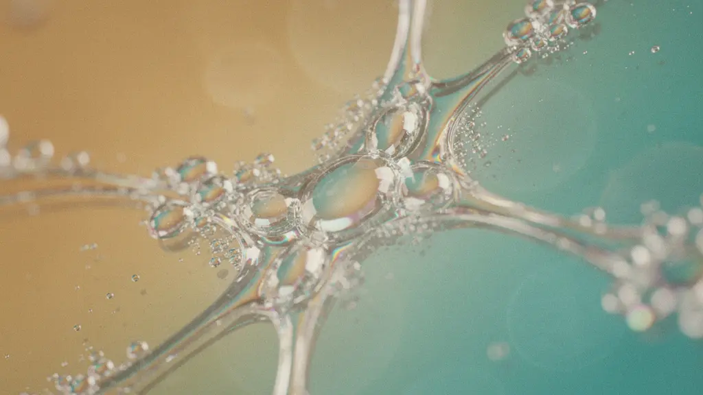
The first and most direct step toward abstraction is to eliminate context. When you photograph a rusty car door from a distance, the subject is “a rusty car door.” But as you move closer, a transformation occurs. The handle, the window, the shape of the door itself—all these identifiers fall away. You are left with a landscape of peeling paint, a river of rust, and a universe of texture. Getting closer is not just a physical act; it is an act of visual deconstruction.
By filling the entire frame with a small section of a larger object, you force the viewer to engage with the image on its own terms, as a composition of color, line, and form. The question “What is it?” becomes irrelevant, replaced by “How does it make me feel?” This is the essence of subject-less photography. You are isolating a fragment of reality so completely that it becomes its own reality. The goal is to move past recognition and straight to emotional resonance.
This technique requires you to retrain your eyes. Instead of scanning for interesting objects, you must scan for interesting surfaces. Look at the cracked pavement, the grain of a wooden bench, the condensation on a glass window. These are your new subjects. Using a very shallow depth of field (a wide aperture like f/2.8) can further enhance this by blurring all but a sliver of texture, creating a beautiful sense of mystery and focus that elevates a simple detail into a compelling abstract statement.
How to Use Intentional Camera Movement (ICM) for Painterly Effects?
If getting closer is about deconstructing a static subject, Intentional Camera Movement (ICM) is about deconstructing a subject through motion. Here, you abandon the quest for sharpness and instead use your camera as a paintbrush. By deliberately moving the camera during a longer exposure (typically between 1/15s and 1 second), you can smear light, color, and form into something entirely new and impressionistic. A line of trees becomes a series of vertical streaks, and city lights at night transform into fluid ribbons of color.
This technique is a partnership between you, your camera, and the environment. The result is never entirely predictable, which is part of its magic. However, it is far from random. The direction, speed, and rhythm of your movement all have a profound impact on the final image. A smooth, horizontal pan across a seascape will create a sense of serenity, while a quick, jagged shake can convey energy and chaos. As fine art photographer Charles Needle has demonstrated through his work and workshops, mastering ICM is about learning to translate physical gestures into emotional expressions.
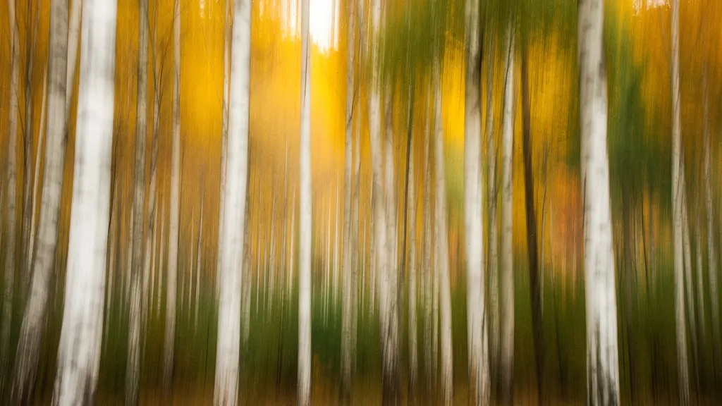
As the image above illustrates, a simple vertical movement in a forest can transform recognizable trees into an ethereal blend of light and color, evoking the feeling of the woods rather than documenting their reality. Each type of movement unlocks a different emotional palette, as detailed in the following guide to ICM techniques.
| Movement Type | Shutter Speed | Emotional Effect | Best Subject |
|---|---|---|---|
| Horizontal Pan | 1/8 – 1/4 sec | Serenity, calm | Horizons, treelines |
| Vertical Shake | 1/10 – 1/5 sec | Energy, dynamism | Trees, buildings |
| Circular Swirl | 1/4 – 1/2 sec | Disorientation, mystery | Flowers, lights |
| Zoom Burst | 1/2 – 1 sec | Explosive, dramatic | Central subjects |
Color Fields or Textural Gradients: Which Anchor an Abstract Series?
As you build a body of abstract work, you’ll notice two dominant themes emerging: images led by color and images led by texture. Understanding the difference is key to creating a cohesive and impactful series. Are you trying to envelop the viewer in a singular emotion through a vast swath of color, or are you guiding their eye on a journey across a tactile surface? This choice defines the core of your abstract project.
Color Fields are about mood. Think of the work of painter Mark Rothko. These images use large areas of uniform or subtly shifting color to evoke a powerful, often overwhelming, emotional response. A photograph of a blue-painted wall, so close that no other detail is visible, isn’t about a wall anymore—it’s about the feeling of “blueness.” This approach is most effective when you want to communicate a single, potent idea: tranquility, passion, coldness, or joy.
Textural Gradients, on the other hand, are about the journey. These images are anchored by surface details, patterns, and perceived tactile qualities. A photo that transitions from smooth, worn stone to rough, cracked concrete invites the viewer’s eye to travel and explore. It’s a narrative told through touch, even though it’s a visual medium. This is best for creating a sense of history, complexity, or organic growth. Of course, the most sophisticated work often combines both, using subtle texture to add depth to a color field or adding a splash of color to an otherwise textural image to create a focal point.
The most important parts of a photo often are the ‘intangibles’ – things like composition, mood, and emotion. Your subject certainly affects these variables. That underlying mood of your photo is somewhat malleable, not irreversibly tied to one particular subject or another.
– Photography Life Editorial, 35 Abstract Photography Tips and Ideas
The “Accidental” Mistake: Distinguishing Art from Blurry Snapshots
Every photographer has a folder of “mistakes”—blurry, out-of-focus, or strangely composed shots. In abstract photography, the line between a happy accident and a simple error can seem thin. One artist recalls how accidentally bumping his tripod mid-exposure led to an obsession with abstract work. The resulting swirl of colors was a mistake, but recognizing its potential and choosing to present it was an artistic act. So, what separates an intentional piece of abstract art from a blurry snapshot?
The answer is intent. Even if the initial discovery is accidental, the decision to pursue, refine, and present it is a deliberate choice. An abstract artist doesn’t just take one blurry photo; they take a hundred, experimenting with shutter speeds, movements, and subjects to control the chaos and achieve a specific emotional result. A blurry photo of a cat is a mistake. An intentionally blurred image that uses motion and form to convey the feeling of feline grace and speed is art.
This intentionality is the invisible framework that holds an abstract image together. It is evident in the composition, which often follows classical rules (like the rule of thirds) even in the absence of a clear subject. It is present in the editing, where color and contrast are manipulated to enhance a specific mood. And it is most obvious in a series, where a single image can be seen not as a one-off fluke, but as part of a deliberate exploration of a theme. True abstract photography is a controlled experiment, not a random event.
Your Action Plan: The Intentionality Checklist
- Points of contact: Can you identify the specific elements (color, line, texture) that make the image compelling, independent of its subject?
- Collecte: Can you recreate a similar effect deliberately, proving it’s not a one-time accident?
- Cohérence: Does the image follow foundational principles of composition, even if it’s abstract?
- Mémorabilité/émotion: Does the image successfully evoke the specific feeling or response you intended?
- Plan d’intégration: Review your camera settings. Were they chosen purposefully to achieve this effect, or were they on auto?
How to Determine the Minimum Print Size for Abstract Impact?
An abstract photograph doesn’t just exist on a screen; it’s an object that occupies physical space. The decision of how large to print an image is not merely technical—it’s a critical part of the artistic statement. The impact of an abstract piece is profoundly tied to its scale. A small, intimate print invites the viewer to come close and inspect its details, while a massive, wall-sized print envelops them in its color and mood.
Consider the nature of your image. Is it a macro shot filled with intricate, jewel-like textures? A small 8×10 print might be perfect, encouraging an intimate viewing experience where the viewer can appreciate the fine details up close. Conversely, is your image a sweeping color field or an immersive ICM landscape? This kind of work often demands scale. Printed at 30×40 inches or larger, it ceases to be a picture on a wall and becomes an environment, altering the atmosphere of the entire room.
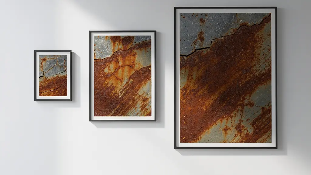
As the gallery view above demonstrates, the same image can offer vastly different experiences depending on its size. There is no single “right” size; the choice depends on what you want the viewer to feel. Do you want them to hold your art in their hands or get lost inside it? As a helpful guide, a recent analysis of print viewing experiences provides a framework for this decision.
| Print Size | Viewing Experience | Best For | Ideal Viewing Distance |
|---|---|---|---|
| 8×10 inches | Intimate, jewel-like | Macro details, textures | 12-18 inches |
| 16×20 inches | Balanced presence | Color fields, patterns | 2-3 feet |
| 30×40 inches | Immersive, environmental | Landscapes, large abstracts | 4-6 feet |
| 40+ inches | Gallery statement | Exhibition pieces | 6-10 feet |
Why Does Breaking the Subject Reveal More Than Showing It Whole?
Our brains are wired for recognition. When we see a complete object—a tree, a face, a bicycle—we instantly label it and move on. The cognitive process is efficient but shallow. We see the ‘what’, but we often miss the ‘how’. Abstract photography’s greatest power lies in its ability to short-circuit this process. By “breaking” the subject—showing only a fragment, an odd angle, or a blurred motion—you disrupt the brain’s automatic labeling system.
This disruption is incredibly valuable. It forces the viewer to slow down and engage with the image on a purely sensory level. Unable to name what they’re seeing, they are compelled to truly *look*. They notice the graceful curve they would have missed in the whole bicycle, the rough texture they would have ignored on the full tree, and the interplay of light and shadow they wouldn’t have seen on the recognizable face. You are essentially using visual metaphors, where a simple curve can represent grace or a rough texture can symbolize resilience.
At first glance, abstract photos may seem a little confusing and cluttered. However, once you understand what ‘abstraction’ does, you’ll realize that a lot of subtraction actually goes into the process. Distracting and useless elements that don’t trigger emotions are eliminated from the image.
– Adorama Learning Center
This act of subtraction is not a denial of reality, but a deeper inquiry into it. By removing the distracting whole, you reveal the essential qualities that give an object its character. You are not showing less of the subject; you are showing a more concentrated, potent version of its essence. It’s a paradox: by breaking the thing, you often reveal its truest self.
Key takeaways
- Intentionality is the key factor that separates abstract art from a simple mistake; it’s about deliberate choice and control.
- The power of abstract photography lies in deconstructing familiar subjects to reveal their core elements of color, form, and texture.
- Techniques like getting closer, using ICM, and flattening perspective are tools for disrupting recognition and forcing a deeper, sensory engagement with the image.
How to Flatten Three Dimensions into Graphic Patterns?
The world we perceive is three-dimensional, full of depth, perspective, and volume. One of the most powerful techniques in abstract photography is to intentionally collapse this depth, transforming a 3D scene into a flat, 2D graphic pattern. This is a profound shift in seeing, where you stop looking at objects and start looking for shapes. A cityscape becomes a grid of rectangles, a staircase becomes a series of parallel lines, and a shadow becomes a bold, solid shape.
There are several ways to achieve this flattening effect. One is through lens compression. Using a long telephoto lens (200mm or more) from a distance compresses the space between near and far objects, making them appear stacked on top of one another. Distant buildings, foreground trees, and background mountains can all be squeezed into a single, dense graphic plane. This technique is fantastic for finding compositions in complex urban or natural landscapes.
Another powerful method is what can be called the perpendicular gaze. This involves positioning your camera perfectly parallel to a flat surface—shooting a decorated wall straight-on or pointing your camera directly down at a patterned floor. This eliminates all perspective lines that would normally give clues about depth, immediately turning the subject into a graphic design. Manhole covers, brick walls, and tiled floors are perfect subjects for this approach. Finally, you can use harsh, direct light to make shadows the primary subject. In strong sunlight, the 3D object casting the shadow becomes secondary to the crisp, two-dimensional shape it projects onto the ground.
Black and White or Color: Which Best Serves Your Emotional Intent?
The final, fundamental choice in shaping your abstract image is the use of color. Is color the hero of your story, or is it a distraction from the true subject: form and light? Your answer will determine whether you present the work in vibrant color or dramatic black and white. This is not a technical setting, but a core emotional decision.
As photographer Bruce Lovelace notes, “The easiest way to make a macro image into an abstract macro photo is to convert it to black and white.” Removing color is a powerful act of abstraction. It instantly strips away a layer of reality and forces the viewer to focus on the fundamental building blocks of the image: texture, shape, and the interplay between light and shadow. A black and white abstract is often about drama, timelessness, and the purity of form. If your image is compelling because of its strong lines, bold shapes, or rich textures, color might be holding it back.
On the other hand, sometimes color IS the subject. An image may have very little textural or compositional interest, but it might sing because of the way a vibrant red vibrates against a cool blue. In this case, converting to black and white would destroy the entire point of the photograph. Color abstracts are about harmony, energy, and mood. They tap into the deep psychological associations we have with different hues—the passion of red, the calm of blue, the energy of yellow. The choice is a diagnostic one: look at your image and ask what makes it strong. If you take away the color, does it get better or worse?
| Aspect | Black & White (Tonal) | Color (Chromatic) |
|---|---|---|
| Primary Focus | Light/dark relationships, texture | Hue relationships, color harmony |
| Best When | Form is paramount, color distracts | Color IS the subject |
| Emotional Range | Drama, timelessness, simplicity | Vibrancy, energy, mood variation |
| Technical Consideration | Focus on contrast and tonal range | Color temperature, saturation control |
Embracing abstract photography is ultimately an invitation to play and to see the world with fresh eyes. Start today by choosing one small area—your desk, a corner of your garden, a single city block—and challenge yourself to find five abstract compositions within it. Don’t worry about perfection; focus on the act of seeing.