Your flash-lit photos look artificial because you’re treating light as a problem to be corrected, not a story to be told.
- Mastering the balance isn’t about rigid formulas, but about observing the existing narrative of ambient light within a space.
- Shutter speed controls the background’s voice, while gels and positioning make your flash a believable character in the scene.
Recommendation: Stop fighting light and start conducting it. Use these principles to orchestrate a seamless visual conversation between your light sources.
There’s a look every photographer dreads: the “flashy” photo. It’s the image where the subject is perfectly exposed but seems cut out and pasted onto a background that feels distant and disconnected. The space is sterile, the atmosphere is gone, and the final result, while technically lit, feels emotionally flat and undeniably artificial. It’s a common frustration for interior and environmental photographers trying to capture a space’s true character.
The standard advice often revolves around a set of mechanical rules: “drag the shutter,” “gel your flash to match,” “aperture for flash, shutter for ambient.” While these technical pillars are essential, following them by rote can still produce an image that lacks soul. The fundamental error isn’t in the technique, but in the philosophy. We are taught to “correct” or “overpower” ambient light, treating it as an obstacle to a clean exposure.
But what if the key to a natural look lies not in correction, but in conversation? A truly breathtaking image is born from seeing light as a narrative. The existing ambient light—the soft glow from a window, the warm pool from a lamp, the cool hum of an office fluorescent—is the story the space is already telling. Your flash is a new character you are introducing into this scene. The critical question is not “How do I make my flash dominant?” but rather, “What role will my flash play in this story?” Will it be a quiet observer, a dramatic protagonist, or a subtle narrator that enhances the existing plot?
This guide moves beyond the simple mechanics to explore the art of orchestrating this visual conversation. We will analyze why color mismatches happen and how to use them artistically, how shutter speed dictates the background’s narrative role, and how spatial logic in light placement is the ultimate key to creating images that feel authentic, dimensional, and alive.
This article provides a structured approach to mastering the art of blending light. The following sections break down key concepts, from managing color temperature to using light for artistic tension, helping you move from a technician to a true lighting artist.
Summary: A Guide to Naturally Lit Photography
- Why Does Mismatched White Balance Turn Windows Blue?
- How to Use Shutter Speed to Control Background Brightness Only?
- LED Panels or Strobes: Which Blends Better with Office Fluorescents?
- The Positioning Error That Shows Your Lights in the Windows
- When to Add Flash During Sunset to Keep the Sky Dramatic?
- Haze Spray vs. Nature: Can You Fake Atmosphere in Studio Landscapes?
- Why Does Backlighting Create Immediate Separation from the Background?
- Why Breaking the Rule of Thirds Can Create More Tension in Art?
Why Does Mismatched White Balance Turn Windows Blue?
The classic “blue window” phenomenon is the most common and visible symptom of a conversation breakdown between ambient and artificial light. It occurs when your camera’s white balance is set for the warm, indoor light from your flash, but the light coming through the window is the much cooler, blue-toned daylight. Your camera can only have one “correct” white balance at a time. When it neutralizes the orange of your tungsten-balanced flash, it pushes everything else on the color spectrum—including the already-cool daylight—further into blue.
The technical fix is to make both light sources speak the same language. This is done by applying a Color Temperature Orange (CTO) gel to your flash. According to technical specifications, a full CTO gel can shift a daylight-balanced flash from 5500°K down to roughly 2900°K, effectively making it match the color of tungsten household bulbs. With both sources now “tungsten,” you can set your camera’s white balance accordingly, and the window will render a more neutral, “correct” color.
However, the goal is not always “correction.” A skilled photographer understands that this color contrast can be a powerful narrative tool. This is the concept of controlled disharmony. Leaving the window slightly blue can evoke a feeling of coldness outside, enhance the sense of a cozy interior, or create a futuristic, cinematic mood. Instead of a full CTO, using a 1/4 or 1/2 CTO gel maintains a subtle, pleasing color contrast without it feeling like an error. The blue window isn’t a mistake to be fixed; it’s a creative choice to be made. It’s the first step in moving from a light technician to a light artist.
How to Use Shutter Speed to Control Background Brightness Only?
One of the most foundational principles in mixing light is that your shutter speed primarily controls the exposure of ambient light, while your aperture (and flash power) controls the exposure of your flash-lit subject. This is because the flash burst is instantaneous, happening far faster than your shutter is open. Whether the shutter is open for 1/60s or a full second, it captures the same amount of flash. However, the longer it’s open, the more of the continuous, ambient light it records.
This technical fact has profound narrative implications. Your shutter speed is not just a brightness dial for the background; it’s a volume control for the background’s story. A fast shutter speed (like 1/250s) will plunge the background into darkness, isolating your subject and creating a sense of drama or focus. A slow shutter speed, often called “dragging the shutter,” allows the ambient environment to become a secondary character in your photo, adding context, mood, and energy. Professional photographer Sal Cincotta often demonstrates that even at extremely slow shutter speeds like 1/20th of a second, images can remain tack sharp. The flash freezes the subject’s motion, while the slow shutter allows the ambient light to paint in the background, creating a dynamic and layered image.
The choice of shutter speed is a deliberate authorial decision about the relationship between your subject and their environment. The illustration below showcases how a slow shutter, combined with rear-curtain sync, can transform background lights into an active, energetic part of the portrait.
The following table provides a framework for thinking about this choice not just technically, but narratively. Each setting determines how much “voice” the ambient environment is given in the final image.
| Shutter Speed | Ambient Light Effect | Narrative Outcome | Best Use Case |
|---|---|---|---|
| 1/15s | Maximum ambient, slight motion blur | Dynamic city street energy | Urban portraits with movement |
| 1/60s | Moderate ambient retention | Subtle office environment feel | Corporate headshots |
| 1/125s | Reduced ambient | Balanced indoor/outdoor | Window-lit portraits |
| 1/250s (sync speed) | Minimal ambient | Stark, isolated subject | Dramatic portraits |
LED Panels or Strobes: Which Blends Better with Office Fluorescents?
Photographing in a typical office environment presents a unique challenge: fluorescent lights. They not only have a notoriously unflattering color cast—often with a green spike that skin tones abhor—but they also flicker, which can create banding issues with strobes at certain shutter speeds. When deciding between LED panels and strobes, the goal is to choose a tool that can have the most seamless conversation with these difficult ambient sources.
Strobes, or flashes, are daylight balanced (around 5500°K). As MagnetMod’s technical team notes, this creates an immediate conflict.
Under fluorescent light sources that are warmer (around 3800°K) and have a green tint, using a bare flash at 5500°K will make your subject look good if balanced for daylight in post, but the ambient fluorescent light will make everything else look green.
– MagnetMod Technical Support, How Color Gels Can Improve Photography
This requires gelling the strobe with both CTO (to warm it) and Plus Green or Minus Magenta gels to match the specific tint of the fluorescents, a process that requires a color meter for accuracy.
High-CRI (Color Rendering Index) LED panels often offer a more intuitive solution. Firstly, many are bi-color, allowing you to dial in the color temperature to visually match the ambient light without gels. Secondly, their continuous output means you see the result in real-time (WYSIWYG – What You See Is What You Get), making it easier to balance ratios and see how the light falls. This avoids the test-and-shoot-and-adjust cycle of strobes. Furthermore, flicker-free LEDs eliminate the banding problem. The key, however, is not just color but quality. Office fluorescents provide broad, soft, overhead light. A bare strobe creates hard, sharp shadows that will instantly look out of place. Whether using a strobe or LED, it must be modified with a softbox or diffuser to mimic the *quality* of the ambient light for a believable blend.
The Positioning Error That Shows Your Lights in the Windows
Nothing screams “this was lit with a flash” more than seeing the bright, rectangular reflection of your softbox in a window, mirror, or picture frame. This is a classic failure of spatial logic. Photographers often become so focused on how the light is hitting their subject that they forget the light source itself exists within the three-dimensional space of the photograph and is subject to the laws of reflection. A professional-looking image requires you to think not just like a photographer, but like a lighting designer and a physicist.
The core principle to master is the “angle of incidence equals the angle of reflection.” Your camera is a single viewpoint. From that viewpoint, any reflective surface acts like a mirror. If your light is positioned in a spot where the line from the light to the window and the line from the window to your camera lens form equal angles, you will see the light source. The solution is to move the light outside of this “cone of visibility.”
This requires a conscious, observational approach to placing lights. Before you even turn a light on, walk around the set. Look at the reflective surfaces from your intended camera position and ask, “What will this surface ‘see’ from here?” By placing lights at steeper angles (higher or wider) or by using flags to block the direct path of the light from hitting the reflective surface, you can control what appears in the reflection. The goal is often to have the *effect* of the light visible—the soft glow on a wall—without the hardware itself being revealed.
This process of controlled reflection is a fundamental skill. The following checklist outlines a systematic way to approach light placement to maintain a natural look free of distracting technical giveaways.
Your Action Plan: Mastering Controlled Reflection
- Visualize the ‘cone of visibility’ from your camera’s viewpoint to predict reflection angles.
- Position diffused light sources so only the glow (not the hardware itself) reflects in any glass or glossy surfaces.
- Place lights in the ‘safe zone’—typically at an angle of 30-45 degrees off the angle of incidence relative to the reflective surface.
- Use a circular polarizer filter (CPL) on your lens as a powerful tool to dynamically control reflections.
- Practice rotating the CPL to see how you can dial reflection intensity from completely eliminated to intentionally visible for artistic effect.
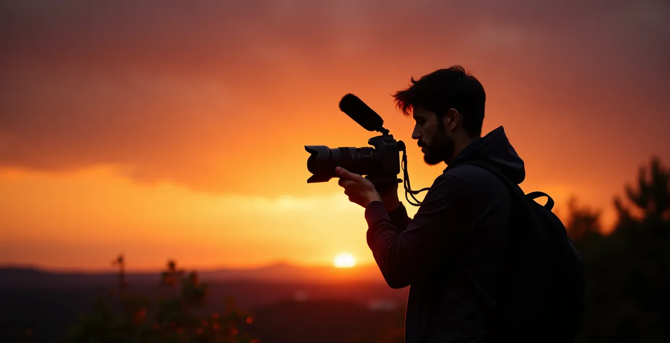
When to Add Flash During Sunset to Keep the Sky Dramatic?
Shooting at sunset is the ultimate exercise in having a conversation with a rapidly changing ambient light source. In a matter of minutes, the sky’s brightness and color temperature will shift dramatically. The common problem is that in order to expose for the beautiful, colorful sky, the subject in the foreground becomes a dark silhouette. Using a flash to light the subject often results in an overpowered, fake-looking sky or a subject that looks pasted onto the background. The key is timing and adaptation.
There is a magic window of opportunity where the conversation between flash and sky is easiest. As a rule, professional photographers know that the 15-30 minute window right after the sun dips below the horizon, known as the “blue hour,” provides the lowest dynamic range between the sky’s brightness and the ambient light on your subject. During this time, the sky is still rich with color, but it’s dark enough that a moderately powered flash can balance with it perfectly without looking artificial. You can expose for the sky’s color and then add just enough flash to gently lift the shadows on your subject.
Case Study: Adapting to the Sunset with Gels
Photographer Laura Barisonzi showcases a masterful approach to this changing light. She demonstrates that creating a perfectly blended result is about continuous adaptation. She might start her shoot during the “golden hour” with a 1/2 CTO gel on her flash to match the warm sunlight. As the sun sets and the light becomes a richer tapestry of reds, magentas, and purples, she will adjust, perhaps switching to a full CTO or even stacking gels to create a custom color that perfectly matches the nuanced gradient of the sky. This isn’t a “set it and forget it” technique; it’s an active, real-time collaboration with nature’s light show.
By waiting for this optimal window and by being prepared to adjust the color of your flash with gels, you can move from fighting the sunset to collaborating with it. Your flash becomes a tool not to create light, but to shape the balance of a scene that is already beautiful, ensuring both the dramatic sky and the perfectly lit subject can coexist in a single, believable frame.
Haze Spray vs. Nature: Can You Fake Atmosphere in Studio Landscapes?
Atmosphere in a photograph—the sense of depth, mood, and place—is often created by what’s in the air itself. Natural haze, fog, or dust particles catch the light, making light beams visible and causing distant objects to appear less saturated and contrasted. This effect, known as Rayleigh scattering, is what gives landscape photos their epic scale. The question for the studio photographer is, can this be convincingly faked?
The answer is a resounding yes, but it requires understanding what haze actually does: it gives light a physical medium to travel through and become visible. Using a water-based haze machine (or canned aerosol “atmosphere”) is the first step, but simply filling a room with haze is not enough. The magic happens when you light the haze itself, not just the subject. This is the key to creating “volumetric lighting.”
To create visible beams of light, you need a hard, directional light source—a bare-bulb strobe or a gridded reflector—positioned as a backlight or a sharp side-light (a “kicker”). Aim this light across the scene, through the haze, rather than directly at your subject. This allows the light to “draw” its path in the air. To enhance the realism, adding a subtle CTB (Color Temperature Blue) gel to this backlight can mimic the cool tone of natural atmospheric haze. Finally, the effect can be sold in post-production by slightly desaturating the elements in the background, further simulating the depth-of-field effect created by a real atmosphere. It’s a multi-layered approach that transforms an empty studio into a misty forest or a dusty, cinematic interior.
Why Does Backlighting Create Immediate Separation from the Background?
Backlighting, or creating a “rim light,” is one of the most effective techniques for making a subject pop from their background. It’s a staple in portraiture and product photography for a reason, but the “why” goes deeper than simply being a stylistic choice. It’s a direct exploitation of how our brains are wired to perceive the world. The effect is less about illumination and more about cognition.
When you place a light behind a subject, pointing back towards the camera, it traces the subject’s outline with a brilliant edge of light. This edge is a powerful visual signal. As neuroscience-focused analyses of photography point out, our visual processing system is fundamentally built on edge detection.
Our visual cortex is hard-wired to detect edges for object recognition. By creating a ‘rim light’, you are giving the viewer’s brain a clear contour to ‘trace’, forcing a cognitive separation of subject from background that is more powerful than mere brightness.
– Neuroscience perspective on lighting, Understanding Visual Perception in Photography
You are essentially handing the viewer’s brain an easy-to-follow map of the subject’s form, which it instinctively separates from the less-defined background. This creates a powerful sense of depth and three-dimensionality, even in a two-dimensional photograph. It’s a visual shortcut to prominence.
This macro shot of hair strands demonstrates the principle in extreme detail. The backlight doesn’t illuminate the person; it simply defines their edge against the darkness, making their form instantly and undeniably clear.
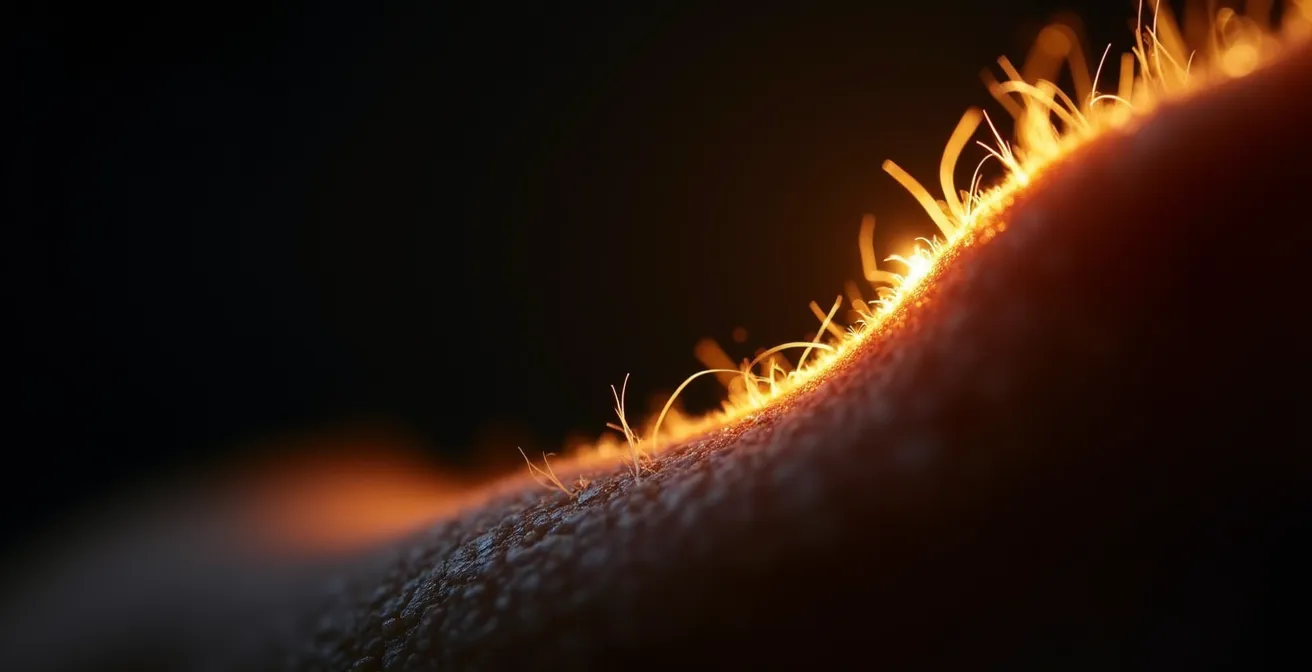
The power of the rim light is so strong that even a sliver of it is enough. This is why it’s so effective for dramatic portraits against dark backgrounds. It’s not about lighting the subject, but about using light to define their shape. This shift in thinking—from illumination to definition—is a major step in mastering the art of lighting. The rim light isn’t just another light in the setup; it’s the one that speaks directly to the viewer’s subconscious.
Key Takeaways
- Treat light as a narrative: Your flash is a character to be directed, not a technical problem to be solved.
- Master spatial logic: Observe how light will interact with the entire scene, including reflections, shadows, and the ambient story.
- Embrace controlled disharmony: Intentional mismatches in color, intensity, or composition create powerful emotional tension and visual interest.
Why Breaking the Rule of Thirds Can Create More Tension in Art?
After mastering the rules of balancing light—matching color, controlling ratios, and positioning for clean reflections—the final step is learning when and how to break them for artistic effect. Compositional rules like the Rule of Thirds are designed to create balance and pleasing aesthetics. Placing a subject off-center generally creates a more dynamic and engaging image. But what happens when the goal isn’t balance, but tension?
This is where light can become a compositional tool in itself, used to create conflict and drama. Instead of using light to support the composition, you can use it to contradict it. Imagine placing your subject dead center in the frame—a traditionally static and “boring” composition. Then, light them with a single, hard light source from the extreme edge of the frame. The stability of the composition is now at war with the dramatic, unbalanced lighting, creating a powerful sense of unease and tension.
This is a technique with a long legacy in the arts, long before photography existed. It is the foundation of chiaroscuro, the dramatic interplay of light and shadow.
Artists like Caravaggio and cinematographers like John Alton used light not just to illuminate, but to obscure. They broke compositional rules by plunging key areas into total blackness, using light as a scalpel to guide the eye and create extreme emotional tension.
– Art History Analysis, Masters of Chiaroscuro and Film Noir Lighting Techniques
You can employ this by creating “pools of light” that don’t align with your subject. Place a bright, empty pool of light at a Rule of Thirds intersection, while your subject is placed in a less compositionally significant spot. The viewer’s eye is drawn to the light, but the subject is elsewhere, creating a question: Why is that spot lit? What is missing? This deliberate contradiction between what the light highlights and where the subject is located generates a narrative tension that a perfectly balanced photo can never achieve. It transforms the photographer from a documentarian into a true storyteller.
Now, stop thinking about exposure and start thinking about the story. Pick up your camera, observe the light in the room, and ask yourself: what does it want to say, and how can your flash help it say it better?
Frequently Asked Questions on Mixing Natural and Artificial Light
Why do high-CRI LED panels blend better with fluorescents than strobes?
High-CRI LEDs render colors more accurately across the spectrum and can be flicker-free, preventing the banding issues that occur with strobes at certain shutter speeds when mixing with flickering fluorescents.
How important is matching the ‘quality’ of light beyond just color temperature?
Office fluorescents typically provide soft, broad, overhead light. A softbox on a strobe can mimic this quality, while a bare strobe creates hard shadows that look unnatural in that environment.
What’s the workflow advantage of continuous LED panels?
LEDs offer ‘What You See Is What You Get’ (WYSIWYG) lighting, allowing real-time visual assessment of light balance and ratios, making fine-tuning more intuitive than the test-and-shoot method required with strobes.