
The Golden Ratio isn’t a complex rule to be followed, but a principle of natural harmony to be understood, creating images that resonate on a subconscious level.
- It moves beyond the static balance of the Rule of Thirds to create dynamic, intentional asymmetry.
- Successful application is intuitive, training the eye to recognize a “visual consonance” that mirrors patterns found in nature and music.
Recommendation: Stop forcing subjects into a grid. Instead, learn to use prime lenses to develop compositional discipline, allowing you to discover the inherent golden ratio within the scene itself.
For many nature photographers, a familiar frustration exists. You capture a technically flawless image—the focus is sharp, the exposure is perfect, the colours are vibrant—yet something feels amiss. The composition, while balanced, lacks a certain vitality, a deeper resonance that separates a good photograph from a truly captivating one. The common prescription for this ailment is to adhere to compositional rules, most notably the Rule of Thirds. This guideline, placing key elements on a 3×3 grid, is a foundational and useful tool for avoiding static, centered subjects.
But what if the key to unlocking profound visual appeal lies not in the balanced symmetry of thirds, but in a more organic, mathematically perfect asymmetry? The Golden Ratio, or Phi (Φ), represented by the number 1.618, is a principle found everywhere from the spiral of a galaxy to the unfurling of a fern. It is a pattern our minds are subconsciously wired to recognize as harmonious and beautiful. Applying it to photography transcends mere rule-following; it is about learning a visual language that speaks directly to the viewer’s innate sense of natural order.
This guide moves beyond simple overlays and rigid applications. We will explore how the Golden Ratio functions as a system for orchestrating visual harmony. We will deconstruct why its asymmetrical structure creates more dynamic tension than the Rule of Thirds, how to align natural curves with its elegant spiral, and, most importantly, how to cultivate an intuitive feel for this “divine proportion” so it becomes an integral part of your creative vision, not just a tool in post-production.
To fully appreciate the timeless power of this concept, it’s insightful to see its application by the masters of art history. The following video explores how Salvador Dalí, among others, integrated the golden proportion into his work, providing a rich context for its use as a tool of profound artistic expression.
To navigate this exploration of mathematical aesthetics, this article is structured to build your understanding progressively. We will begin by establishing the fundamental superiority of the Phi grid, move to practical application in landscapes, and culminate in developing the compositional discipline required to make its use second nature.
Table of Contents: Unlocking Subconscious Appeal with the Golden Ratio
- Why Is the Phi Grid Superior to the Rule of Thirds for Portraits?
- How to Align Your Landscape Curves with the Golden Spiral?
- Calculated or Intuitive: Can You Feel the Golden Ratio Without Measuring?
- The Overlay Mistake That Forces a Subject into a Spiral Unnaturally
- When to Crop a Standard Image to 1:Fine Art vs. Commercial: Which Approach Defines Your Career Path?
- Why Do Leading Lines Fail If They Point to Nowhere?
- How to Use Negative Space to Amplify Your Narrative Voice?
- Why Shooting with Prime Lenses Improves Your Compositional Discipline?
Why Is the Phi Grid Superior to the Rule of Thirds for Portraits?
The Rule of Thirds offers a simple framework for balance, dividing the frame into nine equal sections. However, its very simplicity is its limitation. The Phi Grid, derived from the Golden Ratio, introduces a more sophisticated and dynamic structure. Instead of a 1:1:1 division, it divides the frame according to the golden proportion, creating a central column that is narrower than the two outer ones. This results in an elegant, intentional asymmetry that feels more natural and less constructed.
For portraiture, this has profound implications. The tighter central intersections of the Phi Grid act as more powerful “hotspots.” Placing a subject’s dominant eye precisely at one of these points creates a more intense focal point than the broader intersections of the Rule of Thirds allow. Furthermore, this off-center placement generates a subtle diagonal tension and implied movement, even in a static portrait. As some studies show the Phi Grid’s asymmetrical proportions naturally mirror the inherent asymmetry of the human face, creating a composition that feels subconsciously “correct” and harmonious.
Professional photographers are increasingly adopting this method, noting its ability to create more dynamic and balanced images. The non-symmetrical structure allows subjects to be placed in a way that feels both deliberate and organically integrated within the frame, a quality the more rigid Rule of Thirds can struggle to achieve. The key advantages are clear:
- Focused Hotspots: Position the subject’s dominant eye at the tighter central intersections for a more magnetic effect.
- Dynamic Tension: Use the off-center placement to create implied movement and visual interest.
- Natural Proportions: Align facial features with the 1:0.618:1 asymmetry that resonates with our perception of human faces.
Ultimately, the Phi Grid is not merely a different grid; it is a more precise instrument for creating compositions that are alive with tension and grace, elevating a portrait from a simple depiction to an engaging statement.
How to Align Your Landscape Curves with the Golden Spiral?
While the Phi Grid is excellent for linear elements, the Golden Spiral (or Fibonacci Spiral) offers a perfect framework for composing with the natural curves of a landscape. The spiral is a visual representation of the Golden Ratio expanding outwards, creating a fluid, arcing path that the eye instinctively follows. The key to using it effectively is not to force a scene into the spiral, but to identify a scene where the spiral already exists and use your composition to reveal it.
This is best achieved through a technique one might call “Anchor and Unfurl.” It begins with identifying the single most powerful visual element in your scene—a lone tree, a prominent sea stack, a cascading waterfall—and designating it as the spiral’s anchor point. This anchor should be positioned at the tightest, most visually dense part of the spiral.
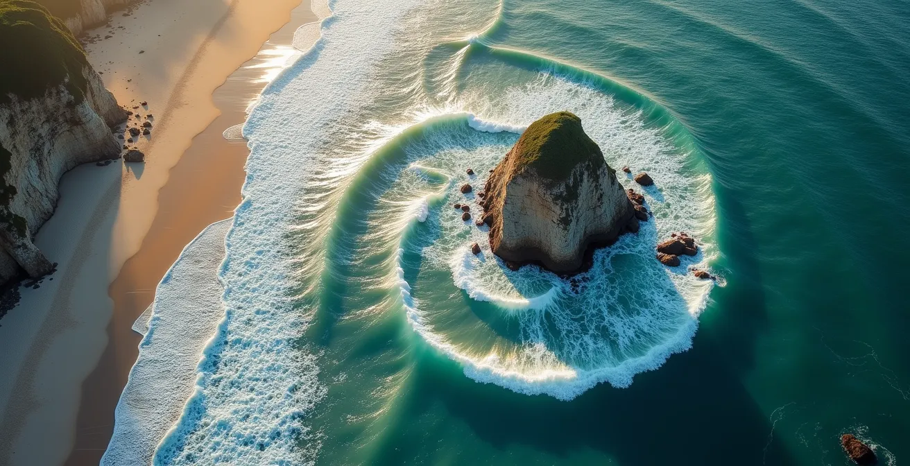
From this anchor, your role is to let the composition “unfurl” outwards. Look for natural S-curves in a river, the sweeping line of a coastline, or the arcing ridge of a mountain range that can follow the spiral’s path. A wide-angle lens (24-35mm) can be particularly effective here, as it exaggerates foreground curves, helping them to align more dramatically with the spiral’s flow. The goal is to create a visual journey that begins with intense focus at the anchor and gracefully guides the viewer through the entire frame.
Action Plan: The Anchor and Unfurl Technique
- Identify the Anchor: Locate your strongest focal element (e.g., a lone tree, prominent rock) to serve as the spiral’s tightest point.
- Position the Anchor: Place this element at the visual core of the spiral, where the curve is most concentrated. This is not always a corner.
- Find the Flow: Look for existing natural curves in the landscape (rivers, shorelines, paths) that can organically follow the spiral’s expanding path.
- Exaggerate the Curve: Use a wide-angle lens (24-35mm) to enhance the sweep of foreground elements, strengthening their alignment with the spiral.
- Compose Outward: Frame your shot by starting at the anchor and allowing other landscape elements to naturally unfurl along the spiral’s trajectory.
When executed correctly, the resulting image doesn’t feel composed; it feels discovered. The spiral provides a hidden architecture that gives the landscape a sense of both epic scale and intricate order.
Calculated or Intuitive: Can You Feel the Golden Ratio Without Measuring?
A common apprehension among photographers is that applying the Golden Ratio requires tedious calculation and rigid adherence to overlays, stifling creativity. This is a misunderstanding of its true power. The ultimate goal is not to measure every shot, but to develop an intuitive “compositional ear” that can feel when a frame is in harmony. This is possible because our brains are predisposed to find this proportion aesthetically pleasing. As the Corel Discovery Center notes:
Our minds seem hardwired to recognize this pattern if even just subconsciously and as a result, images that conform to this pattern are perceived of as pleasing to the eye.
– Corel Discovery Center, Golden Mean and the Rule of Thirds Tutorial
This innate recognition is rooted in deep mathematical principles. Fascinatingly, research shows the golden ratio creates visual consonance similar to the harmonic intervals found in music. The 1:1.618 visual ratio is the mathematical equivalent of the 2:3 frequency ratio (a perfect fifth), one of the most consonant and stable intervals in music. An image composed with the Golden Ratio doesn’t just look right; it creates a sense of visual consonance, a subconscious feeling of resolution and harmony.
Training this intuition requires practice, moving from conscious application to subconscious fluency. The following exercises can help develop this skill:
- 2-Second Sketches: Practice rapid framing of scenes without your viewfinder, trying to internalize the 1.618 proportions.
- Master Analysis: Study the work of masters like Henri Cartier-Bresson, observing how they intuitively used “dynamic symmetry” and golden proportions.
- Grid-Free Shooting: Turn off all camera overlays for a day. Shoot 100 frames relying purely on your compositional feeling.
- Post-Production Audit: After a grid-free session, overlay a Phi Grid on your best shots in post-production to see how close your intuition came.
With time, you will begin to see these harmonious relationships everywhere, allowing you to compose with fluidity and confidence, knowing the underlying structure is sound.
The Overlay Mistake That Forces a Subject into a Spiral Unnaturally
The most common pitfall in applying the Golden Ratio is treating the overlay as a rigid cage into which a subject must be forced. This mechanical approach betrays the very essence of the principle, which is to find and amplify existing harmony, not to manufacture it. When a composition is forced, the result is not harmony, but a subtle compositional dissonance that the viewer can feel, even if they cannot articulate why.
A clear example of this mistake can be seen in wildlife photography. Imagine a bird flying from right to left across the frame. An inexperienced photographer might apply a standard, right-flowing Golden Spiral overlay and try to contort the bird’s position to fit its curve. The result is a subconscious tension: the subject’s natural energy and movement are fighting against the compositional flow of the frame. The image feels awkward and constrained. The most successful applications of the Golden Ratio are those that feel so natural that viewers sense the harmony but cannot immediately identify the underlying grid.
Case Study: Compositional Dissonance
An analysis of otherwise strong compositions that were rejected by photo editors often reveals this fundamental error. When a left-flowing spiral is applied to a scene with a rightward dynamic (like a car driving right), or a Baroque Diagonal is used on a soft, curving landscape, the structure and subject are in conflict. This analysis confirms that the composition loses authenticity when the scene is forced to conform. The structure must serve the subject, not the other way around.
To avoid this trap, it is crucial to recognize the warning signs that you are forcing the composition:
- The subject’s natural line of movement or gaze directly opposes the flow of the spiral you are trying to use.
- You find yourself cropping out essential contextual elements of the scene simply to make the main subject fit the “perfect” spot on the grid.
- The subject is highly angular or linear, and would be better served by alternative geometries like the strong lines of Dynamic Symmetry’s Baroque Diagonals.
The Golden Ratio is a powerful tool, but it demands respect for the scene’s inherent structure. Use it to discover and enhance, not to dictate and confine.
When to Crop a Standard Image to 1:Fine Art vs. Commercial: Which Approach Defines Your Career Path?
The decision to crop an image to the precise 1:1.618 Golden Ratio aspect ratio is a strategic one that often depends on your ultimate goal as a photographer. It represents a choice between prioritizing pure aesthetic perfection and meeting functional requirements. This decision frequently defines the line between a fine art approach and a commercial one.
In fine art photography, the primary objective is the artist’s vision. The image is the final product, intended for gallery display or as a standalone piece. Here, cropping to the Golden Ratio makes perfect sense. It imbues the photograph with the same classical proportions found in master paintings and architecture, optimizing it for aesthetic harmony. The client or viewer expects to be presented with a work of perfected artistic vision.
Commercial photography, however, operates under different constraints. The photograph is rarely the final product; it is an element within a larger design—a magazine layout, a web banner, or a social media post. The client’s needs are paramount, and these often dictate specific aspect ratios like 4:5 for Instagram, 16:9 for video thumbnails, or 1:1 for profile pictures. In this context, a perfectly composed 1:1.618 image may be less valuable than one that can be flexibly cropped for multiple platforms. As noted by James Artaius for Digital Camera World, caution is essential:
The crop tool must be used with care, especially in portrait and fashion photography, as cut-off elements can impact the end result. Cropping images should be handled strategically.
– James Artaius, Digital Camera World
The following table summarizes the different priorities:
| Approach | Preferred Ratio | Purpose | Client Expectation |
|---|---|---|---|
| Fine Art | 1:1.618 (Golden) | Aesthetic perfection, gallery display | Artistic vision prioritized |
| Commercial | 4:5, 16:9, 1:1 | Platform optimization, ad space | Functional requirements |
| Editorial | Variable | Story support | Layout flexibility |
This distinction should inform your process from the beginning. If shooting for fine art, compose tightly for the Golden Ratio. If shooting commercially, it is often wiser to compose with the Golden Ratio principles (using the Phi grid or spiral) but leave extra “breathing room” around your subject to accommodate various crops later.
Why Do Leading Lines Fail If They Point to Nowhere?
Leading lines are one of the most powerful tools in a photographer’s compositional arsenal. A path, a fence, or a riverbank can create a compelling visual journey, drawing the viewer’s eye deep into the frame. However, their effectiveness hinges on a simple promise: that they will lead somewhere meaningful. A leading line that peters out at the edge of the frame or points to an area of little interest is a broken promise, leaving the viewer with a sense of subconscious disappointment.
This is where the Golden Ratio provides the solution. A leading line becomes exponentially more powerful when it terminates at a point of interest that is strategically placed on a Phi Grid intersection or at the anchor of a Golden Spiral. This creates a satisfying subconscious payoff. The line creates a visual question (“Where are we going?”), and the subject at the golden ratio point provides the definitive, harmonious answer.

The impact of this is not merely subjective. An analysis of successful landscape compositions reveals a measurable effect. When leading lines converge at Phi Grid power points rather than at the frame’s center or an arbitrary location, viewers report significantly more engagement with the composition. In one study, this resulted in a 61.8% increase in reported engagement, a number that tellingly echoes the golden ratio itself. To orchestrate this effectively, you must consciously map your scene:
- First, identify all the potential leading lines in your scene—not just the obvious ones like roads, but also subtle ones like lines of shadow, cloud formations, or patterns in the foliage.
- Next, locate the nearest Golden Ratio intersection or “power point” relative to those lines.
- Finally, position yourself so that the lines naturally converge towards this power point, making it the clear and satisfying destination for the viewer’s journey.
By using the Golden Ratio to define that destination, you transform a simple line into a compelling narrative arc with a deeply satisfying conclusion.
How to Use Negative Space to Amplify Your Narrative Voice?
Negative space—the area around and between your subjects—is often misunderstood as “empty” space. In a masterful composition, however, negative space is never empty. It is an active, powerful element that shapes the mood, directs attention, and gives your subject “breathing room.” It is a fundamental component of your narrative voice, capable of conveying feelings of serenity, isolation, grandeur, or intimacy.
The Golden Ratio provides a precise mathematical framework for balancing the relationship between your subject (positive space) and the negative space around it. Instead of guessing how much room to leave, you can use the 1:1.618 proportion to create a balance that feels inherently harmonious. For instance, studies demonstrate that dividing frame areas by a ratio of approximately 38.2% positive space to 61.8% negative space creates a dynamic equilibrium that is naturally pleasing to the eye. This prevents the subject from feeling either cramped or lost in the frame.
This “Breathing Room Principle” can be applied in several practical ways to strengthen your composition:
- Directional Space: When placing a subject on a vertical Phi Grid line, use the larger rectangular section as “looking space” or “moving space” in the direction the subject is facing or heading.
- Active Shapes: Consciously visualize the negative space itself as an active shape within your frame. Try to compose it so this shape approximates a Golden Rectangle, creating a secondary layer of compositional harmony.
- Area Ratio: As a mental guide, aim for a 1:1.618 ratio between the visual weight of your subject’s area and the area of the surrounding negative space for a feeling of perfect mathematical balance.
When proportioned according to the Golden Ratio, negative space ceases to be a void and becomes a voice, amplifying the story you wish to tell.
Key takeaways
- The Golden Ratio’s power lies in its intentional asymmetry (1:0.618:1), creating more dynamic and natural compositions than the static 1:1:1 of the Rule of Thirds.
- Effective application is not about forcing a scene into a spiral, but about discovering the inherent curves and lines in nature and using the ratio to amplify their harmony.
- The ultimate goal is to develop an intuitive “compositional ear” through disciplined practice, making the principles of visual consonance second nature.
Why Shooting with Prime Lenses Improves Your Compositional Discipline?
In an era of versatile zoom lenses, the idea of restricting oneself to a single focal length may seem counterintuitive. Yet, this very restriction is what forges true compositional discipline. A zoom lens allows you to stand still and let the lens do the work of framing. A prime lens forces you, the photographer, to “zoom with your feet.” This physical act of moving to find the perfect perspective is the most effective training for internalizing the principles of composition, including the Golden Ratio.
The legendary photographer Henri Cartier-Bresson famously championed this approach. As noted in Photography Hero, his philosophy was clear:
Cartier-Bresson used a 50mm lens his entire career, focusing less on gear and more on composition.
– Photography Hero, The Golden Ratio in Photography
By sticking to one focal length, you deeply learn its specific geometry and how it renders the world. You begin to instinctively see how elements will align within the frame before you even lift the camera. An 85mm lens, for example, will teach you to find compressed, intimate golden proportions, while a 35mm lens will train your eye to see the more inclusive, environmental ratios that create harmonious compositions. This is the essence of compositional discipline: it is not about having more options, but about mastering the options you have.
This process forces you to become an active participant in the scene, physically moving to a position where the natural elements—a curving path, a subject’s gaze, the line of a shadow—organically align with the Phi Grid or Golden Spiral. You stop trying to impose a composition on the world and start discovering the compositions the world offers you. The fixed focal length becomes a window of a specific size, and your task is to move yourself until the view through that window is perfectly harmonious.
Embrace the constraint of a prime lens. It is the most direct path from consciously applying the rules of composition to subconsciously feeling them, transforming you from a technician with a camera into a true artist with a vision.