In summary:
- True tonal depth is not about aggressive contrast but about meticulously managing luminance values across the entire photographic process.
- Treat your RAW file as a “digital negative” by preserving its signal integrity with 16-bit workflows and proper exposure techniques (ETTR).
- The order of operations matters: establish mid-tones first, then set black/white points, and refine with local adjustments to build, not break, your image’s tonal architecture.
- Your final output quality is dependent on a calibrated monitor and a conscious export process that prevents digital artifacts like banding.
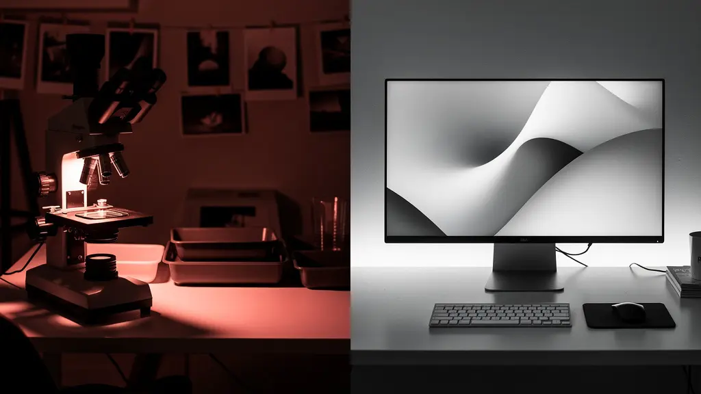
There is a quiet frustration shared among many digital photographers. You capture a technically perfect image—sharp, well-exposed, clean—yet it feels sterile. It lacks the soul, the weight, the deep, luminous quality of a masterfully crafted darkroom print. The shadows are just black voids, the highlights feel clipped, and the transitions between them are abrupt. The image is flat, a mere representation rather than an experience.
The common advice often involves blunt instruments: apply a “film look” preset, drag the contrast slider to the right, or follow a formulaic S-curve. While these can create a temporary “moody” effect, they often do more harm than good, crushing vital shadow detail and creating a generic, stylized look. They are shortcuts that bypass the fundamental craft. This approach fails to address the core issue: the image lacks a coherent and sophisticated tonal architecture.
What if the secret to profound tonal depth wasn’t in applying a look, but in building it from the ground up? The solution lies in adopting a darkroom master’s mindset and applying it to your digital workflow. It’s a shift from merely adjusting pixels to consciously managing the luminance values at every stage, from the initial capture to the final export. This is not about faking a film look; it’s about achieving the same principles of tonal richness using the powerful tools at your disposal.
This guide will walk you through this methodical process. We will explore how to translate analog principles like the Zone System to your histogram, understand the critical role of bit depth in preserving smooth gradients, and establish a precise workflow for adjustments that protects, rather than destroys, the delicate details in your highlights and shadows. By the end, you will have a framework for creating images with a depth and dimension that truly rivals the finest gallery prints.
Summary: How to Achieve Tonal Depth That Rivals Darkroom Prints Digitally
- Why Do Crushed Shadows Destroy the Emotional Impact of Your Image?
- How to Map the Zone System to Your Lightroom Histogram?
- 8-bit vs. 16-bit: Does It Really Matter for Printed Tonal Transitions?
- The Export Mistake That Introduces Banding in Your Smooth Skies
- In Which Order Should You Adjust Contrast to Preserve Detail?
- Why Is Local Contrast Superior to Global Contrast for Drama?
- Why Can’t You See Detail in the Shadows on Your Uncalibrated Monitor?
- Why Does Pushing the Histogram to the Right Reduce Noise?
Why Do Crushed Shadows Destroy the Emotional Impact of Your Image?
In digital photography, there’s a pervasive temptation to “crush the blacks.” It’s an easy way to add instant, dramatic contrast. But this action comes at a significant artistic cost. When shadows become pure, detail-less black, they cease to be shadows; they become holes in your composition. An engaging shadow invites the viewer’s eye in, suggesting form, texture, and depth. It holds information, even if it’s subtle. A crushed black, by contrast, is a dead end. It stops the eye and flattens the perceived space, making the image feel cheap and overtly digital.
The emotional impact is profound. Rich, detailed shadows create a sense of realism, mystery, and sophistication. They allow for a gradual transition from light to dark, which the human eye perceives as natural and pleasing. When you eliminate this information, you are removing a critical layer of visual storytelling. The difference is akin to a symphony orchestra versus a single, loud drum beat. Both have impact, but only one has nuance and emotional complexity. The goal isn’t to eliminate black but to control it, ensuring that pure black is an intentional choice, not a byproduct of careless editing.
Think of the darkest areas of your image as the foundation of your tonal architecture. If that foundation is a solid, impenetrable block, the entire structure built upon it will feel unstable and artificial. To build an image with emotional resonance, you must preserve the subtle gradations that exist within the deepest tones. It is in these barely-perceptible details that the true sense of volume and presence resides, transforming a flat picture into a believable world.
By protecting these delicate tonal transitions, you are not just saving data; you are preserving the very credibility and emotional power of your photograph.
How to Map the Zone System to Your Lightroom Histogram?
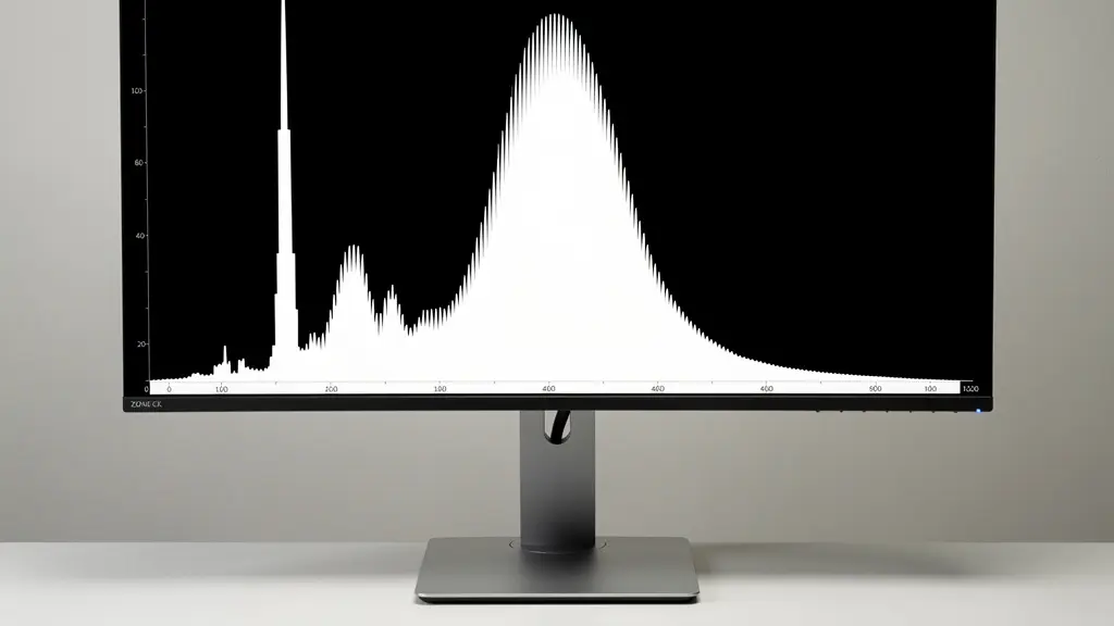
Ansel Adams’s Zone System was a revolutionary method for pre-visualizing and controlling tone in black and white film photography. It provided a language to connect the light in a scene to the final print. While our digital tools are different, the underlying principle of managing tonal values remains paramount. Your Lightroom histogram is the modern-day equivalent of Adams’s densitometer, and understanding how to map the Zone System to it is the first step toward true tonal mastery.
The system is a scale of brightness values. As Wikipedia contributors explain in their article on the topic, the Zone System has a clear structure:
The Zone System assigns numbers from 0 through 10 to different brightness values, with 0 representing black, 5 middle gray, and 10 pure white; these values are known as zones.
– Wikipedia Contributors, Zone System – Wikipedia
To apply this to your histogram, you can mentally divide it into sections. The far left edge represents Zone 0 (pure black), while the far right is Zone X (pure white). The exact center of the histogram is your Zone V, or middle gray. The area just to the left of center represents the detailed shadows (Zones II, III, IV), and the area just to theright represents the detailed highlights (Zones VI, VII, VIII). This visualization transforms the histogram from a generic graph into a powerful map of your image’s tonal structure.
With this map, your editing becomes more intentional. Instead of randomly pushing sliders, you can ask specific questions. Where do I want to “place” my subject’s skin tones? (Often Zone VI). Is there important detail in the shadows I want to keep visible? (Ensure they don’t fall below Zone II). By placing key tonal values in their appropriate zones, you are not just adjusting brightness; you are building a deliberate and harmonious tonal architecture that guides the viewer’s eye and enhances the emotional impact of the image.
This systematic approach moves you from a reactive editor to a proactive artist, shaping the light in your image with precision and purpose.
8-bit vs. 16-bit: Does It Really Matter for Printed Tonal Transitions?
The debate between 8-bit and 16-bit files can seem abstract and overly technical, but its impact on tonal depth is profoundly practical, especially when your goal is a high-quality print. An 8-bit file can describe 256 different levels of brightness per color channel. A 16-bit file, by contrast, can describe 65,536 levels. While your eye can’t distinguish all 281 trillion colors of a 16-bit file, the extra data provides critical “headroom” for editing.
When you make significant adjustments to an 8-bit file—pushing exposure, adjusting curves, or dodging and burning—you are stretching those 256 levels. The gaps between them become wider, leading to a visible artifact known as “banding,” where smooth gradients (like a clear sky or a studio backdrop) break into distinct, ugly steps of color. This is the primary culprit behind the “digital look” in many images. A 16-bit file, with its vast reservoir of tonal information, allows for the same edits without creating these gaps. The transitions remain smooth and seamless because you have an abundance of data to work with. In this context, fine art printing experts confirm that 256 tones are insufficient for producing smooth gradations in professional black and white prints.
The difference becomes most apparent in print. A digital screen can sometimes hide minor banding, but a fine art print under good light will reveal every flaw in your tonal transitions. Working in a 16-bit environment is the single most important step you can take to ensure the signal integrity of your digital negative throughout the editing process. The following table breaks down the practical implications:
| Aspect | 8-bit | 16-bit |
|---|---|---|
| Tonal Steps Per Channel | 256 | 65,536 |
| Total Colors (RGB) | 16.7 million | 281 trillion |
| Banding Risk in Gradients | High after adjustments | Minimal even with heavy editing |
| File Size | Smaller (faster processing) | 2x larger |
| Print Quality Impact | Visible banding in smooth areas | Smooth transitions maintained |
| Best Practice | Final output only | All editing work |
While an 8-bit JPG is a perfectly acceptable format for final delivery to the web, all your critical editing—the construction of your image’s tonal architecture—should be performed in a 16-bit workspace to maintain the highest possible quality.
The Export Mistake That Introduces Banding in Your Smooth Skies
You’ve done everything right. You shot in RAW, edited meticulously in a 16-bit environment, and crafted beautiful, subtle tonal transitions. Then, you export the image as an 8-bit JPEG for the web, and suddenly, your perfectly smooth sky is riddled with ugly, concentric bands of color. This frustrating experience is often caused by a flawed export workflow, specifically when and how you convert from 16-bit to 8-bit.
The key is to preserve the high-bit-depth information for as long as possible. All your major tonal and color adjustments should be completed while the image is still in its 16-bit state. Converting to 8-bit should be the very last step. A critical, and often overlooked, element in this conversion is dithering. Dithering is a process that adds a very fine, almost imperceptible layer of noise to the image during the bit-depth reduction. This noise breaks up the hard edges between tones, effectively masking the banding that would otherwise occur. As retouching expert Greg Benz notes:
Be sure that Photoshop’s dithering is enabled. Go to Edit / Color Settings and make sure “Use dither (8-bit/channel images)” is checked. If you are using Lightroom to export to JPG, dithering is used automatically (you don’t have a choice). This helps add a bit of noise that should minimize the risk of any banding being exposed with the final conversion to 8-bits.
– Greg Benz, Greg Benz Photography
A correct workflow is a sequence of precise steps designed to protect your tonal gradations. It is not just about clicking “Export.” To ensure your final image is as pristine as your working file, follow this protocol:
- Work in a 16-bit mode (like ProPhoto RGB or Adobe RGB) throughout your entire editing process.
- Apply all your creative adjustments before any conversion.
- Before reducing bit depth, convert the image to its destination color space (e.g., sRGB for web).
- Ensure dithering is enabled when you finally convert or save the file to an 8-bit format.
- Always save a 16-bit master file (TIFF or PSD) with all layers intact before creating any 8-bit copies.
By treating the export process with the same care as the editing process, you ensure that the tonal depth you worked so hard to create is what your audience actually sees.
In Which Order Should You Adjust Contrast to Preserve Detail?
The order in which you apply tonal adjustments is not arbitrary; it’s a critical part of building a strong tonal architecture. Many photographers make the mistake of immediately reaching for the contrast or clarity sliders. This is a destructive approach because these global adjustments affect the entire tonal range at once, often clipping highlights and crushing shadows before you’ve had a chance to protect them. A more refined, professional workflow mimics the logic of the Zone System by establishing the key tonal anchors first and refining from there.
The primary goal is to preserve detail at all costs. This means you must first define your mid-tones, as this sets the overall brightness of the scene without destroying the extremes. Once your mid-point is established (placing your subject in the correct “Zone”), you can then carefully set your black and white points. This involves bringing the blacks down just enough to create a solid anchor without losing detail in adjacent shadow areas, and bringing the whites up to add brightness without blowing out important highlights. Only after these foundational pillars are in place should you work on the areas in between.
Based on the logic of darkroom masters, a methodical digital workflow should follow this sequence to build contrast constructively:
- Set Your Mid-tones: Use the Exposure slider to place your primary subject or the most important mid-tone at its desired brightness (e.g., Zone V or VI). Ignore the blacks and whites for now.
- Establish the Black Point: Gently lower the Blacks slider until you achieve a rich black in areas that should have no detail, ensuring it doesn’t “bleed” into and crush your detailed shadows.
- Establish the White Point: Raise the Whites slider until you get clean highlights, using the clipping warnings to ensure you don’t lose texture in bright areas like clouds or skin.
- Refine the Shadows: Now, lift the Shadows slider to bring back detail in the darker areas that were compressed when setting the black point.
- Refine the Highlights: Similarly, pull down the Highlights slider to recover detail in the brightest parts of the image.
This deliberate process ensures that every tonal adjustment builds upon a stable foundation, resulting in an image with rich contrast and fully preserved detail from the deepest shadows to the brightest highlights.
Why Is Local Contrast Superior to Global Contrast for Drama?
Global contrast, manipulated via the main Contrast slider or a simple S-curve, is a blunt instrument. It brightens everything that is already bright and darkens everything that is already dark, affecting the entire image uniformly. While useful for initial adjustments, it lacks sophistication and often leads to clipped highlights and crushed shadows. Local contrast, on the other hand, is the artist’s tool for creating drama and dimension. It is the digital equivalent of the darkroom master’s most cherished techniques: dodging and burning.
Local contrast adjustments increase or decrease contrast only within specific tonal ranges or physical areas of the image. Instead of pushing the entire histogram apart, you are carefully sculpting the light. This is what creates the perception of three-dimensionality and texture. When you darken the edges of an object or brighten its center with a soft brush, you are using local contrast to give it form and shape. When you increase the “Clarity” or “Texture” in Lightroom, you are applying a form of automated local contrast that enhances mid-tone definition without blowing out the extremes of the tonal range.
The philosophy comes directly from the analog darkroom. As described in classic photography education, dodging and burning are about selective exposure. Dodging (lightening) involves blocking light from hitting a certain area of the photographic paper, while burning (darkening) involves giving an area extra exposure. This hands-on manipulation is how photographers would guide the viewer’s eye, enhance mood, and reveal texture. The same principle of perceptual contrast applies digitally. Your goal is not to make the whole image “pop,” but to selectively enhance the parts that matter, creating a visual hierarchy that tells a story and directs attention.
By mastering local contrast adjustments, you move beyond simple tonal correction and begin to truly sculpt with light, adding a level of sophistication and intentionality that global sliders can never achieve.
Why Can’t You See Detail in the Shadows on Your Uncalibrated Monitor?
You can spend hours meticulously crafting rich, detailed shadows, only to realize that they appear as muddy, indistinct gray splotches or pure black voids on another screen. The most common culprit for this discrepancy is an uncalibrated monitor. Your monitor is your only window into your digital darkroom. If that window is tinted, distorted, or set too bright or dark, you are making critical creative decisions based on false information. You are, in effect, trying to paint in the dark.
An uncalibrated consumer monitor, straight out of the box, is almost always set excessively bright and with a cool, blueish color cast designed to look punchy in a retail store. This has a disastrous effect on shadow perception. When monitor brightness is too high, it artificially lifts the darkest parts of your image. You might then compensate by crushing the blacks in your editing software to achieve a “true” black on your screen, but you are actually destroying all the subtle detail you intended to preserve. On a properly calibrated display, your carefully edited image would look unnaturally dark and clipped. As calibration studies reveal, a display with its brightness set too high makes shadows appear gray, leading to incorrect adjustments.
Achieving accurate shadow detail requires a consistent and reliable viewing environment. This means controlling not only your monitor’s settings but also the ambient light in your room. Professional calibration involves more than just eyeballing it; it requires a hardware device (a colorimeter or spectrophotometer) to measure the screen’s output and create a corrective profile. This ensures that black is truly black, white is truly white, and every tone in between is rendered accurately. Without this baseline, you are simply guessing, and your prints and web exports will never consistently match your artistic vision.
Your Action Plan: Monitor Calibration for Accurate Shadow Detail
- Set Native Color Temperature: Begin by setting your monitor to its native color temperature, typically targeting 6500K for standard photographic editing.
- Adjust Brightness Correctly: Use a calibration pattern to adjust brightness until the darkest patch is just barely distinguishable from pure black.
- Verify Gamma: Ensure your monitor’s gamma is set to the industry standard of 2.2 for still photography work.
- Use a Hardware Calibrator: Invest in a hardware calibrator and use it monthly to maintain consistency, as monitor performance drifts over time.
- Control Ambient Lighting: Match the lighting in your editing space to your intended viewing conditions, avoiding glare and reflections on the screen.
Calibrating your monitor isn’t a luxury; it’s a fundamental requirement for any serious photographer who cares about tonal control.
Key Takeaways
- Tonal architecture is built, not applied. A deliberate, sequential workflow that protects detail is superior to using blunt contrast tools.
- The quality of your digital negative is paramount. Always work in 16-bit to maintain signal integrity and prevent banding during heavy edits.
- Your editing is only as reliable as your viewing environment. A calibrated monitor is a non-negotiable tool for accurate tonal judgment.
Why Does Pushing the Histogram to the Right Reduce Noise?
The technique known as “Expose to the Right” (ETTR) can feel counterintuitive. It involves intentionally overexposing your image at the point of capture, pushing the histogram as far to the right as possible without clipping the highlights. Then, in post-processing, you reduce the exposure back to a normal level. The reason this practice yields a cleaner, less noisy image lies in the fundamental nature of how a digital sensor captures light. A sensor’s primary job is to convert light (the “signal”) into digital information. However, this process is not perfectly clean; it also introduces a low level of random electronic interference (the “noise”).
The crucial insight is that signal increases exponentially with more light, while noise remains relatively constant, especially in the shadows. The brightest parts of your image have a very high signal-to-noise ratio (SNR). The darkest parts have a very low SNR, meaning the noise is much more prominent relative to the actual image information. When you underexpose an image and then “lift the shadows” in post-processing, you are amplifying everything in those dark areas—both the weak signal and the ever-present noise. This is why underexposed shadows always look grainy and “muddy.”
ETTR is a strategy to maximize the signal across the entire tonal range at the moment of capture. By overexposing, you are feeding the sensor the maximum amount of light it can handle, thus recording the strongest possible signal in your mid-tones and shadows. When you later darken the image in your software, you are reducing the strong signal back to its proper level, but since the noise level was low to begin with, it gets reduced as well. You are effectively starting with a much cleaner “digital negative.” This is especially vital as digital sensors have surpassed the dynamic range of film; while Adams worked with ten stops, many modern cameras can capture 14 or more, giving you more data to manage.
By prioritizing a strong, clean signal at capture, you provide your future self with the highest quality raw material to build an image with deep, clean shadows and profound tonal depth.