Achieving gallery-quality prints is not about buying better gear, but mastering a system of non-negotiable professional standards.
- The common mistake is treating printing as a final step; it is an integral part of the photographic process that demands total environmental control.
- Subjective adjustments fail. Success depends on objective data: screen calibration to a precise candela value, output sharpening based on mathematical viewing distance, and the mandatory use of archival pigment inks.
Recommendation: Shift your mindset from “what looks good” to “what meets the standard.” The first step is to establish a ‘master print’ as your physical ground truth, the benchmark against which all future work is measured.
The chasm between a stunning image on a backlit screen and a lifeless print in your hands is a frustration every serious photographer knows. You’ve invested in a capable camera, mastered composition, and spent hours perfecting an edit in Lightroom, only to be betrayed at the final stage. The print is too dark, surprisingly soft, or the colours feel muted. This experience leads many to believe that exhibition-quality printing is an esoteric art, reserved for high-end labs with unobtainable equipment.
Common advice revolves around simple checklists: calibrate your monitor, use a paper profile, sharpen the file. While not incorrect, this advice is dangerously incomplete. It treats a complex, interconnected system as a series of independent tweaks. It fosters a cycle of trial and error, leading to wasted ink, paper, and—most importantly—confidence. The fear of producing an “amateur” print for a show is paralyzing because it suggests a fundamental misunderstanding of the craft.
But what if the problem isn’t your equipment, but your workflow? The professional standard for printing is not about guesswork; it is a discipline of control. It’s about understanding that your monitor, software, printer, and viewing environment are a single, cohesive system that must be calibrated in unison. This guide breaks down that professional workflow. We will move beyond platitudes to establish the non-negotiable standards for colour management, sharpening, material selection, and presentation—transforming your home studio into a predictable, high-precision printmaking environment.
This article provides a complete framework for achieving professional print quality. The following sections detail each critical step in the process, from initial screen calibration to the final matting and presentation, ensuring you have the knowledge to produce work worthy of any gallery wall.
Summary: How to Master Exhibition-Quality Printing at Home
- Why Is Your Screen Brightness Lying to You About Print Darkness?
- How to Apply Output Sharpening Based on Viewing Distance?
- Dye vs. Pigment Ink: Which Is Mandatory for Gallery Sales?
- The Dust Spot Mistake That Rejects Your Work from the Gallery
- How to Calculate the Perfect Mat Border for Visual Balance?
- How to Calibrate Your Printer for Heavyweight Hahnemühle Stock?
- Why Does Adobe Standard Color Look Dull Compared to a Custom Profile?
- How to Ensure Your Print Matches Your Monitor Every Single Time?
Why Is Your Screen Brightness Lying to You About Print Darkness?
The most common printmaking failure stems from a fundamental misunderstanding: your monitor is a light source, while a print is a reflective object. A screen at 100% brightness is emissive, creating a dazzling brilliance that paper can never replicate. When you edit an image on an overly bright screen, you are subconsciously compensating by darkening the tones to make it look “right.” The result is a file that is objectively too dark, a fact that becomes painfully obvious when it hits the paper. This is not a subjective issue; it is a failure of system calibration.
The professional workflow demands removing this subjectivity. Rather than trusting your eyes in an uncontrolled environment, you must conform to a measurable standard. Most consumer monitors are factory-set to over 250 cd/m² (candelas per square meter), designed to look impressive in a bright retail store. However, professional print calibration standards recommend setting monitor brightness to a much lower value, typically between 80 and 120 cd/m². This setting dramatically reduces the perceptual gap between the luminous screen and the reflective paper, forcing you to create an edit that will translate effectively to the printed medium.
To achieve this, photographers use a technique called “Paper-White Simulation.” This involves calibrating the monitor not to a theoretical perfection, but to visually match the actual paper stock you intend to use under a controlled viewing light. By making the white of your screen mimic the white of your paper, you establish a reliable visual reference that ensures what you see is what you will get. This is the first and most critical step in taking control of your print output.
How to Apply Output Sharpening Based on Viewing Distance?
A print that looks perfectly sharp on screen can often appear soft or “muddy” when printed. This is because the process of ink spreading on paper, known as dot gain, naturally introduces a slight loss of acuity. More importantly, the sharpness you apply should not be based on a 100% view in Photoshop, but on the final print size and its intended viewing distance. A small 8×10 print viewed from a foot away requires a delicate sharpening touch, while a large 40×60 gallery piece viewed from ten feet away needs a much more aggressive approach to appear crisp to the observer.
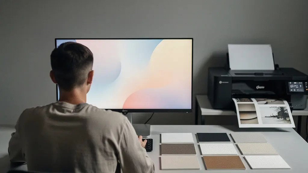
Failing to account for this is a hallmark of an amateur print. The goal is not a “sharp file” but a print with high perceptual sharpness. Professionals achieve this through a methodical process of output sharpening, which is the very last step before sending the file to the printer. This involves creating a dedicated, resized version of your image for a specific print dimension and applying a tailored Unsharp Mask or Smart Sharpen filter. A highly effective method is to create small test strips of a detailed area of your image, each with a different sharpening amount, to see how they render on the actual paper.
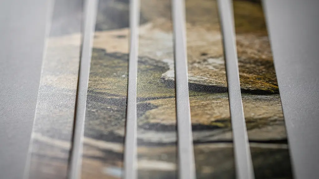
This testing method removes all guesswork. By evaluating the physical strips, you can choose the precise setting that looks best for a given size and paper combination. Over time, you will develop a reliable set of parameters for your workflow. The following table, based on common professional practices and information from resources like guides on print preparation, provides a solid starting point for determining these parameters.
| Print Size | Typical Viewing Distance | Sharpening Radius | Recommended DPI |
|---|---|---|---|
| 11×14 inches | 18-24 inches | 0.8-1.2 pixels | 360 ppi |
| 16×20 inches | 3 feet | 1.5-2.0 pixels | 300 ppi |
| 24×36 inches | 5 feet | 2.5-3.0 pixels | 240 ppi |
| 40×60 inches | 8-10 feet | 3.5-4.5 pixels | 150-200 ppi |
Dye vs. Pigment Ink: Which Is Mandatory for Gallery Sales?
The choice between dye and pigment inks is not a matter of preference when your goal is gallery sales; it is a commercial and archival mandate. While dye-based inks can produce vibrant, punchy colours, they are fundamentally unstable. The water-soluble molecules sit on top of the paper’s coating and are highly susceptible to fading from UV light, ozone, and environmental pollutants. A beautiful dye-based print can show noticeable fading in as little as a few years, making it an unacceptable liability for any serious gallery or collector.
Pigment inks, conversely, are the professional standard for fine art printing. These inks use microscopic, encapsulated particles of solid pigment suspended in a liquid carrier. When printed, the liquid evaporates, leaving the encapsulated pigments physically bonded to the paper’s surface. This structure is far more resistant to environmental degradation. The result is a print with vastly superior archival permanence, a non-negotiable requirement for the fine art market. Collectors are not just buying an image; they are investing in a physical object they expect to last for generations.
Independent testing bodies provide the data that underpins this standard. For a print to be considered “gallery-worthy,” it must have a proven longevity. According to Wilhelm Imaging Research testing, modern pigment inks achieve display permanence ratings of over 200 years for colour prints and more than 400 years for black and white. This level of durability, confirmed by research on media from manufacturers like ILFORD, establishes the work as a sound investment. Using anything less than pigment ink for an exhibition print is a critical error that undermines the perceived and actual value of your work before it ever hangs on a wall.
The Dust Spot Mistake That Rejects Your Work from the Gallery
In the world of professional printmaking, perfection is the baseline. After navigating the complexities of colour management, sharpening, and archival inks, the final print is placed under scrutiny. It is here that one of the most frustrating and entirely avoidable mistakes can lead to an immediate rejection: the humble dust spot. A single white or black speck, invisible on a down-sampled Instagram post, becomes a glaring beacon of unprofessionalism on a large, beautifully rendered print.
A gallerist or a discerning collector sees a dust spot not as a tiny flaw, but as a symptom of a careless workflow. It signals that the photographer did not perform the most basic of quality control checks. It suggests that if such an obvious error was missed, what other, more subtle mistakes might be lurking in the colour or tone? The final inspection of a print is a ritual. Professionals use a viewing booth with raking light—a light source positioned at a low angle to the print’s surface—which exaggerates every surface imperfection, from the paper’s texture to the slightest speck of dust or tiny fibre that has settled on the ink.
The process is methodical. Using a print loupe, the entire surface of the print, especially in large areas of smooth tone like skies or shadows, is scanned inch by inch. This is not something to be done on the file at 100% zoom; this is a physical inspection of the final object. Finding a dust spot on the print means the work is a failure. The file must be reopened, the spot cloned out with meticulous care, and the entire print must be remade. There is no “fixing” it on the paper. Attempting to spot-tone or physically remove the speck often leads to a worse-looking blemish. The only professional solution is a reprint. This uncompromising standard is what separates a fine art object from a mere reproduction.
How to Calculate the Perfect Mat Border for Visual Balance?
Presentation is not an afterthought; it is an integral part of the artwork. Matting and framing a print serves to protect it, but more importantly, it creates a “breathing room” that isolates the image from its surroundings and focuses the viewer’s attention. A common amateur mistake is to use a mat with equal borders on all four sides. While geometrically correct, this creates an optical illusion that makes the artwork appear to be sinking in the frame. The human eye perceives the visual centre to be slightly higher than the geometric centre, a principle that professional framers have understood for centuries.
The professional solution is to use a bottom-weighted mat, where the bottom border is slightly larger than the top and side borders. This provides “visual support” for the image, making it appear perfectly balanced and centered to the viewer’s eye. This isn’t a matter of taste; it is a deliberate calculation to achieve visual harmony. While there are no absolute rules, a common practice is to make the bottom margin 10-20% larger than the top and side margins. While a common exhibition standard uses an 11×14 inch print in a 16×20 inch mat, the specific proportions can be adjusted to enhance the artwork’s composition.
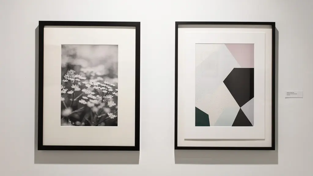
Minimalist images often benefit from wider, more generous matting to emphasize the negative space, while complex, busy compositions might be better served by narrower borders that keep the focus tight. The choice of mat colour is also critical; a bright white mat can compete with the print’s highlights, so professionals often choose an off-white or natural white that is slightly darker than the paper’s brightest white (D-min), creating subtle but effective separation. Mastering these nuances of presentation elevates the print from a simple photograph to a finished art object.
Your Action Plan: Auditing the Mat for Optical Balance
- Calculate base margin: Start by determining the basic margin for the top and sides using the formula: (Mat width – Print width) ÷ 2.
- Apply bottom-weighting: Use the formula: Bottom margin = Top/Side margin × 1.15. This adds the necessary visual weight to the bottom of the print.
- Assess composition: For minimalist images, consider increasing the overall mat width by 20-30% to enhance negative space. For complex images, a standard 2-3 inch mat border is often sufficient.
- Check mat colour and contrast: Hold your chosen mat board next to your print. The mat should be slightly darker than the paper’s brightest white point (D-min) to provide contrast without competing with the image.
- Verify mounting technique: Ensure only acid-free tape is used, and only along the top edge of the print. This allows the paper to expand and contract freely with environmental changes, preventing buckling.
How to Calibrate Your Printer for Heavyweight Hahnemühle Stock?
Using premium, heavyweight fine art paper like a 308 gsm Hahnemühle Photo Rag is a commitment to quality. However, simply selecting the paper is not enough. Your printer must be precisely configured to handle its specific thickness, texture, and ink absorption properties. A standard “Glossy Paper” setting will lead to disastrous results: ink pooling, head strikes that leave streaks on the paper, or inaccurate colour rendition. Each paper is a unique variable in the printing system, and it demands its own calibration.
The first step is a physical adjustment. Heavy, thick papers require a wider platen gap—the distance between the print head and the paper. Using the standard gap can cause the print head to drag across the paper’s surface, smearing ink and potentially damaging the head. Most professional-grade printers allow you to set the platen gap to ‘Wide’ or ‘Wider’ through the printer driver or control panel. Secondly, you must select the correct Media Type in the driver. This setting does more than just name the paper; it controls the amount of ink the printer lays down. A porous, matte paper like Hahnemühle German Etching requires a different ink load than a smoother paper like Photo Rag. Using the wrong setting can lead to oversaturation and loss of detail in the shadows.
Printer manufacturers and paper mills work together to provide guidance. The following table shows recommended starting points for popular Epson and Canon printers when using Hahnemühle stock, based on information provided by art supply specialists.
| Hahnemühle Paper | Weight (gsm) | Epson Media Setting | Canon Media Setting | Platen Gap |
|---|---|---|---|---|
| Photo Rag | 308 | Velvet Fine Art | Fine Art Paper 1 | Wide |
| German Etching | 310 | Watercolor Paper | Fine Art Paper 2 | Wide |
| Museum Etching | 350 | Watercolor Paper | Fine Art Paper Other | Wider |
| Bamboo | 290 | Velvet Fine Art | Fine Art Paper 1 | Standard |
However, for the ultimate in precision, a generic setting is not enough. The pinnacle of professional calibration is the creation of a custom ICC profile for each specific printer-paper-ink combination. As noted in professional workflows, photographers using Canon printers rely on specific ICC profiles where each paper has its own profile defining its exact colour performance. This file acts as a unique translation map, ensuring that the colours you see on your calibrated monitor are reproduced as accurately as possible by that specific paper. This eliminates the last element of guesswork from the colour workflow.
Why Does Adobe Standard Color Look Dull Compared to a Custom Profile?
Many photographers are disappointed when they first import a RAW file into Lightroom and see the colours appear flat and lifeless compared to the vibrant preview on the back of their camera. This is often because the default profile applied is ‘Adobe Standard’. This is not an error, but a misunderstanding of what that profile is designed to do. It is a generic, one-size-fits-all starting point, engineered to produce an acceptable, if uninspired, result from any camera model it supports.
The problem is that every camera sensor has a unique way of interpreting and recording colour—its own “colour science.” The generic profile cannot possibly account for the specific nuances of your Canon, Nikon, or Sony sensor. As one professional guide on the topic notes, this is the core issue. A color management expert from Digital Photography School’s guide states:
Adobe Standard is a generic profile designed to work passably on all cameras, thus failing to capture the unique color science of your specific sensor.
– Professional Photography Color Management Expert, Digital Photography School Color Management Guide
A custom camera profile, on the other hand, is a bespoke file created specifically for your individual camera. By photographing a standardized colour target, like an X-Rite ColorChecker Passport, under controlled lighting, you can use software to analyze how your camera sees those known colours. The software then generates a profile that corrects for any deviations, creating a perfectly accurate baseline. This custom profile ensures that the colours in your RAW file are a true and neutral representation of the scene, giving you a far superior starting point for your creative edits.
For the highest level of accuracy, professionals create a dual-illuminant profile. This involves shooting the colour target under two different light sources (e.g., daylight and tungsten) and combining the data. This creates a single, highly robust profile that produces accurate colour across a wide range of lighting conditions, further removing variables from the colour management chain.
Key Takeaways
- Control, Don’t Guess: Success in printing comes from replacing subjective adjustments with a workflow based on objective, measurable standards for light, colour, and sharpness.
- The System Is One: Your monitor, software, printer, paper, and viewing light are not separate tools. They are a single, interconnected system that must be calibrated as a whole for predictable results.
- The Print Is the Goal: The entire photographic process, from capture to final edit, must be performed with the final, physical print as the intended outcome, not the glowing image on a screen.
How to Ensure Your Print Matches Your Monitor Every Single Time?
The pursuit of a perfect screen-to-print match is the ultimate goal of a calibrated workflow. The recurring theme is that this match is not achieved by luck or by last-minute tweaks. It is the guaranteed result of establishing and maintaining total control over every variable in your printing environment. It is the culmination of a system-wide discipline where nothing is left to chance. This means controlling the light you edit by, the light you view prints by, and even the ambient conditions of your workspace.
This level of control requires creating a dedicated, consistent environment. The walls of a professional printmaker’s studio are often painted a neutral 18% gray to avoid colour casts influencing perception. Ambient room lighting is kept low and controlled, and a dedicated, colour-correct D50 viewing lamp is used to evaluate prints, ensuring they are always judged under the same conditions. Even factors like humidity and the “dry-down” period of an ink—the time it takes for its colour and density to stabilize, often up to 24 hours—are accounted for. This is the difference between a casual hobby and a professional discipline.
The most powerful concept in this workflow is the creation of a ‘master print’. As highlighted in professional workflows, once you achieve a perfect print of a reference image through this controlled process, that physical object becomes your ‘ground truth’. It is the ultimate benchmark. If, in the future, your prints start to deviate, you don’t chase new settings. You recalibrate your system until you can once again perfectly reproduce that master print. This physical artifact is more reliable than any on-screen preview. It is the anchor for your entire quality control process, ensuring long-term consistency.
The following checklist is not a list of suggestions; it is the blueprint for a professional-grade printing environment. Implementing it is the final step in removing uncertainty from your workflow.
- Paint workspace walls a neutral gray (equivalent to an 18% gray card).
- Install a D50 viewing light positioned at a 45-degree angle to your print viewing area.
- Calibrate your monitor to a brightness of 100-120 cd/m² and a white point of 5000K.
- Control ambient room lighting, keeping it to a maximum of 32-64 lux.
- Allow prints a full 24-hour dry-down period before making final colour evaluations.
- Maintain a consistent humidity level of 20-50% in your printing environment to ensure paper and ink stability.
- Store paper in its final printing environment for at least 24 hours before use to acclimate.
- Document all printer settings, paper types, and profile details in a printmaker’s logbook for absolute reproducibility.
Adopting this disciplined, standards-based workflow is the definitive step toward producing prints that meet the exacting requirements of any gallery. It is time to elevate your craft from image-making to creating lasting, physical works of art.