The true value of a premium print is not its surface look, but its engineered resistance to a cascade of chemical and physical failures over time.
- Resin Coated (RC) papers offer initial sharpness but their plastic base and internal chemistry (lignin, OBAs) are designed for short-term impact, not long-term stability.
- Cotton Rag papers, when properly manufactured and handled, create a synergistic system with pigment inks and archival framing to actively fight degradation from light, air, and contact.
Recommendation: Base your paper choice not on a single factor like texture, but on the entire intended lifecycle of the print, from creation to decades of display. For any work intended as a lasting piece of art, a true archival cotton paper is non-negotiable.
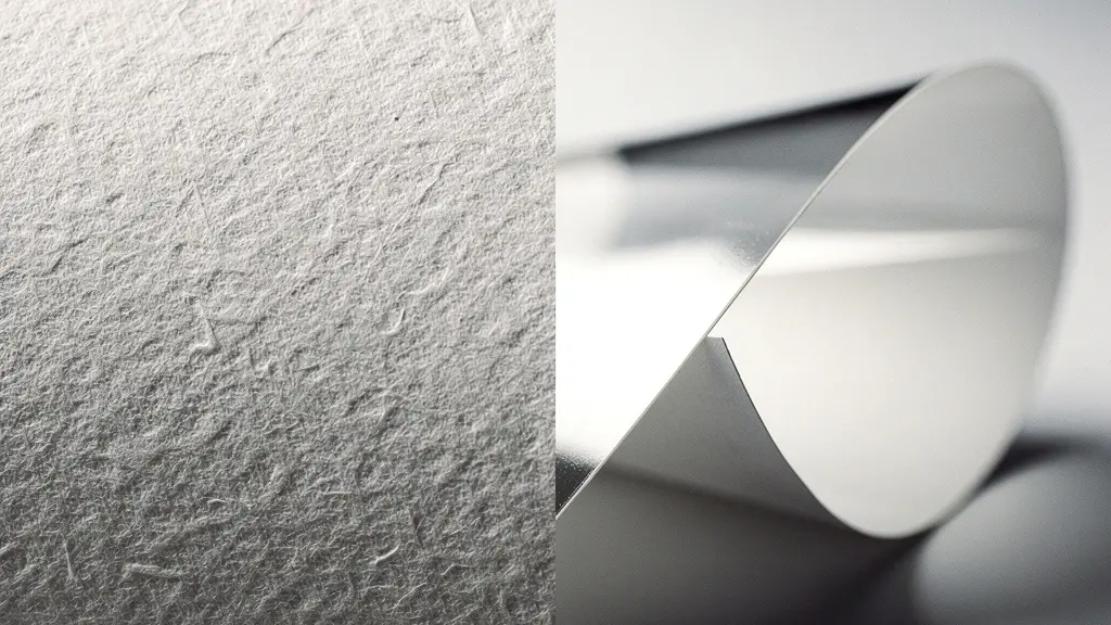
In the world of fine art printing, the conversation often begins with a simple question: why choose a $50 sheet of cotton rag paper when a $5 resin-coated (RC) sheet looks just as sharp out of the printer? The immediate, tactile differences are obvious. One feels substantial, like fabric; the other is slick, light, and plastic-like. But to focus only on texture is to miss the fundamental point. The cost difference isn’t about a preference for a matte or glossy finish; it’s the price of time itself. It is the difference between a disposable image and an artifact with material integrity.
Most discussions stall at superficial comparisons: cotton is for “art,” RC is for “photos.” This is a dangerous oversimplification. The real distinction lies in a hidden world of material science. It’s a system where every component—the paper pulp, the ink, the sizing agents, and even the mat board it will eventually touch—is either working in concert to preserve the image or actively conspiring to destroy it. A cheap paper isn’t just a less-prestigious base; it is an unstable chemical environment, a ticking clock counting down to yellowing, fading, and embrittlement.
But what if the true measure of a print’s value was understanding this chain of cause and effect? This guide abandons the simple “good vs. bad” narrative. Instead, we will deconstruct the print as a system. We will explore the molecular breakdown that causes yellowing, the physics of light that creates color shifts, the precise mechanical calibrations required to handle museum-grade stock, and the insidious threat of acid migration from non-archival materials. Understanding these forces is what separates a technician from a master printer. It is the knowledge that justifies the price tag and ensures a photograph becomes a legacy.
This article provides a detailed breakdown of the critical factors that determine a print’s quality and longevity. We will examine the science behind paper degradation, the importance of surface texture, the role of optical brighteners, and the correct handling and printing procedures that define a truly archival workflow.
Contents: A Deep Dive into Archival Print Quality
- Why Do Cheap Papers Turn Yellow Within 5 Years of Display?
- How to Select the Perfect Texture for High-Detail Architectural Prints?
- OBA-Free Papers: Are They Essential for Your Black and White Work?
- The Handling Error That Ruins Velvet Fine Art Paper Instantly
- How to Calibrate Your Printer for Heavyweight Hahnemühle Stock?
- Why Does Non-Archival Mat Board Destroy Your Print in 10 Years?
- How Long Will a Pigment Print Last Before Visible Fading?
- Dye vs. Pigment Ink: Which Is Mandatory for Gallery Sales?
Why Do Cheap Papers Turn Yellow Within 5 Years of Display?
The primary culprit behind the rapid degradation of inexpensive papers is an organic polymer called lignin. Found in the cell walls of wood, lignin is the natural glue that gives trees their rigidity. However, in paper, it is a volatile agent of self-destruction. When exposed to oxygen and UV light, lignin molecules break down, creating acids. This process isn’t just cosmetic; it’s a fundamental chemical attack on the paper’s structure. In fact, research published in Polymers journal demonstrates that the paper’s pH can drop from a neutral 7.0 to an acidic 4.5-5.0 within just five years of display. This acidic environment systematically severs the cellulose fibers that give the paper its strength, leading to the characteristic yellowing and brittleness.
This degradation follows a predictable timeline. In the first year, yellowing may only appear at the edges where air exposure is highest. By year two, a light, uniform yellow tint covers the surface. In year three, the paper feels noticeably brittle at the corners. By year five, the paper is deeply yellowed, often with brown spots, and its structural integrity is severely compromised. In contrast, high-quality archival papers made from 100% cotton linters are naturally lignin-free and acid-free. Their stability isn’t an added feature; it’s an inherent property of their composition, preventing this destructive chemical cascade from ever beginning.
How to Select the Perfect Texture for High-Detail Architectural Prints?
Beyond chemical stability, the physical surface of the paper plays a critical role in how an image is perceived. For high-detail subjects like architecture, texture is not a mere aesthetic choice; it is a tool for managing detail and dimensionality. The goal is to find a balance where the paper’s surface enhances the subject without overwhelming it. A smooth, resin-coated paper might render every line with maximum sharpness, but it can also create a flat, clinical feel. A heavily textured paper can add a beautiful artistic quality but may obscure the fine details that define the structure. The choice of paper surface has a direct impact on the final print’s perceived resolution and character.
Case Study: Matching Paper to Architectural Detail
In a documented test, Keith Dotson Photography sought the perfect paper for an image of Nashville’s Custom House, a building with intricate stonework. For this subject, a smooth RC paper made the limestone facade look flat and lifeless. In contrast, Canson Platine Fiber Rag, with its subtle stipple texture, enhanced the tactile quality of the stone. The paper’s baryta-like coating preserved the essential micro-contrast and sharpness of the details, while its delicate texture added a sense of depth and dimensionality that a perfectly smooth paper could not replicate. This demonstrates a key principle: the texture must serve the image.
Selecting the right surface is a matter of matching it to the architectural style. A modern glass-and-steel skyscraper might benefit from the razor-sharp rendering of a pearl or metallic RC paper. Conversely, the weathered facade of a historic stone building comes to life on a smooth or cold-press cotton rag, where the paper’s subtle texture echoes the subject’s own. This decision is a crucial part of the printer’s craft.
The following table, based on an analysis of high-resolution photo papers, outlines how different surfaces interpret architectural detail.
| Paper Type | Surface Texture | Detail Resolution | Best Architecture Style |
|---|---|---|---|
| Pearl/Metallic RC | Ultra-smooth | Maximum sharpness | Modern glass/steel buildings |
| Cotton Rag Smooth | Slight texture | Subtle diffusion | Historic stone structures |
| Cold Press Cotton | Pronounced texture | Artistic interpretation | Rustic/weathered buildings |
OBA-Free Papers: Are They Essential for Your Black and White Work?
Optical Brightening Agents (OBAs) are chemical compounds added to many papers—from office copy paper to low-end RC photo papers—to make them appear “whiter” and “brighter.” They work by absorbing invisible ultraviolet (UV) light and re-emitting it as visible blue light, effectively masking the natural, slightly warm tone of the paper pulp. While this creates a dazzling initial impression, it’s a Faustian bargain for fine art printing, especially for black and white work. The problem is twofold: OBAs are unstable and they cause metameric failure. Over time, OBA molecules break down and revert to their natural yellowish state, causing a distinct color shift in the paper’s white point.

More critically, OBA-rich papers are highly susceptible to metamerism—the phenomenon where colors appear to change under different lighting conditions. Because OBAs rely on UV light to function, a print displayed under UV-rich gallery lighting (cool LEDs) will look dramatically different from the same print under UV-poor incandescent home lighting (warm tungsten). The white point can shift from a cool blue to a muddy yellow. In fact, professional testing reveals a potential 20-point color shift when moving between different lighting environments. For black and white prints, where tonal relationships are everything, this inconsistency is unacceptable. A true archival paper for gallery sale must be OBA-free to ensure color stability and predictability across all viewing conditions.
As the technical experts at Canson explain, the science is clear. In their guide, they note:
The OBA can absorb electromagnetic radiation between 300-400 nm and re-emit energy into the visible blue spectrum between 400-500 nm. As the blue is complementary to yellow, adding OBA brings more whiteness, but these unstable molecules may turn yellow over time.
– Canson Technical Documentation, Canson Infinity Technical Guide
The Handling Error That Ruins Velvet Fine Art Paper Instantly
The very qualities that make cotton rag papers superior for archival printing—their soft, uncoated, and absorbent surfaces—also make them incredibly delicate. Unlike resin-coated papers, which have a protective plastic layer, fine art papers have no barrier between the world and their fragile fibers. A single misstep during handling or printing can cause irreversible damage, turning an expensive sheet into waste. The most common and devastating error is a head strike, where the printer’s print head physically scrapes across the paper’s surface. On a textured matte paper like a velvet or photo rag, this doesn’t just smudge ink; it permanently flattens and burnishes the paper fibers, leaving a glossy track that is impossible to remove.
This risk is not just theoretical; it’s a painful reality for many printers, as one user on a professional forum recounted:
Cotton rag is more difficult to get a good print as the gloss and pearl papers seem to be more forgiving. I learned the hard way that even careful handling isn’t enough – the print head scraped my Hahnemuhle Photo Rag creating irreversible tracks that ruined a $40 sheet.
– Forum user, DPReview Forums
Preventing this and other handling damage requires a disciplined, methodical approach. It is a ritual that separates amateur output from professional results. Simply being “careful” is not enough; a specific set of protocols must be followed every time a sheet of fine art paper is touched. This includes everything from wearing gloves to giving prints adequate time to dry and “outgas” before they are stacked.
Your Action Plan: Safe Handling of Fine Art Papers
- Wear cotton gloves: Always handle uncoated cotton papers with gloves to prevent oils from your skin from creating spots and discolorations.
- Adjust platen gap: Set the printer’s platen gap (the distance between the print head and the paper) to its widest setting for any paper over 300gsm to prevent head strikes.
- Clean the feed rollers: Regularly check and clean the printer’s “pizza wheel” rollers to prevent them from leaving small, repeating track marks on the print surface.
- Allow 24 hours to dry: Never stack prints immediately after printing. Let them lie flat, separated, for at least 24 hours for the ink to fully cure and outgas.
- Use interleaving tissue: When storing or transporting prints, always place a sheet of acid-free interleaving tissue between them to prevent scuffing and surface transfer.
How to Calibrate Your Printer for Heavyweight Hahnemühle Stock?
Printing on heavyweight, textured cotton rag paper is not a plug-and-play process. Unlike thin RC papers that feed easily, thick stocks like those from Hahnemühle (e.g., Photo Rag 308gsm) require precise printer calibration. Simply selecting a generic “matte paper” profile is a recipe for disaster, leading to ink bleeding, poor color accuracy, and physical damage from head strikes. Proper calibration is a two-part process: a physical adjustment of the printer hardware and a digital adjustment of the ink output via custom ICC profiles.
The first step is always mechanical. As detailed in the previous section, the platen gap must be widened to accommodate the paper’s thickness. This physically moves the print head further away from the paper, providing the necessary clearance to avoid scrapes and scuffs. The second, equally crucial step, is managing the ink. Thick, uncoated matte papers are extremely absorbent, and a standard ink profile will lay down far too much ink. This leads to oversaturation, “ink bleed” where fine lines blur, and an excessively long drying time. To prevent this, you must use a specific ICC profile designed for that exact paper, which intelligently reduces the total ink load to a manageable level.
Professional Workflow: Calibrating for Hahnemühle Photo Rag
The professional lab Zone8 shared their standard workflow for their preferred paper, Hahnemühle Photo Rag 308gsm. Their process highlights the system-based approach. The first and most critical step was always a physical adjustment: setting the platen gap to “wide.” Only after this mechanical precaution was taken did they move to the digital side. They created custom ICC profiles for each paper and ink combination, which allowed them to precisely control the ink load. This dual calibration ensures that the final print has maximum sharpness, correct color density, and a flawless, undamaged surface.
The relationship between paper weight, ink load, and platen gap is critical, as shown in the table below.
| Paper Type | Weight | Recommended Ink Limit | Platen Gap Setting |
|---|---|---|---|
| RC Glossy | 260gsm | 100% | Standard |
| Cotton Rag Matte | 308gsm | 65-70% | Wide |
| Heavyweight Cotton | 350gsm+ | 60% | Widest |
Why Does Non-Archival Mat Board Destroy Your Print in 10 Years?
The print’s journey does not end when it leaves the printer. The framing and mounting materials it comes into contact with become part of its chemical environment. Using a non-archival mat board is one of the most common and destructive mistakes in presentation. Standard mat boards are made from wood pulp that, like cheap paper, is full of lignin. Over time, this lignin breaks down and releases acids. Through a process called acid migration, these acids will literally leach out of the mat board and into any material they touch—including the edge of your pristine, expensive print.
This is not a slow, gentle process. Conservation research demonstrates that acids can migrate up to 1.5 inches from the source material in as little as two years. This creates a visible brown, scorched line on the print known as “mat burn,” which is permanent and irreversible. It is the chemical signature of a dying print, a clear sign that a cheap frame has destroyed a valuable piece of art from the outside in. Even if a mat board is labeled “acid-free,” it may still contain lignin. This is a critical distinction, as the lignin will eventually turn acidic, nullifying the initial “acid-free” status.
As the experts at Gaylord Archival, a leading supplier of conservation materials, state:
Lignin is a natural component in wood that binds fibers together. However, as it breaks down it becomes acidic, contributing to deterioration. Even if a product is acid-free at manufacture, if it contains lignin, it risks becoming acidic over time.
– Gaylord Archival, What Does That Mean? Acid- and Lignin-Free
Therefore, for true archival framing, all materials that touch the print—the mat board, the mounting board, and any interleaving tissues—must be not only acid-free but also lignin-free. These materials are typically made from 100% cotton fiber, often referred to as “rag board” or “museum board,” ensuring that the print is housed in a chemically stable and non-destructive environment.
How Long Will a Pigment Print Last Before Visible Fading?
The question of longevity is central to the value of a fine art print. While manufacturers often tout impressive numbers, the true lifespan of a print is determined by the “weakest link” in the system: the ink, the paper, and the display conditions. Modern pigment inks are incredibly stable. Using accelerated aging tests, Wilhelm Imaging Research testing indicates longevity ratings of over 400 years for specific black and white prints made with Epson UltraChrome HD inks on certain fine art papers. These figures represent the ink’s resistance to fading under controlled, museum-quality display conditions.
However, these headline numbers can be misleading if taken out of context. The paper’s quality is often the deciding factor. Independent research from institutions like Aardenburg Imaging provides a more nuanced view. Their testing often shows that even with the most stable modern inksets, discernible color fade or paper yellowing can begin in as little as 50 to 75 years, depending heavily on the paper type used. The critical finding is consistent: the paper’s stability, or lack thereof, often dictates the true lifespan of the print long before the pigment ink itself begins to fade. An archival ink on a cheap, acidic paper will not last.
Therefore, a print’s permanence rating is not a single number but a prediction based on the entire system. A 200-year rating assumes the use of high-quality pigment ink, on a 100% cotton, OBA-free, lignin-free paper, framed with archival materials, and displayed under UV-filtered glass away from direct sunlight. Any compromise in this chain—a paper with OBAs, a mat board with lignin, or exposure to raw sunlight—will dramatically shorten the print’s life. True longevity is achieved only when every component of the system is of archival quality.
Key Takeaways
- Internal Chemistry is Destiny: A paper’s longevity is primarily determined by its composition. Lignin-based papers are chemically programmed to self-destruct, while 100% cotton papers are inherently stable.
- OBAs Create Instability: Optical Brightening Agents (OBAs) provide a false sense of whiteness and lead to metameric failure (color shifts under different lights) and eventual yellowing. True archival prints must be OBA-free.
- The Print is a System: A print’s lifespan depends on its weakest link. Archival ink on non-archival paper, or an archival print in a non-archival frame, results in system failure. Every component must be of archival quality.
Dye vs. Pigment Ink: Which Is Mandatory for Gallery Sales?
In the fine art market, there is no debate: pigment ink is the mandatory standard. While modern dye-based inks can produce vibrant, beautiful colors, they are fundamentally unsuited for the creation of lasting, investment-grade prints. The difference lies in their molecular structure. Dye inks consist of small, water-soluble molecules that are absorbed into the paper’s coating. This solubility makes them highly susceptible to fading from UV light and “bleeding” from humidity. Their lifespan is typically measured in a few decades at best, making them unacceptable for any serious collector or gallery.
Pigment inks, in contrast, are composed of microscopic, encapsulated particles of solid colorant suspended in a liquid carrier. Instead of being absorbed, these particles are deposited onto the paper’s surface, forming a durable, stable layer. This structure makes them far more resistant to UV degradation and environmental factors. As confirmed by extensive testing from authorities like Wilhelm Imaging Research, pigment ink prints are predicted to remain stable for 100 to 200 years or more under proper display conditions, with some black and white combinations exceeding 400 years.
This vast difference in longevity has a direct impact on a print’s commercial viability. Galleries and collectors view a photograph as an asset. An artwork that visibly degrades within the owner’s lifetime is not a sound investment. Consequently, the use of pigment ink is a baseline requirement for entry into the fine art market. The following table illustrates the stark difference in how the market values prints based on the ink used.
| Ink Type | Longevity Rating | Gallery Acceptance | Investment Value |
|---|---|---|---|
| Dye-based | 25-50 years | Rarely accepted | Depreciates quickly |
| Pigment (Standard) | 75-100 years | Widely accepted | Stable value |
| Pigment (Archival) | 200+ years | Preferred/Required | Appreciates over time |
To create a print that justifies a premium price and endures for generations, every decision must be deliberate. It requires moving beyond surface aesthetics and embracing the material science that governs longevity. It’s about building a stable system where paper, ink, and presentation work in concert to defy time. To ensure your work endures, the next step is to audit your entire print workflow, from paper selection to final framing.