
Breaking the rule of thirds isn’t about creating chaos; it’s about mastering the visual psychology that controls a viewer’s emotional response.
- Effective rule-breaking, like Wes Anderson’s centering, is part of a complete, deliberate visual system, not an accident.
- Placing subjects at the frame’s edge creates more profound unease than placing them on a thirds-intersection, by leveraging peripheral vision.
Recommendation: Stop seeing composition as a set of rules to follow or break, and start seeing it as a toolkit for manipulating emotion and narrative.
For decades, the rule of thirds has been the foundational bedrock of photographic composition, the first lesson taught and the last one forgotten. We’re told to place key elements along imaginary lines or at their intersections to create harmony and balance. It’s a safe, reliable formula for creating a pleasing image. But for the advanced photographer, “pleasing” is often not the goal. The real work begins where the rules end.
You’ve likely felt the restriction. Your compositions are balanced, but feel static. They are correct, but lack a voice. This is because the rule of thirds is a tool for creating comfort, a visual default that our brains process with ease. But what if your story isn’t comfortable? What if it’s about tension, unease, power, or isolation? This is where you graduate from a rule-follower to a storyteller. The key isn’t to simply break the rule, but to understand the visual psychology behind it so you can bend it with purpose.
This guide will not give you more rules. It will give you liberation. We will deconstruct why certain “broken” compositions work by exploring the emotional and cognitive responses they trigger. We’ll move beyond the grid to understand the power of the edge, the weight of the center, and the breath of the void. It’s time to stop just placing subjects and start controlling the narrative.
To navigate this deeper level of composition, this article explores the specific techniques and psychological principles that turn a broken rule into a powerful statement. The following sections break down exactly how to move beyond the grid and into the realm of intentional, emotion-driven art.
Summary: Mastering Tension by Breaking the Rule of Thirds
- Why Does Center-Framing Work for Wes Anderson but Not for You?
- How to Use the Thirds Grid to Check Horizon Lines Quickly?
- Edge Placement vs. Thirds Intersection: Which Creates More Unease?
- The Composition Mistake That Leaves 60% of the Frame Empty and Boring
- How to Move the Viewer’s Eye From a Thirds Point to the Edge?
- The Symmetry Trap That Makes Your Photos Look Like Stock Images
- Why Do Viewers Ignore 80% of Images with Cluttered Compositions?
- How to Apply the Golden Ratio to Nature Photography for Subconscious Appeal?
Why Does Center-Framing Work for Wes Anderson but Not for You?
The allure of the perfectly centered subject is strong, yet it’s often the first “mistake” a novice photographer makes, resulting in flat, passport-style photos. Then we see a Wes Anderson film and the rulebook goes out the window. His obsessive center-framing feels deliberate, stylish, and powerful. The difference isn’t the act of centering; it’s the artistic system built around it. Anderson’s visuals work because his eccentric characters and settings are perfectly complemented by this rigid, storybook aesthetic.
According to an analysis on StudioBinder, Anderson’s rule-breaking is accepted by audiences because it meshes perfectly with his quirky, emotionally detached narratives. His centering is not an isolated choice. It is reinforced by a cohesive visual language: flat space, hyper-curated color palettes, and meticulous set design. For an amateur, accidental centering feels lazy. For Anderson, it’s a deliberate tool to convey themes of formality, awkwardness, or objective observation. The subject isn’t just in the middle; the entire world of the frame is engineered to justify its position.
To successfully employ center-framing, you must think like a director, not just a photographer. Is the centering essential to the emotion you want to evoke? Does it serve the story? Or is it simply the easiest place to put the subject? True mastery of centering comes from building a world within the frame that makes the center the only place the subject could possibly be. Without this supporting visual structure, a centered subject feels less like a bold choice and more like a missed opportunity.
Action Plan: The Anderson System for Successful Centering
- Check Narrative Congruence: Before shooting, articulate exactly why you are centering the subject. Knowing your intention is key to developing a unique style and ensuring the choice enhances the intended emotion, be it power, unease, or formality.
- Apply Perfect Symmetry: Don’t be shy. If you choose to center, commit to it by creating a deliberately symmetrical scene to reinforce the feeling of order, control, or tension.
- Create ‘Broken Symmetry’: Construct a perfectly symmetrical composition, then intentionally place a single, small element off-center. This creates a powerful focal point and an immediate sense of narrative.
- Ensure Visual Support: All other elements—color, light, background, and foreground—must reinforce the central composition. A chaotic background undermines a centered subject.
- Test the Emotion: Does the final image feel formal, divine, and awkward in a purposeful way? Or does it just look like a poorly composed snapshot? If it’s the latter, the system has failed.
How to Use the Thirds Grid to Check Horizon Lines Quickly?
Most photographers use the rule of thirds grid to place subjects. However, advanced practitioners use it as an analytical tool, especially for the rapid and intentional placement of horizon lines. The grid isn’t just for *what* you place, but *where* you place it to control mood. The position of the horizon fundamentally alters the narrative weight of the sky versus the land, creating vastly different emotional effects. Instead of defaulting to a thirds line, think of the grid as a scale of emotional expression.
The true power of the grid lies in making conscious decisions. A low horizon gives dominance to the sky, creating feelings of openness, freedom, or isolation. A high horizon grounds the viewer, emphasizing the texture and details of the foreground, creating intimacy or even claustrophobia. Placing the horizon dead-center—a classic “broken” rule—is a power move. It’s perfect for creating tension through stark division or perfect harmony in scenes with reflections. The grid helps you see these zones and choose the one that serves your story.
But what about vertical horizons? In urban or abstract photography, the edges of buildings or structures act as powerful vertical compositional lines. Applying the same logic here can create profound tension. Tilting the camera (a “Dutch angle”) can turn stable verticals into dynamic, unsettling diagonals that guide the eye with a sense of urgency or instability. This is about seeing beyond the horizontal and using all lines in the frame to create a specific rhythm.
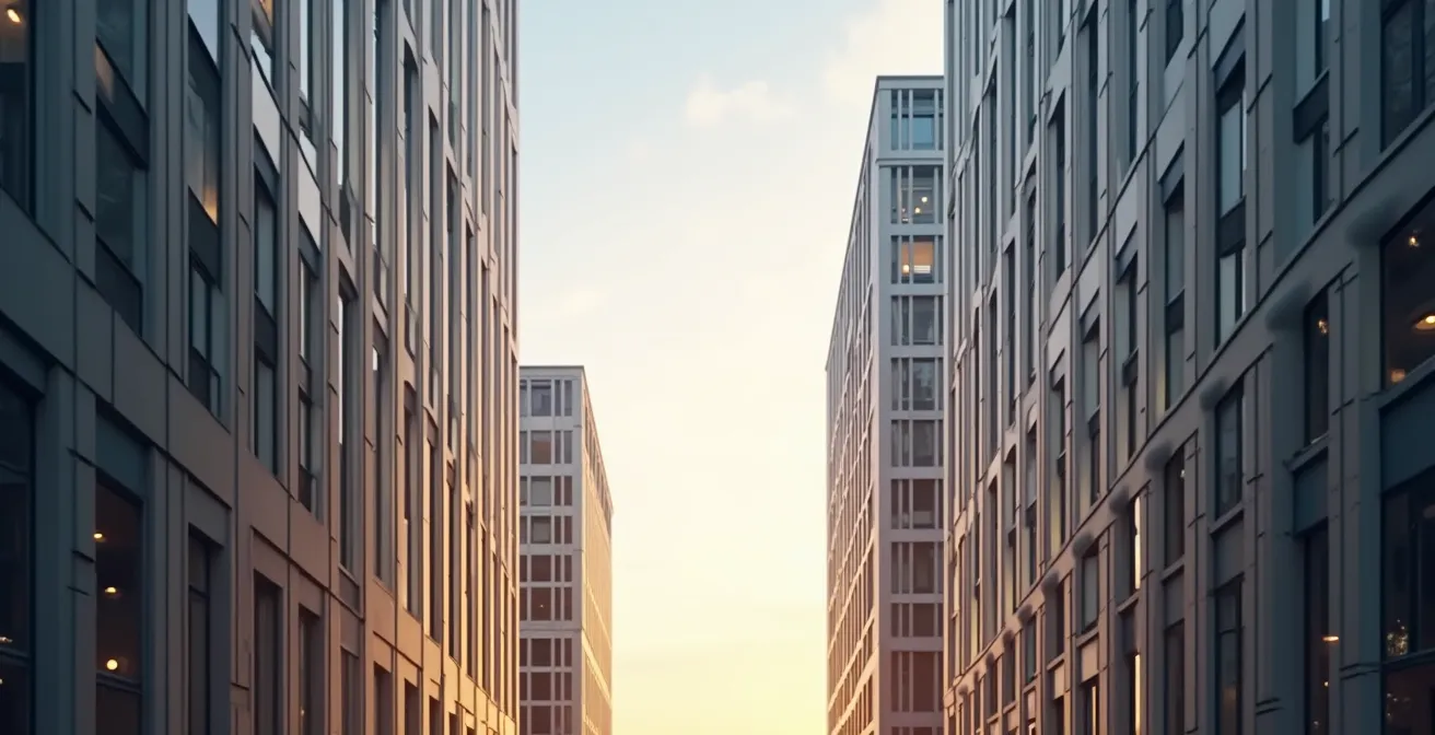
This image demonstrates how vertical edges, when combined with a subtle Dutch angle, can function as dynamic ‘horizons’ that create tension and guide the eye in a non-traditional way. The following table, based on compositional theory, breaks down how different horizon placements can be used to elicit specific emotions.
| Horizon Position | Visual Rhythm | Emotional Effect | Best Use Case |
|---|---|---|---|
| Bottom Third | 1/3 land to 2/3 sky | Creates a sense of expansiveness by drawing the viewer’s eye to the sky above | Freedom, openness, aerial perspective |
| Top Third | 2/3 land to 1/3 sky | Draws the eye to the foreground to create a sense of proximity with the landscape | Intimacy, claustrophobia, grounded feeling |
| Center (Breaking Rule) | Equal split | Creates tension or perfect balance | Reflections, symmetrical scenes |
| Extreme Edge | Minimal sky or land | Creates dramatic emphasis | Abstract compositions, minimalism |
Edge Placement vs. Thirds Intersection: Which Creates More Unease?
Placing a subject on a rule of thirds intersection is comfortable. It’s balanced and aesthetically pleasing, a quiet hum of harmony. But placing a subject at the extreme edge of the frame is a shout. It’s inherently unstable, creating immediate calculated tension and a sense of unease. While a thirds-point placement invites the viewer in, an edge placement often suggests a narrative of departure, intrusion, or instability. This is a direct manipulation of visual psychology.
Why does this work? Our brains are wired for balance. When an element is pushed to the very edge, it feels like it’s about to fall out of the frame, or that something is about to enter from the void beyond it. This activates a sense of anticipation and anxiety. Furthermore, research on peripheral vision and emotion processing confirms that off-center placements can invoke stronger emotional responses. An object at the edge of the frame might feel more threatening or significant simply because it’s not where we expect it to be.
The experts at B&C Camera articulate this principle perfectly. They explain how breaking the rule of thirds can be a powerful tool for mood-setting:
Breaking the rule of thirds can create a sense of tension or unease in a photo, which can be helpful if you’re trying to convey a certain mood or emotion. For example, placing the subject close to the edge of the frame can create a sense of movement or instability.
– B&C Camera Photography Experts, How to Use the Rule of Thirds Guide
The choice between a thirds intersection and the edge is a choice between stability and instability, harmony and tension. A subject on a third is the subject of the photo; a subject on the edge is a character in a story that’s either just begun or is about to end. It’s a more advanced, and often more powerful, form of visual storytelling.
The Composition Mistake That Leaves 60% of the Frame Empty and Boring
A common piece of advice for beginners struggling with the rule of thirds is to avoid “empty space.” This leads to a fear of minimalism and a tendency to fill the frame with clutter. The real mistake isn’t the presence of empty space, but the quality of that space. The goal isn’t to eliminate the void; it’s to activate it, turning it from boring, inactive negative space into a purposeful void—a concept the Japanese call ‘Ma’ (間).
As described in Digital Photography School, positioning a subject on a thirds line is effective because it creates a balanced relationship between the subject and the negative space. The two-thirds of “empty” frame aren’t empty at all; they are a breathing room that gives shape and importance to the subject. The critical distinction is between active and inactive negative space. Inactive space is flat, featureless, and dead. Active negative space has texture, gradients, leading lines, or a subtle tonal shift that directs the eye and contributes to the mood.
Think of the sky in a landscape. If it’s a flat, blown-out white, it’s inactive space that detracts from the image. If it’s filled with rolling clouds, a color gradient at sunset, or the faint texture of stars, it becomes an active, compelling part of the composition. ‘Ma’ is the art of making this void meaningful. It’s the silent pause in a piece of music, the unpainted silk in a scroll painting—the emptiness that gives form and significance to what is present.

By mastering this, you can use vast amounts of negative space to make a tiny subject feel incredibly powerful and significant. You’re no longer just taking a picture of a thing; you’re composing a relationship between presence and absence, sound and silence.
How to Move the Viewer’s Eye From a Thirds Point to the Edge?
Placing a subject on a rule of thirds intersection is a starting point for the viewer’s journey, not the destination. An advanced composition doesn’t just present a subject; it controls the viewer’s gaze, leading it on a deliberate path through the frame. The question is, how do you orchestrate this movement, especially when you want to guide the eye from a point of stability (the third) to a point of tension (the edge)?
The primary tools for this are vectors and gradients. A vector can be an explicit leading line—a road, a fence, a river—that physically points from one area of the frame to another. If your subject is on a right-third point, a line originating near them and sweeping towards the left edge will pull the viewer’s eye along with it, creating a sense of journey or departure. Vectors can also be implicit, such as the direction of a subject’s gaze. A person looking out of the frame towards the edge creates a powerful psychological pull, as the viewer instinctively wants to see what they are looking at.
Gradients of light, color, and focus are more subtle but equally powerful. Our eyes are naturally drawn to areas of high contrast, brightness, and sharp focus. You can create a visual path by composing a scene that moves from dark to light, from muted color to saturated color, or from soft focus to sharp focus. By placing your main subject at the start of this gradient (on the thirds point) and having the gradient resolve near the edge of the frame, you create a seamless and organic flow for the viewer’s eye. This creates a visual narrative, a micro-story told in the span of a single glance.
The Symmetry Trap That Makes Your Photos Look Like Stock Images
Symmetry is the most obvious way to break the rule of thirds. It can be powerful, conveying stability, order, and formality. However, it’s also a trap. Overused or poorly executed, perfect symmetry can feel sterile, predictable, and devoid of life—the hallmark of a generic stock image. It’s often applied to subjects that are not naturally symmetrical, like a candid portrait, which feels forced and artificial. The key to using symmetry effectively is to move beyond simple reflection and embrace more sophisticated forms, especially symmetry interruption.
As noted in Better Digital Photo Tips, a powerful technique is to create a perfectly symmetrical scene and then introduce a single element that breaks it. This “interruption” immediately becomes the focal point, creating tension and raising a narrative question. Imagine a perfect architectural reflection in a lake, broken by a single red leaf floating on the surface. The symmetry draws you in, but the interruption holds your attention and tells a story. This technique leverages the brain’s pattern-recognition software; we are drawn to the pattern (symmetry) but fascinated by the anomaly (the break).
Furthermore, one must differentiate forced symmetry from inherent symmetry. Inherent symmetry, found in architecture, reflections, and natural patterns, feels authentic and enhances the subject’s nature. More advanced forms like radial symmetry (found in a spiral staircase or the petals of a flower) create a dynamic central focus, while translational symmetry (the repeating pattern of arches in a hallway) creates rhythm and scale. The trap is not symmetry itself, but the thoughtless application of its most basic form. True mastery lies in recognizing these different types of symmetry and knowing when to honour them perfectly and when to break them with intention.
Why Do Viewers Ignore 80% of Images with Cluttered Compositions?
In a world of infinite scrolling, a viewer’s attention is the most valuable currency. An overly complex or cluttered image is a cognitive dead end. The reason viewers disengage is not a matter of taste, but of pure brain science: cognitive load. Every element you add to a frame is another piece of information the viewer’s brain must process. When the processing demand becomes too high, the brain’s defense mechanism is to simply give up and move on.
This isn’t just theory; it’s backed by data. A 2023 eye-tracking study published by MDPI on visual communication revealed a crucial insight: visual expressions which can effectively grab people’s attention don’t necessarily need to be complex. The research states that “overly complex images can increase the viewer’s cognitive burden,” leading to faster abandonment. This is why minimalism, negative space, and clear focal points are so powerful. They respect the viewer’s cognitive budget.
Breaking the rule of thirds effectively is often an exercise in subtraction, not addition. By moving a subject out of a “safe” thirds position and into a more daring composition—like extreme edge placement with vast negative space—you are often simplifying the overall image. You are reducing the number of competing elements and clarifying the visual hierarchy. You are telling the viewer, “This is the most important thing. Look here.” A cluttered composition with a subject on a thirds point is far weaker than a minimalist composition with a subject placed with radical intent. Simplicity is not boring; it’s a confident and direct form of communication.
Key takeaways
- True mastery isn’t in following or breaking rules, but in understanding the visual psychology that makes a composition emotionally effective.
- Techniques like center-framing or symmetry are only powerful when they are part of a deliberate, cohesive visual system, not isolated choices.
- The quality and purpose of negative space (‘Ma’) are more important than its quantity; it must be an active element that gives shape and importance to the subject.
How to Apply the Golden Ratio to Nature Photography for Subconscious Appeal?
If the rule of thirds is a simple, stable structure, the Golden Ratio (or Fibonacci Spiral) is its more organic, dynamic, and complex cousin. While the thirds grid creates a static, grounded balance, the Golden Ratio creates a sense of flow and natural harmony. This is why it is particularly powerful in nature photography, as the ratio (approximately 1:1.618) and its resulting spiral are found everywhere in the natural world, from the curve of a breaking wave to the spiral of a galaxy. Tapping into it creates a subconscious appeal, a feeling that the composition is “right” on a primal level.
Some photographers find themselves instinctively drawn to the Golden Ratio’s phi grid. As noted in a comparative analysis, it offers a unique aesthetic that can create a more intriguing and organic sense of balance. The key difference is energy. The rule of thirds is stable and best suited for portraits or architectural shots where stability is desired. The Golden Ratio is all about dynamic flow, making it perfect for capturing movement and the elegant forms found in nature.
Applying it goes beyond simply placing a subject on an intersection. It’s about training your eye to see the spiral and flow in a scene. Look for natural spirals like fern fronds or nautilus shells. Arrange your foreground, midground, and background elements along the curve of the spiral to create harmonious depth. The Golden Ratio isn’t a replacement for the rule of thirds; it’s a different tool for a different job. It’s a step away from rigid geometry and a step towards composing with the elegant, asymmetrical rhythm of the universe itself.
By moving beyond the rigid grid of the rule of thirds and embracing the psychological power of centering, edge placement, negative space, and organic ratios, you transition from a photographer who captures scenes to an artist who constructs narratives. This is the essence of compositional mastery: knowing not just the rules, but the reasons behind them, and having the confidence to choose the right visual language for the story you want to tell.